Design a splash screen for Krita 2.4
Tags:
None
|
KDE Developer 
|
I'm not sure what to do about the license... Whether it should be there or not. For beta3, I propose we use al-dy's warrior splash, btw. It's nice and strong, but maybe a bit gloomy for the 2.4 release.
I would still love to see more splashes entered for the final 2.4 release! |
|
Registered Member 
|
I'll publish mine this week. I worked around the "creative freedom" theme, expressly for the Krita's splash-screen...  Now, I'm giving the last touches... |
|
Registered Member 
|
Kra file: http://www.mediafire.com/file/jxayna3h1 ... krita+.zip
Without frame: 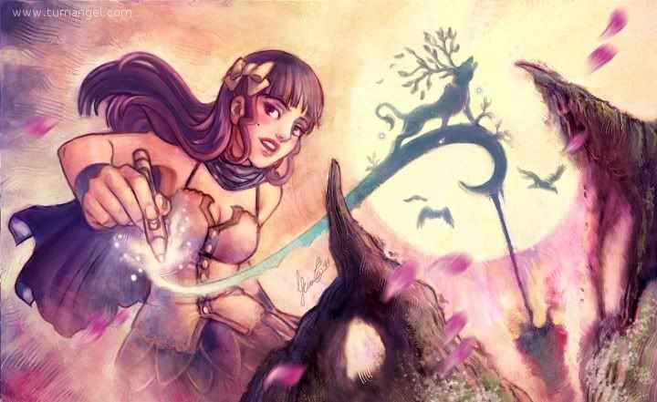 My splash-screen proposals: 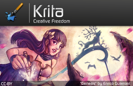 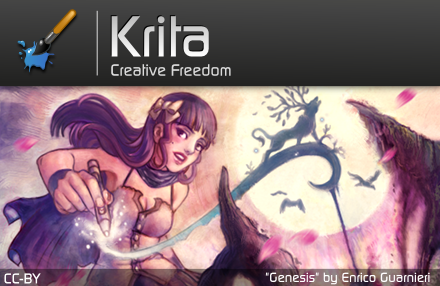 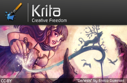 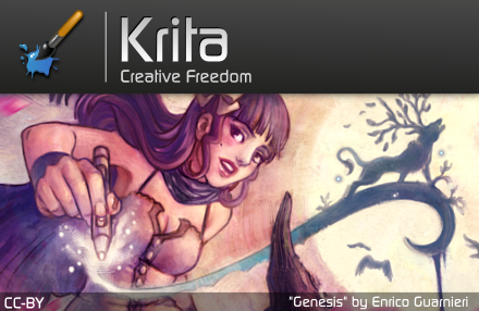 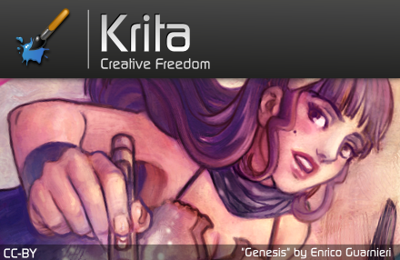 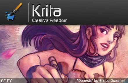 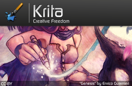
Last edited by Ico-dY on Sat Nov 19, 2011 2:55 pm, edited 2 times in total.
|
|
Administrator 
|
This one has my vote. Fabulous!
Problem solved? Please click on "Accept this answer" below the post with the best answer to mark your topic as solved.
10 things you might want to do in KDE | Open menu with Super key | Mouse shortcuts |
|
KDE Developer 
|
I think I want to use Swordman of the Apocalypse for the next beta. He looks as if he can help us kill the remaining bugs...
|
|
KDE Developer 
|
For the final release, I'm torn between girl in the garden and the the painting girl. I like the colors and the details on girl in the garden -- it's just fun to look at while waiting. The painting girl is bold and on-topic -- and I like this variant best: http://img.photobucket.com/albums/v694/ ... ash_v4.png
|
|
KDE Developer 
|
I'm wondering whether for ico-dy's splashes, it wouldn't be nice to make the top bar semi-transparent instead of solid black. Any opinions?
|
|
Administrator 
|
Personally I would prefer to not have any transparent bars at all, since it looks more "professional" in my opinion.
Problem solved? Please click on "Accept this answer" below the post with the best answer to mark your topic as solved.
10 things you might want to do in KDE | Open menu with Super key | Mouse shortcuts |
|
KDE Developer 
|
Or the girl's head could be on top of the top black bar, as a cut-out -- could be nice as well.
|
|
Registered Member 
|
I'd go cut out over the top before going semi transparent. Semi transparent makes the whole layout a bit less clean and bold imo. Then again, I'd also have the top bar be a bit thinner so we could see more of the image itself.
As to which splash, I like them both, however I'd point out that using the fully zoomed in version of Ico-Dy's splash, you can't actually see that she's holding a pen and drawing / painting, which detracts from th "on-topic"ness of it... Personally I'd either go for one where you could see the full pen (like the one Hans liked), or go for Ramon's. |
|
Registered Member 
|
Sorry, I'm late... Here's the kra file of my splash-screen! ^^ http://www.mediafire.com/file/jxayna3h1 ... krita+.zip
|
|
KDE Developer 
|
Aaaand... We've chosen!.
In the first place comes Enrico Guarnieri with his "Genesis". From all the entries, Genesis was most clearly about Krita itself. He will receive a DVD and Comic pack! In the second place, Ramon Miranda, who entered six proposals. The one that came closest to winning was "Gwap". Third place goes to Alvaro Dopazo, for his whimsical and funny "Cat Lover". We had so much fun and pleasure with all the entries for the splash screens that we dediced to give all the entrants a Krita DVD! Please mail your snail mail addresses to boud@valdyas.org so I can send them out! |
|
Registered Member 
|
YATTA! Thank you very much! I'm happy!

|
|
Registered Member 
|
I'm agree with the election, Genesis is the most representative illustration for Krita. Congratulations Enrico!
And thanks for select my illustration in third place 
|
|
Registered Member 
|
Thank you! 
|
Bookmarks
Who is online
Registered users: Bing [Bot], claydoh, Google [Bot], markhm, rblackwell, sethaaaa, Sogou [Bot], Yahoo [Bot]

.png)


