The Discussions and Opinions forum is a place for open discussion regarding everything related to KDE, within the boundaries of KDE Code of Conduct. If you have a question or need a solution for a KDE problem, please post in the apppropriate forum instead.
All aboard! Brainstorming for a better calendar!
Tags:
None
|
Registered Member 
|
EDIT: I have changed the scope of this post. See my comment #9 in this thread.
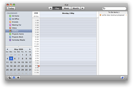
================================= I thought about putting this is the PIM-section, but since this is more of an opinion and a discussion-piece, I think this is the better place for it. It has been several years since I last tried Kontact (IIRC, back in 2005). And I remember back then that I didn't use the Calendar at all, because the UI was so confusing, and basically a mess. Between 2005 and today I have used Mac OS as my primary OS, and it was refreshing to have a calendar that is actually usable. What do I mean? Well, take a look at these: Calendar in KDE 4.1 iCal in OS X 10.5 Notice the MASSIVE difference in the UI. Here's a hint: one of those UI's suck, other does not. One of those UI's look like something people might want to use, the other one does not. Why is the calendar in KDE so damn confusing? I count no less that FIVE windows all showing me information. And the funny thing is that while the UI in OS X is A LOT simpler, it still shows me everything I need to know. And since it has such a simple and clean UI, I actually USE that calendar! Calendar in KDE is so confusing, that I simply never used it. The thing that is important in calendar is the actual calendar. In OS X, it has most of the application-window. In KDE, it's just one window among five windows. It has less than 25% of the application-window to itself, rest of the space is being wasted on things like week-view (at least I think that's what the top-right window is), a mystery-box showing two identical entries called "Default Korganizer resource". Then there's a window to show additional info about the selected meeting. I'd guess that's OK, but there should be a better way to handle that. Aaaah, the horror continues when I actually to enter a calendar-entry! Thankfully I could just start typing, and it tries to add the entry automatically. But when I ht enter, I get a popup-box giving me two choices: "Default Korganizer resource" and "Default Korganizer resource" (yeah, I'm still confused). Both are checked by default. If I just hit enter, the entry gets listed TWICE in the calendar! Not like this.... not like this.... Then there are other various problems. Why is the middle-left box out of alignment when compared to the windows above and below it? Why is the actual calendar (bottom right) out of vertical alignment when compared to the window to it's left? And why are there so many confusing windows in the UI in the first place? Why hasn't Calendar been taken behind the barn yet, and shot? Is it so that no-one uses the calendar, so these problems go unnoticed?
Last edited by Janne on Wed Nov 12, 2008 8:35 am, edited 1 time in total.
Freedom is not a destination, it's a journey
|

Administrator
|
KDE-PIM has been historically low in manpower. I think that is the only real reason for this.
"Violence is the last refuge of the incompetent."
 Plasma FAQ maintainer - Plasma programming with Python |
|
Registered Member
|
I don't know what's happened to your version of Kontact (the simple fact that you have two different default resources makes me suspect something wonky has happened somewhere), but mine looks a lot more like that iCal screenshot. And yes, I use it all the time even if the screenshot in the url-below could make you think otherwise
 Take a look: http://www.flickr.com/photos/29319276@N ... 817836285/ Never mind the empty top-bar though. It's only empty because there are no events with a date set but without a specific time of the day set.
OpenSUSE 11.4, 64-bit with KDE 4.6.4
Proud to be a member of KDE forums since 2008-Oct. |
|
Registered Member
|
Well, my Kontact is from latest Kubuntu, but IIRC it looked more or less the same in OpenSUSE by default. Yes, you calendar does look better, but it still seems to be a bit "lacking". It doesn't look as refined. And it seems to be missing the month-view  . .
Freedom is not a destination, it's a journey
|
|
Registered Member
|
Sorry. By "wonky" I mostly meant the two-default-resources thing which I never have encountered. I do recognize the look of the default view, but I can't honestly say what I did to get my look if anything. I've used Kontact for ages and it is possible that some of the settings are "left-overs" from when I used the 3.x version.
Well, refined is a matter of opinion...but I'm not sure what exactly is missing apart from the month-view. I assume you mean the month-view as shown in the bottom-left corner of the iCal screenshot? If so, I had deliberately turned it off because I don't think "widget" is all that useful. If you mean a bigger month-view, the fourth from the left of the views-icons switches to it. Still, I uploaded a third screenshot to the URL I posted that shows the month-view widget and a bit more. And to be honest, I can't see anything in the iCal screenshot that my third kontact-screenshot does not provide. I can see a couple of things iCal doesn't provide though - such as the timeline, time spent, and event list (granted, it may be hidden and accessible if you click on the arrows in the top-center. I don't use Macs all that often, and the one I own just stands in a closet gathering dust...) I agree that the default-kontact view leaves a lot to be desired, though. I do not think it is impossible to fix though. Some saner defaults would probably give you and others in your situation a far more favorable impression of it. Oh, and it wouldn't hurt if they fixed the bug that makes Kontact (sometimes) prone to forget how I want my toolbars...
OpenSUSE 11.4, 64-bit with KDE 4.6.4
Proud to be a member of KDE forums since 2008-Oct. |
|
Registered Member
|
It's not really a question as to what is missing... "refined" is a hard thing to define, because it's nothing that I could point my finger at and say "it's this thing here". It's the overall presentation. iCal simply look very very smooth and very, very polished. Calendar in Kontact looks.... utilitarian.
The functionality the two apps provide is probably more or less similar, it's just a question HOW it's provided. I guess it''s the question of number of buttons in the toolbar, colors and overall "busyness" of the UI.
Freedom is not a destination, it's a journey
|
|
Registered Member
|
Well then you should probably rename the thread, it sounds a bit harsh, and as if the whole application would suck. Starting the design of an alternative wouldn't hurt either. What about Clicking something together with Qt Designer?
'And all those exclamation marks, you notice? Five? A sure sign of someone who wears his underpants on his head.' ~Terry Pratchett
'It's funny. All you have to do is say something nobody understands and they'll do practically anything you want them to.' ~J.D. Salinger |
|
Registered Member
|
I have no skills, to be honest  . But I could try if I have the time, . But I could try if I have the time,
Freedom is not a destination, it's a journey
|
|
Registered Member
|
I Installed QT Designer yesterday (thanks for that tip BTW!), and made some initial sketches. I'll see what I can come up with.
But I do have few questions. First, about QT Designer: What UI-element does the calendar use to display the day or week)? I could find the normal month-view, but not the week/day-view. Now, on to the calendar itself: What would you like to see in it? What do you think are the most important things in a calendar? What things should be brought to the forefront, and what are less important? I promise to listen to your input, but I can't quarantee that I will implement them in my mockup. Besides, I will just be creating a mockup, not an actual UI.
Freedom is not a destination, it's a journey
|

KDE Developer
|
I'm not saying that Kontact's Calendar interface is great, but the screenshots you provided give unfair advantage to iCal. iCal's window in the screenshot was way larger (in pixels^2) than the KDE's one.

|
|
Registered Member
|
Well, I have used both apps, and trust me: iCal looks better in any case. And the problem is not the size of the app-window in the screenshot, the problem is that by default, KDE's calendar is crammed full of stuff, and not all of that stuff is really necessary for day-to-day usage. Yesterday I showed the calendar to my wife (running full-screen btw.) Her comment was "it looks like an app from the eighties". She also made some interesting observations that I need to double-check before I comment on them. I'm attempting to create a mockup that would simplify the UI, and give more space and attention to things that are really important in a calendar. I have few ideas, but I'm more than willing to listen to ideas and suggestions from other people .
Freedom is not a destination, it's a journey
|
|
Registered Member
|
OK, I have now version 0.1 of the "new calendar"-UI done. Note, this is a VERY rough mockupm but I hope it will give you some idea.
Here it is: http://rapidshare.com/files/163122233/c ... 2.png.html If someone has a better place to host the file, I would really appreciate if you could mirror it . With Rapidshare, it can only be downloaded 10 times a day.OK, now to explain my idea: The problem with current calendar is the there are too many thing demanding attention from the user. The most important part of the calendar (the calendar itself) only has about 25% of the UI to itself, rest being split on other competing textboxes. The task of actually using the calendar is buried under all that clutter. Of course it could be configured, but the user should not have to do that. In my suggestion, the calendar has most of the app-window to itself. And there's a lot less stuff in the actual UI (note: the mockup is missing things like the toolbar and the menubar). There's the calendar that shows your appointments, there's a minicalendar that can be used to choose the date and there's a textbox for to-do's. Yes, in my suggestion, calendar would also handle to-do's, removing one component from Kontact. The calendar in my mockup is not exactly the way I would want it to be, since I couldn't find a suitable calendarview in the Qt designer. So I just re-used the month-view that you can see in the top-left of my mockup. There is no separate textbox to show details of his appointment, since he could see the summary of it right in the calendar-view. Of course if he hovers or clicks on an entry, he gets further information about the entry. Instead, the textbox is used for to-do's. Notice the four tabs above the calendar? Those would take user to month-view, week-view, day-view and tasklist. Tasklist would show a list of tasks/appointments, starting from today, and going on as long as user has calendar-entries. This setup would reduce the clutter in the toolbar )sonce those views would not require a button in the toolbar), and the different views would be immediately accessible right next to the calendar. The user could tag calendar-entries, just like he could tag files in Dolphin. All this would of course be tied to Nepomuk and Akonadi. Of course there are some views that would be accessed through the toolbar like timeline and time spent. List of different calendars would also be selected from elsewhere, as opposed to cluttering the UI by constantly showing a list of calendars. What's missing is a textbox right of the tabs, that could be used to search the calendar and to-do's. But, like I said, this is just my first, initial idea. If you have suggestions and feedback I would be more than willing to hear it. Please don't kill me .
Last edited by Janne on Wed Nov 12, 2008 6:08 pm, edited 1 time in total.
Freedom is not a destination, it's a journey
|
|
Registered Member
|
Why not upload it to flickr or photobucket?
It already can
Apart from that, I like your idea and mockup. The tasklist is a great idea, but I'm not so sure about the tabs. Yes, it removes clutter from the toolbar but introduces clutter somewhere else. And since most people are used to toolbars in apps, wouldn't it make more sense to keep it in the toolbar - especially since the toolbar would be there anyway? Maybe just center the month/week/etc part of the toolbar straight above the calendar by default instead of left-aligned? Another advantage with the toolbar is that it can be customized. For example, the user could remove the tasklist if he never uses it, or move the toolbar to the right or bottom of the screen. As far as I know, tabs are not that flexible.
Do you mean different "mini-calendars" on the side for different months, or if the user has more than one calendar (one local and one on a collaboration server for example) configured?
OpenSUSE 11.4, 64-bit with KDE 4.6.4
Proud to be a member of KDE forums since 2008-Oct. |
|
Registered Member
|
Don't you need user-account for those?
Why is there a separate to-do app in Kontact?
Well, tabs are (IMO) a more "Integrated" part of an UI than buttons are. So they are not as quite "in your face". They seem to be part of the window, rather than a separate ui-element.
The toolbar would still be there. But less stuff we have in the toolbar, the more accessible the things in it are. If we have lots of stuff in the toolbar, less visible each individual thing in it is. And people are also familiar with tabs, in browsers, Dolphin and now, even in Kmail (so we would have commonality between Kmail and Korganizer). And if we want to look for calendars with similar tab-system than in my mockup, Lotus Notes has them. Yes, a lot has been said about UI in Notes, but it's not really that bad. The calendar works well.
Yes. I would say that overwhelming majority of people have only one calendar: their own personal calendar. And if they do use more than one calendar, I don't think they would be constantly switching between the two. While it would be nice to be able to show a list of other calendars in the main UI, I think we need to figure out what things are REALLY needed for everyday-calendaring, and focus on those. But I like your suggestions, keep them coming BTW, I noticed that "Contacts" (aka address book) is also a mess. I might create a mockup for it as well, depending on the success of this experiment .
Freedom is not a destination, it's a journey
|

Registered Member
|
You can use imageshack.us without an account.
Type Colemak!
Proud, Conservative Republican "Gentlemen! You can't fight in here! This is the war room!" --President Merkin Muffley, Dr. Strangelove |


Bookmarks
Who is online
Registered users: Bing [Bot], Evergrowing, Google [Bot]


