The Discussions and Opinions forum is a place for open discussion regarding everything related to KDE, within the boundaries of KDE Code of Conduct. If you have a question or need a solution for a KDE problem, please post in the apppropriate forum instead.
[SOLVED] Dolphin Ideas (with mockups)
Tags:
None
|
Registered Member 
|
That means that the tab is locked, but navigation is allowed in the tab. FC uses tabs a bit different then Dolphin. For Dolphin, the tabs are only for the right pane, but for FC the tab covers both panes. That is why navigation within the tab is more imporant. For Dolphin, I think that locking tabs would be a great feature, but perhaps there is no need for the various options controlling navigation. |
|
Registered Member
|
What is the advantage of this over opening a folder in a new tab by middle clicking on the folder?
Man is the lowest-cost, 150-pound, nonlinear, all-purpose computer system which can be mass-produced by unskilled labor.
-NASA in 1965 |

Registered Member
|
I'd make it even simpler, like firefox's white if nothing is filtered, green if results are found, red if nothing is found.
Proudly dual-booting openSUSE 11.1 with KDE 4.3 and Windows Vista on a Toshiba A205-S4577 since July 2007.
|
|
Registered Member
|
It isn't the filter bar that changes color, it is the entire file browser area. The filter bar is green, and remains green, so you know that when your file browser area turns greens you have a filter in place. Similarly, the search bar is blue so you know that if your file browser area is also blue you are looking at the results of a search. Basically, the file browser changes color to let you know if an unusual situation occurs that affects what the file browser shows or changes how you can interact with it. That way you never get stuck in the situation where you can't find the file you are looking for because you forget that you are looking at filtered results or you can't figure out why you can't change the filename in a folder you don't have write permission to. The color, or colors, of the file browser will tell you what is going on. Changing the filter bar color would wreck the connection between the filter bar color and the file browser color.
Man is the lowest-cost, 150-pound, nonlinear, all-purpose computer system which can be mass-produced by unskilled labor.
-NASA in 1965 |
|
Registered Member
|
I don't have a middle mouse button - I'm using a notebook. Is it the 'open in new tab' function you are referring to? The main reason for this feature is that there is really no other way to keep tabs stable. I can open a few tabs to the folders that I use for a particular project, but they won't stay like that for long. Even if I try not to, before long I've moved the tabs to other folders. I think that a common use for other people would be to lock their home folder into the first tab. |
|
Registered Member
|
X11 has an "emulate middle mouse button" option that is probably enabled by default. Try clicking the left and right mouse buttons at the same time, that should do the trick. There is also a right-click "open in new tab" option for folders.
I fail to see why you can't just not navigate away from a folder. The folder won't change unless you change it yourself.
Man is the lowest-cost, 150-pound, nonlinear, all-purpose computer system which can be mass-produced by unskilled labor.
-NASA in 1965 |
|
Registered Member
|
Defnitely horizontal split is a need. You can barely read the file names if they are a bit long and view is split vertically, unless you increase a lot Dolphin's window. But I don't agree about infinite split being a bad idea, there might be the situation of moving files from two or three folders to another one in which splitting the view in four would be very useful; and managing files is the purpose of Dolphin, no?
Browsing history is also a very basic feature I can't understand why hasn't been implemented,  . .I'd also add more information colums, especially for audiovisual files. Sorting audio or video files by date or duration; or documents by tags like author, subjet, etc would be also very useful for managing them. These are features Windows Explorer handles rather well, a pity we can't say the same for Dolphin, 
|
|
Registered Member
|
My thoughts exactly.
It wasn't my choice, I am pretty sure the Dolphin devs have already vetoed infinite splitting. They considered it an advanced feature they would keep with konqueror. So my mockup was done based on that.
Yes, that is already on my to-do list for a mockup.
Man is the lowest-cost, 150-pound, nonlinear, all-purpose computer system which can be mass-produced by unskilled labor.
-NASA in 1965 |
|
Registered Member
|
Hi
Dolphin Suggestion : Abiltiy to view file sizes in bytes. Regards |
|
Registered Member
|
Here are the next few mockups. The focus of these are the on the filter bar. Here is the reviesed filter bar based on some of bcooksley's recomendations:
 There are three main changes. The most obvious is the removal of the icons on the right. They are not actually gone, there are two ways to get them back. One is by clicking on the "More" button, which pops up a menu with a list of filters. The other is to click the double arrows to the left of the More button, which expands the filter list. More on both of these later. I think this is a good compromise between having the filters available but not having them clutter up the window. The next addition is a "clear" button, which the filter bar is currently missing. I also added the "Enter Filter Here..." text, which disappears when you start typing in the box. It makes it absolutely clear that you are doing filtering. If this had been a search, by pushing the search button on the left, the area would be green not blue and it would say "Enter Search Here..." instead. The next three images are three different possible ways the icons could be displayed if you clicked the double arrows. I am not sure which is best honestly. 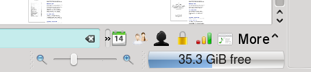 In this first version, the right edge of the filter bar slides to the left and the area where it was gets filled in by the icons. Clicking the double arrows again makes it slide back, hiding them again. This has the advantage of having the icons remain visible as long as you want them but are out of the way when you don't. The disadvantage is that it does not rely on any built-in functions and it has to be hidden manually (which is also a benefit, depending on your preference). 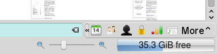 This next version uses the existing toolbar expansion system, I think this is a Qt thing. You click the icon and the toolbar expands out to the left, with the filter bar moving out the way in the process. Then when you click away from the filter bar it goes away. This has pretty much the opposite set of strengths and weaknesses relative to the previous version. It covers exactly the same amount of the screen, though. 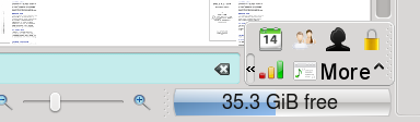 This last one is basically the same as the previous one, except that is sacrifices vertical screen real estate to save horizontal screen real estate. It also encroaches on the file browser and scroll bar, which the other two does not. 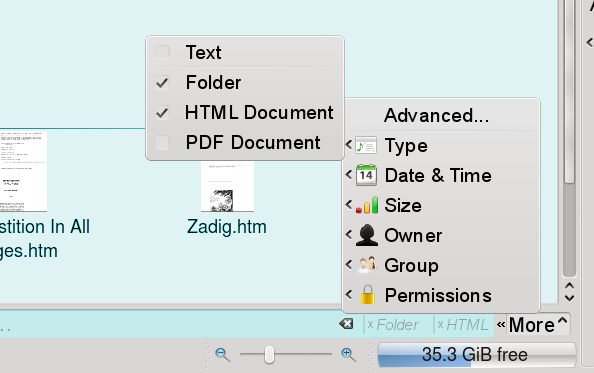 This last picture shows the menu version. The choices in the menu are identical to the buttons in the pictures above, it is simply a different way to access them. Clicking on them pops up the same menus. The only difference is the "Advanced..." option, which pops up the advanced filter dialog box (as bcooksley recommended). You can see the "file type" menu is currently selected here. The check boxes with the check marks are the file types that will be visible. By default when you click this all the check boxes are checked. The filter is applied when you start unchecking them. Only those file types that are actually in the folder will be listed here. The "Text" filter at the top is for all file in the "Text" mimetype category, which includes both html and pdf documents (as well as many others). It does not include the "Inode" filetype that the folder is part of because I thought it would be too confusing. Checking the "Text" check box will automatically check all of the "Text" file types. If any of the "Text" filetypes are unchecked the "Text" checkbox also becomes unchecked. However, if the "Text" checkbox is checked all "Text"-type extensions are also hidden and their extensions are automatically unchecked. There are a couple of other additions in this picture besides just the menu. Notice that the file browser area in the back is no longer white, but blue (a lighter shade of the same blue as the filter bar). This is because a filter is in place. That way you always know when you have a filter and never have the problem of getting confused as to why the files you know are there aren't showing up. Also notice the "Folder" and "HTML" text in the filter bar. If you use one of the filters from the icons or the menu bar those filters appear is gray italic text at the far right of the filter bar. That way you always know what filters you have in place even without opening up the menus. The small "x" next to each one is a way to easily remove that particular filter. Also notice that the "clear" button has moved to the left of the special filters. Clicking that button will only clear typed filters, not filters from the menu. They have those x buttons so I thought having it clear the special filters, which are harder to set up, would increase the risk of frustrating errors while not significantly increasing the efficiency of the interface.
Last edited by TheBlackCat on Wed Feb 04, 2009 6:17 am, edited 1 time in total.
Man is the lowest-cost, 150-pound, nonlinear, all-purpose computer system which can be mass-produced by unskilled labor.
-NASA in 1965 |

Administrator
|
The more integrated one ( without the frame ) is the better of the two. You might also want to change the "Search" and "Filter" buttons to a combo box providing the two functions ( recommended by usablity documents on Techbase )
The Advanced options menu looks really good ( would the sub-options be offered by clicking on each button like the advanced menu? )
Last edited by bcooksley on Wed Feb 04, 2009 6:24 am, edited 1 time in total.
KDE Sysadmin
[img]content/bcooksley_sig.png[/img] |
|
Registered Member
|
I think so too, since the menu will automatically go away when you click away from it so having the toolbar do that as well is redundant. However, I am not sure how easy this one is to do from a programming perspective. I do not recall seeing any widgets doing this elsewhere.
I considered this, but I was afraid people wouldn't find it and we would end up getting lots of wishlist items for some sort of search bar despite the fact that it is right there.
Last edited by TheBlackCat on Wed Feb 04, 2009 6:27 am, edited 1 time in total.
Man is the lowest-cost, 150-pound, nonlinear, all-purpose computer system which can be mass-produced by unskilled labor.
-NASA in 1965 |
|
Administrator
|
I have not seen many standalone icons actually in KDE. Most are now accompanied by explanative text. I think many people would check the combo box, and find the search option.
I have also encountered a very low duplicate amount of ways to access functionality. Providing both the "More" menu and the icons is both confusing and duplicative.
Last edited by bcooksley on Wed Feb 04, 2009 6:34 am, edited 1 time in total.
KDE Sysadmin
[img]content/bcooksley_sig.png[/img] |
|
Registered Member
|
I noticed that too, but there just isn't enough room. It would take up nearly the entire filter bar area. The icons alone are taking up a lot of space as it is.
I am operating under the assumption most users do not experiment much, they just go with what is immediately obvious. Advanced users will experiment, but ordinary users probably will not. That is why I am going out of my way to emphasize to users what they can do and what they can interact with.
That is one of the good things about this particular layout, the developers can ultimately pick either of these techniques or both. If they don't like the menu, then the "More" is just static text and not a button. If they don't like the icons, the double left arrows can go away and you leave it with just the "More" button. I portrayed them together here because it was less work for me, but I designed the layout so that only one was actually necessary.
Last edited by TheBlackCat on Wed Feb 04, 2009 6:49 am, edited 1 time in total.
Man is the lowest-cost, 150-pound, nonlinear, all-purpose computer system which can be mass-produced by unskilled labor.
-NASA in 1965 |
|
Administrator
|
That explains it, no problem ( features / abilities are a good thing (tm) ). I will leave it for others to comment now.
KDE Sysadmin
[img]content/bcooksley_sig.png[/img] |


Bookmarks
Who is online
Registered users: bartoloni, Bing [Bot], Evergrowing, Google [Bot]


