The Discussions and Opinions forum is a place for open discussion regarding everything related to KDE, within the boundaries of KDE Code of Conduct. If you have a question or need a solution for a KDE problem, please post in the apppropriate forum instead.
[SOLVED] Dolphin Ideas (with mockups)
Tags:
None
|
Registered Member 
|
I changed the earlier mockups to reflect the new filter bar.
Man is the lowest-cost, 150-pound, nonlinear, all-purpose computer system which can be mass-produced by unskilled labor.
-NASA in 1965 |
|
Registered Member
|
This doesn't qualify as a mockup, but here are a list of additional columns for the "details" view.
These will only have values for certain sorts of file, and if no files of that type are present the column disappears even if it is selected:
Last edited by TheBlackCat on Wed Feb 04, 2009 8:43 pm, edited 1 time in total.
Man is the lowest-cost, 150-pound, nonlinear, all-purpose computer system which can be mass-produced by unskilled labor.
-NASA in 1965 |

Global Moderator
|
Yes! Go go go! Also as a note you can already view the number of items inside a directory by going to View -> Additional Info. The main issue I have is that Dolphin is a bit slow to start up and use. I also find it a bit hard to click on the plus signs when wanting to select several. This might sound crazy but maybe a system where if you click the filename, it selects it, but if you click the icon, it opens it. What do you think of this?
Moult, proud to be a member of KDE forums since 2008-Oct.
thinkMoult - source for tech, art, and animation: hilarity and interest ensured! WIPUP.org - a unique system to share, critique and track your works-in-progress projects. |
|
Registered Member
|
Yes, but it takes a while to get this information. Dolphin devs already vetoed this method because it is too slow for regular file-browsing, but said it might be possible with nepomuj.
Yeah, I can't put that in a mockup though.
Not as the default, but it may be possible as an option. Try submitted a wishlist item for it in bugs.kde.org
Man is the lowest-cost, 150-pound, nonlinear, all-purpose computer system which can be mass-produced by unskilled labor.
-NASA in 1965 |
|
Registered Member
|
I have new mockups. I am nearing the end of my ideas, so if you have anything please let me know soon because I want to wrap this up.
This idea is something that Vista has, and I think it is important that Dolphin has it as well because it adds a bit of polish to the program: 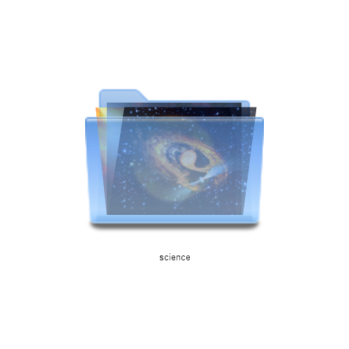 When you have thumbnails enabled for a directory, and that directory has subdirectories, dolphin will go through the subdirectories and grab thumbnails for a handful of files from each subdirectory (just a few, there are three shown here). These are then placed inside of the folder as examples of the contents of that folder. If you have no files in the subdirectory, you get something like this: 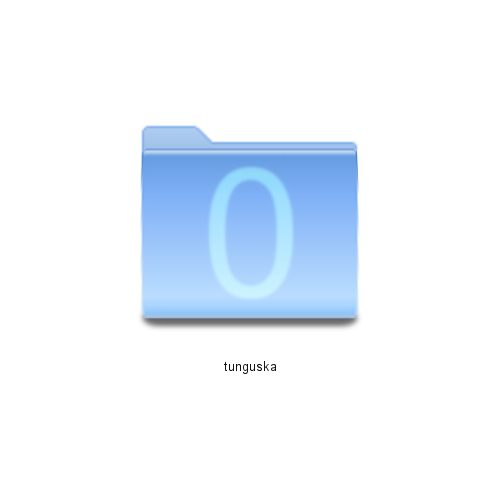 Notice that not only are there no icons shown, there is a big "Zero" on the folder. This is because it may be ambiguous whether the folder is not showing any previews because previews are turned off, or because there are no files to show previews of. The other thing that may not be apparent at first glance is that the icon for this folder is different than the normal one, even excluding the zero. The folder is closed tightly, in contrast to the normal icon that has the folder open somewhat. This is once again to show there is nothing there, but it is not as obvious as the zero. This idea I readily admit I stole from someone else who posted it KDE-apps.org, I think, but it was such a great idea I felt I needed to include it. These mockups are mine, though: 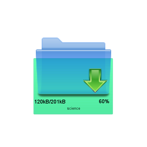 In this mockup, folders or files in dolphin will show progress bars when there is something happening to them. In this specific case, the folder is being downloaded using KGet. So you see there is a kget icon on the folder, the amount of data that has been downloaded in the lower left, and the progress percent in the lower right. The green area is a progress bar that will grow vertically as the file is downloaded. This next one is essentially the opposite: 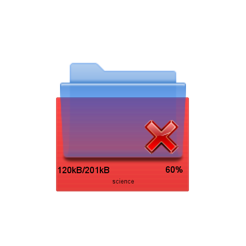 In this case the file is being deleted. The progress bar is red, to show the file is going away rather than coming in, and the progress bar will shrink until it is completely gone as the file is deleted. Normally deleting is quick, although it can take longer for large files and depends on the filesystem a great deal. However, this is just an example. If you are, for instance, moving a file, the source file will show this progress bar as it is moved while the destination file will show the green progress bar. It can also be used, for instance, for erasing a rewritable CD or DVD. These two examples show two different levels of progress for the "Details" view. The "Columns" view would look similar to this: 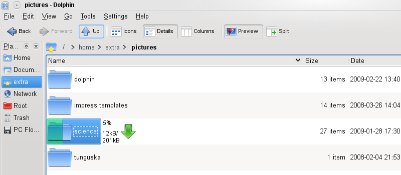 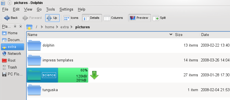 Notice that in the first one the text and kget icon are both to the right of the folder, while in the second one the text is inside the progress bar. The text stays outside the progress bar until the progress bar is far enough past the name of the folder that the text won't overlap. The icon stays outside. This sort of thing could be used for a large number of different tasks, copying to a somewhere, cutting to a somewhere, cutting from somewhere, downloading, uploading, backing up, restoring, compressing, uncompressing, even ripping from a CD or DVD. If you go into your "media" folder it can show the progress of a CD or DVD being burnt. The places bar can show similar things, burning or ripping disks, backing up to a disk, etc. I would guess that the same principles that allow the notification system in the 4.2 plasma system tray could be used to notify dolphin which files are being worked on and by what program. Something similar could be used for taskbar icons (windows 7 has that already). This next one is fairly simple: 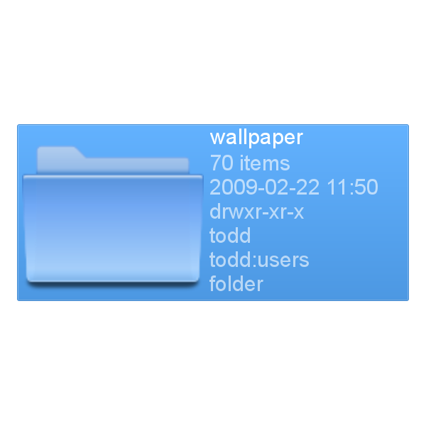 Currently dolphin has two ways of orienting the icon view, by rows or by columns. Rows puts text below icons and put them in a series of rows, while columns puts text beside the icon and puts it in a single column. However, as far as I see it, where the text goes and what direction the icons are laid out have nothing to do with each other. For this reason I propose that there be an option, in one of the view dropdowns I mentioned above, the option to put the text next to the icon while maintaining the same row-based layout. This next idea is an improvement on the column view. Normally, with the column view, you are limited to only seeing columns that are subdirectories of the directory you first activated column view in. If you want to get to a higher directory, you must navigate up and re-enable column view. This has the disadvantage of enabling column-view for that folder until you change it. My idea is to put a box around the breadcrumbs of the folders currently shown in column view:  The left edge of this box can be dragged left or right to include or exclude levels from the column view. Below you can see the result of dragging the box so it includes more folders: 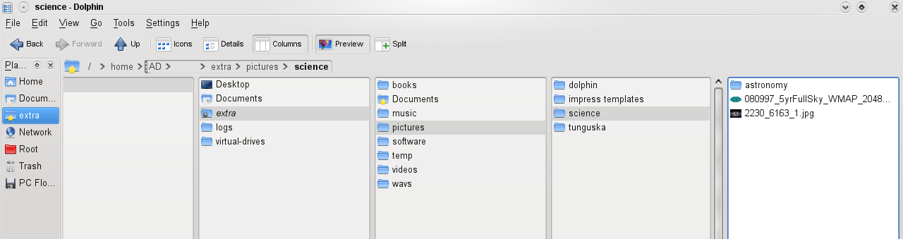 This could also be useful for details view if you enable folder trees in that view. This next idea is an extension of the active corners ideas I saw being used in plasma prior to the release of KDE 4.0. I don't know what happened to it, but I have resurrected it here:  As you can see, the + button is still in the upper left-hand corner. However, in addition there are three other buttons, one for each of the three corners. If the icon is small, too small to fit all of these icons comfortably, then only the + button is shown. But if it is big enough, as it is here, all 4 are shown. The + button does the same thing as always. The eye in the lower left-hand corner is a previewer, clicking on it pops up a large preview of the file or folder using the plasma previewer widget (identical to "right-click->actions->Preview This File" action that is already in Dolphin). The lower right-hand corner is a button to allow you to access the metadata of a file, or multiple files if more than one is clicked. The upper right-hand corner is more complicated. It is designed to solve a common problem I have. Because the + button is kind of small, and even if I use ctrl, I often miss where I intend to click or accidentally let off the ctrl button for a moment. Either way, what I end up with is deselecting all of my files, or opening a file and deselecting all of my files. This can be very annoying when I am trying to highlight a number of non-adjacent files. What this icon does is what I called "pinning" the file. It is essentially an alternative group of selected items that you don't lose if you click on a blank area or open another file. You can click on the icon for multiple files to pin them all. This way, if you accidentally open a file or click on a white area, you won't lose you selection. Pinning the file will highlight it in an orange box instead of a blue one. If you click on a pinned file, it will open all of pinned files. Dragging and dropping a single pinned file will drag and drop all of them. However, clicking on a blue-highlighted file, that is one that was selected normally, or an unhighlighted file, will not open any of the pinned files. That way you can set a group of files aside you know you want to work with later, and then work with other files without affecting them. When you do this, the entire dolphin file browser area turns tan to let you know that files have been selected this way. Another example of a use-case for this is if you are trying to find certain pictures that are too similar to other pictures to differentiate based on just the thumbnail. You click through pictures that might be the ones you want in order to open them gwenview so you can see them more closely. You find one of them, close gwenview, then pin it. Then you continue. You can open other possible files just by clicking them, it won't affect the pinned files in any way nor will it open them. As you find more files, you pin them as well. If you make a mistake and pin the wrong file, you just click the pin icon again and it is back to normal. When you are done, you can then do the action on the entire group, like moving them to a different folder. Then you can right-click on the file browser and select (unpin all files). The files go back to normal and the file browser goes back to its normal white color.[hr] These next few mockups show a series of interconnected ideas, none of which is that useful on its own but when combined can be extremely powerful. The first looks like a fairly standard split view:  You might notice two seemingly minor differences. The first is that the breadcrumb for the right split is right-aligned instead of left-aligned as it normally is. This is to give room for the important part, the chain link between the two split folders. Clicking that chain will link those two split views, giving something like this (once the left view is zoomed out):  The first thing you will probably notice is that the left side is no longer grayed out. Further, there is only one breadcrumb navigation bar, only one filter bar, and only one set of file information. This is because the two split views are now linked. Moving to a new directory moves both views to that directory. Selecting one or more files selects the same files in both views. Scrolling one view scrolls both, sorting one directory sorts both, etc. Anything you do to one affects both. This way, as an example, you can have the details view showing detailed file information and at the same time have a very zoomed-in icon mode showing large previews. This is most valuable, however, when combined with the next mockup. This show a single-file view, essentially a large preview of a single file (or the first page of a file if it has multiple pages):  This isn't like Konqueror's embedded file editors, it only shows a non-interactive preview. You can navigate back and forth through the files using the left and right arrow buttons or the scroll wheel. This gets more interesting, however, if you have a linked split view where one split is a normal file browser and the other is a single-file view: 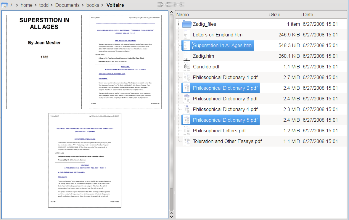 Here you can see that three files were selected in the details view. In the single file view, the previews of these three files are arranged so you can see them. If you only have a single file selected, only that file is shown in the preview view, allowing you to move through the file list to see large versions of the files. But if you have more than one file selected, they will be scaled and arranged so you can see all of their previews in the same view. These previews are replaced temporarily with an individual preview of a file as you mouse over it. This would be much more efficient than click the preview button on every single one. When combined with the pinned selections above, normally selected files have precedence of pinned files. So there is a heirarchy to which preview it show. It alway shows the preview of the file your mouse is over. If your mouse is not over a file, it will show the previews of all files you have currently in a rubber-band selection box. If there is no rubber-band selection box, it shows the files that are selected normally. If there are no files selected normally, it shows the files that are pinned. If there are no files pinned, it shows nothing. That's it for today. As always, suggestions and comments will be greatly appreciated.
Last edited by TheBlackCat on Mon Mar 02, 2009 7:40 pm, edited 1 time in total.
Man is the lowest-cost, 150-pound, nonlinear, all-purpose computer system which can be mass-produced by unskilled labor.
-NASA in 1965 |

Administrator
|
Sorry, I haven't had the time to read everything yet. But what do you think of my idea of the breadcrumb bar - Bug 157593? Any ideas of how it can be improved?
Problem solved? Please click on "Accept this answer" below the post with the best answer to mark your topic as solved.
10 things you might want to do in KDE | Open menu with Super key | Mouse shortcuts |
|
Registered Member
|
I think the best way to implement this idea is that, when the bar is in text mode, there is a toggle button on the far right you can press that changes it between manually changing the mode (the current way) and automatically changing mode (the method suggested above).
So when the user starts up Dolphin for the first time, the current method (manually changing back and forth) is used. However, if the users presses the toggle button, from then on leaving the location bar makes it go back to breadcrumb mode automatically. This happens every time the user switches to text mode. If the user wants the old method back, he or she just has to press the toggle button again and it returns to the traditional method.That way you only have the two modes, breadcrumb and text, and the user can choose on the fly whether you have to manually change it back from text mode or it changes back automatically.
Last edited by TheBlackCat on Mon Feb 23, 2009 12:35 am, edited 1 time in total.
Man is the lowest-cost, 150-pound, nonlinear, all-purpose computer system which can be mass-produced by unskilled labor.
-NASA in 1965 |
|
Global Moderator
|
Wow, this is very impressive work being done! Or rather, talking about work that could be done. I sure hope that Dolphin developers are looking at them. And since I'm posting this anway and they might be reading, I would like to stress again to make Dolphin FASTER. Please.
Great job TheBlackCat, though again I don't think I can benefit from these unless they are implemented so that it runs at a fast pace instead of loading slowly.
Moult, proud to be a member of KDE forums since 2008-Oct.
thinkMoult - source for tech, art, and animation: hilarity and interest ensured! WIPUP.org - a unique system to share, critique and track your works-in-progress projects. |
|
Registered Member
|
I love your ideas of progress-bar integrated top the icon, but I don't really understand this suggestion. I mean, deleting files/folders takes just fraction of a second. So what purpose does the deletion progress-bar serve? I asked this before, and I'll ask again: have you notified the Dolphin-devels of your suggestions? There are loads of great ideas here!
Freedom is not a destination, it's a journey
|
|
Registered Member
|
Deleting a file of a few gb can take longer than a fraction of a second. But even if this is the case, it is just an example. When you do a cut and paste of a file, the original file would show this while the new file would show the green progress bar. Formating an RW cd or DVD would also probably show this.
I want to get all the mockups finished and all the suggestions incorporated before I submit it. There have already been changes I had to make in earlier mockups in order to incorporate new ideas, and I have a few more I have to add before I am done. I am hoping to finish the whole thing this weekend and submit it shortly after. I am curious, what is the best way (or ways) to go about getting it to them? There are a lot of pictures that need to be included.
Man is the lowest-cost, 150-pound, nonlinear, all-purpose computer system which can be mass-produced by unskilled labor.
-NASA in 1965 |
|
Registered Member
|
More mockups. I will probably finish this today and submit it to the dolphin mailing list shortly after. If you have any suggestions post them here right away!
As promised [url-dolphin-ideas-with-mockups-t-28472.html#pid41858]Post 24[/url], here are the specialized filter mockups. I am not including the user and group mockups since they are essentially the same as the file type mockup, just a list of users and groups present in that folder respectively. Here is the one fore file sizes:  It defines a range of file sizes, so it uses the Plasma right and left limit sliders used for setting the width or height of a panel. It goes up to 2 TB here, which is the limit for Ext3 filesystems. The real limit would depend on the largest and smallest files in the folder. Notice that it has evenly spaced 1B, 1KB, 1MB, 1GB, and 1T points. This is because the slider is actually on a logarithmic scale. This is invisible to users, but 1B, 10B, 100B, 1KB, 10KB, 100KB, 1MB, 10MB, 100MB, 1GB, 10GB, 100GB, and 1TB are all evenly spaced along the length of the slider, as opposed to 1B, 11B, 21B, 31B, etc being evenly spaced (at least in decimal mode, more on that later). All the user will see is that as he or she moves the slider from left to right, the amount of increase in file size that moving the slider one pixel will cause gets larger. There is no way that I can tell to cover the whole range of possible file sizes on a linear scale, and once again the user does not have to know that it is using a logarithmic scale or even what a logarithmic scale is, it should be intuitively obvious after a using it for few moments that the scale shifts. The text boxes reflect the exact value for the slider, and are natural language (i.e. 1000, 1000B, 1000 B, 1KB, 1 kilobyte, 1 KB, .001 MB are all the same). The dropdown has two option, Binary and decimal. In decimal mode it uses the same units as SI, so 1KB=1000B, 1MB=1000KB, etc. This is the method used by hard drive manufacturers. In binary mode, it uses base-2 numbers, so 1KB=1024B, 1MB=1024KB, etc. This is how many filesystems do it natively. I do not know which is better as a default. This also works with the natural-language function. If use, for example, 1 KiB, 1 kibibyte, 1KB binary, or binary 1KB, it will always use binary mode no matter what the dropdown says. If you use, for example, 1 decimal KB, decimal 1KB, or 1 KB decimal, it will use decimal mode no matter what the dropdown says. If you use 1KiB binary or 1 kb decimal binary, it will return an error because you are contradicting yourself. The up and down arrows also work with the natural language function, and they change the smallest significant figure that is actually typed out. So if the text box says 1000, pressing the up arrow will change it to 1001. But if you have 1KB, pressing the up arrow will change it to 2KB. If you have 2.00 KB, pressing the up arrow will change it to 2.01 KB. The next one is the permissions filter: 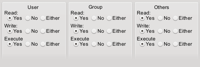 This one is pretty straightforward, it just checks the different permission bits of each file. The first is for the user access permissions, the next is for the group access permissions, and the final is the permissions for everyone. This uses the same terminology in the file properties dialog box. "Yes" only shows files that have that permission bit on, "No" only shows files that have that permission bit off, and "either" ignore that permission bit when doing filtering. The default (i.e. no filter) is to have them all set to "either". These next two are the date and time filters. The first is what you get when you first open it (if today were February 4, 2009):  The next assumes a later date, and show how you set a range of dates:  The first thing to notice is the check boxes at the top and the bottom. These allow you to filter everything after a certain date, before a certain date, or between two dates. So as you can see in the first picture, if you have "From" checked but not "To", it will show all files created after the date specified in the "From" box. The "To" box is grayed out and shows "Now" to tell the user it filters everything after the specified date, and the area highlighted in the calendar is green to show that it goes on forever. It is green because "From" is where the search starts. Similarly, if you check the "To" box and uncheck the "From" box (not shown), it filters everything before the specified date, the "From" box is grayed out and shows "Forever", and the area filtered is red since the To box is where the filter stops. If you have box the "From" and "To" check boxes set it filters all files between the specified date. That is inclusive, it includes that date specified on both end. The area highlighted is blue, to signify it is a range. If you uncheck both boxes (not shown) it highlights the entire calendar in gray and says "From Forever" and "To Now". If you start using tags for filtering, which could potentially have dates set in the future, it might bet better to use "From Any Time" and "To Any Time". You can click on one of the text boxes and then click on a date on the calendar to set the date for that check box. If only one check box is set then you don't even need to click the text box, it will automatically be selected. The text boxes deserve some further explanation. They are nature-language searches, like the file size boxes. So for instance if you have your short date formate set to m/d/y, then Feb 4 2009, Feb--4---2009, 4--Feb--2009, 2009-4-Feb, 2/4/2009, 2, 4+2009, 2009/2/4 2/4/9, day 4 month 2 year 9, and 35/2009 are all the same. There are a few separate issues at work here. First, in cases where there are ambiguity the date format set in your personal settings is assumed. So for 2/4/9, it knows you have set the first number to the month, the second to the day, and the third to the year, so it uses that. For years it is assumed that you are talking about the current century or millenium when there is ambiguity, up to the present day, and if that doesn't work go with the most recent past century or millenium. So year 9 is treated as 2009, while 11 is treated as 1911 because we have not reached 2011 yet. If you want to specificy 11 AD, you need to use 0011. If you want to specify 2011, you need to write it out completely because 011 will be treated as 1011. The next thing is that any number greater than 365 is assumed to be a date. So if you set 2009/2/4 it first sees that 2009 is a year, and sets the year to that. Next, it compares 2/4 to your short date format and sees month comes before day, so it sets 2 to the month and 4 to the date. This would work even if your short date format is m/y/d since month still comes before day. This is NOT the case with dates larger than 12 being counted as days. The reason is as follows. Lets say that is how it works and you use 18/2/2009 even though your short date format is m/d/y. That would seem clear enough, since there is no month 18. But now lets say someone thinks "oops, it was really the 7th I was looking for" and, without thinking it through, sets it to 7/2/2009. Now suddenly it changes to July 2 2009, since there is a month 7. I think this would lead to too many users errors, errors that are less likely with the year but very likely with the month and day. So if you set an invalid month it will return an error. Next, that the delimiter is completely ignored, it doesn't matter whether you use a dash, comma, space, slash, &, or any combination therefore. The only things you cannot use is a colon, which is reserved for times (more on that later), and alphanumerics (which would be infeasible for the program to deal with). Next, when there are only two numbers, both less than or equal to 365, it is treated as the month and day of the present year if it is from today or before, and if it is for a date that has not yet happened in the present year it is treated as that date from the previous year. If there are only two numbers one greater than 365, it is treated as the absolute date of that year, so for instance 35/2009 will be day 35 of the year 2009, or February 4 2009. Next, you can spell out what you mean explicitly. So for instance you can say "day 4, month 2, year 2009" to force it to use certain numbers for certain values. As another example "day 4 2009" would be the 4th day of 2009, or January 4 2009. AD, BC, CE, and BCE are also acceptable when specifying dates, with or without periods. It also follows the proper rules for your calendar. As for the time, you can also specify a time before or after the date using colons as delimiters. Similar rules apply, if you set h:m:s, then "10:" is treated as 10 AM, ":5: PM" is treated as 12:05 PM, and so on. A "hidden" feature is the "Ago" function, which searches for events a certain amount of time in the past. So, for example, if you type "2/4/9 ago" it will set that as 4 days, 2 months, and 9 years in the past. Note that in this mode there is no assumption about the year, so 9 is not interpreted as 2009, 11 is not interpreted as 1911. The year is used literally as it is written. Like all of the filters, the clickable areas of the calendar will be restricted only to date present in the folder you are looking. You can manually set the date outside this range in the text box, but the calendar will not let you click it. The final thing is the radio buttons on the bottom. Those tell it whether you are searching for the date the file was created, the date it was modified, or a date present in its metadata tags (once nepomuk is working properly).
Man is the lowest-cost, 150-pound, nonlinear, all-purpose computer system which can be mass-produced by unskilled labor.
-NASA in 1965 |
|
Registered Member
|
Here are two more mockups.
The first one is an improvement on the breadcrumb navigation bar: 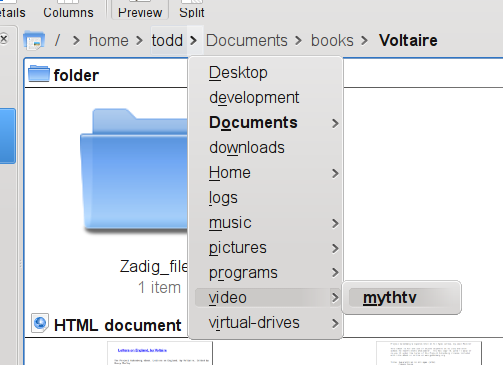 In this, as you can see, the popups between each folder in the bar is a full tree-style navigation system, allowing you to navigate up to any folder in the hierarchy. If there were subfolders in the mythtv folder, you would be able to navigate to those, and subfolders of those subfolders, etc. You can see that not every folder has an arrow. That is because the arrow only appears when there is a subfolder you can navigate to. Further, this works with dragging and dropping of files. So if you grab a file and drag it to one of the arrow between folders in the address bar, and then hold it there for a few moments, the arrow will open the folder list. If you drop the file on one of the folders in the folder list you get the standard "Move, Copy, Link" menu. If instead of dropping the file you hover it over a folder with subfolders, you will get the list of subfolders that you can then either drop on or expand in turn. This will make moving a single block of files between distant folders much easier, and moving individual files between nearby folders easier as well. The next is an implementation of Hans' idea in post 36: 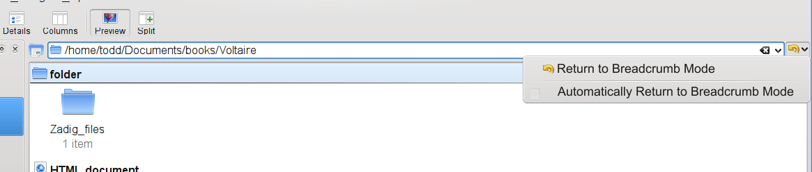 Here, at first glance the text-style address bar is similar to what you see normally. The difference is that the circular arrow button that currently returns you to the breadcrumb mode now has an arrow to pop up a menu. Clicking normally does the same thing as it currently does, but clicking and holding brings up a menu. The menu has one entry that returns to the breadcrumb mode, which is what just normally clicking the button does. However, it also has a check box that allows you to switch it so that clicking away from the address bar causes it to automatically return to breadcrumb mode. That way, for people who much prefer the breadcrumb mode and only use the text mode occasionally and briefly, it allows them to easily go back to the breadcrumb mode. However, it does not get in the way of people who prefer the current system, nor does it make the toolbar look any busier or more crowded. And for people who want to use it one way some times and the other way other times, it allows them to easily switch back and forth without having to pull up the dolphin configuration dialog box or delving through multiple layers of sub-menus in the menu bar.
Last edited by TheBlackCat on Tue Mar 03, 2009 2:45 pm, edited 1 time in total.
Man is the lowest-cost, 150-pound, nonlinear, all-purpose computer system which can be mass-produced by unskilled labor.
-NASA in 1965 |
|
Registered Member
|
And here they are: the final mockups. With this my artwork should be mostly finished. I need to make a couple changes to older artwork to reflect some ideas I have come up with since then, and to reflect a few changes to dolphin itself. But the bulk of the work should be done. I also have to rewrite the OP. So there is still a little time to get ideas in, but not much.
Does anybody know the best way to go about getting these ideas to the Dolphin developers? This idea is a variant of Apple's coverflow, but improved (I hope):  For the implementation here the Pictureflow view is only the top pane, with the actual pictures. The lower pane is a normal icon view. They are combined using the "linked split view" I mentioned above. Pictureflow is pretty useless on its own, it is primarily intended to be used in a linked split view. This is not necessary to the idea, it is possible to have the pictureflow view automatically have a second view below it. The problem is, which one? I can imagine situations where each of the three existing views would be useful. So rather than force people to use pictureflow in combination with one of the three views in particular, this allows users to pick which other view they want. An alternative is that when you select pictureflow view, it automatically creates a linked split view with a particular view below that can be easily changed by clicking on the lower pane and then changing the view. To get away from pictureflow view you click on the pictureflow pane and then changing the view. That would also work well in my opinion. Either way, your position in the pictureflow view is controlled by your scrolling in either that view or the lower pane. So if you scroll the lower pane pictureflow centers itself on where you have scrolled to. If you scroll pictureflow the lower pane scrolls as well to keep itself centered on the file in pictureflow. In this mockup pictureflow has a scroll bar because it cannot show as many files as the lower pane shows. I should point out that the link for the linked split view is left out here, and that horizontal slider does not have the correct position and size. That was merely to save time on my part. The big change is in the next mockup:  Here you see what happens when you select files in either pictureflow view or the lower pane. What happens is pictureflow shifts down and shrinks to create space above. It then positions an image of the selected file at the top above the main pictureflow area. If you select more than one file, they are all placed above. If there are too many to all fit, they form a second pictureflow thing at the top, with only the selected files that are currently visible in the lower pictureflow area laid out flat in the upper area and the rest rotated and placed off to the side. What happens when a selected file comes into view in the lower view is that a blue box is drawn around the file in both view and they are connected with a line, showing you where the file appears in the overall view. This would likely all be animated in the real thing, with an animation of the file being pulled out of the pictureflow, rotated to face you if it isn't already, and stuck up above. You can see the far right file does not have a blue box. That is because that file is not currently visible in the lower pictureflow view. There should be more files visible off to the sides in this view because all the thumbnails have shrunk, but if I did that I could not show the how the blue box is present in some cases and not present in others. That is why I didn't include them here. I also did not reproduce the reflections here because it was too much work. The name for this view is taken from an optomized Qt clone of Apple's coverflow called Pictureflow. I assume that such a view in Dolphin would be based off of this program, but I do not know if it would be able to do the things I described here or not.
Last edited by TheBlackCat on Tue Mar 03, 2009 7:11 am, edited 1 time in total.
Man is the lowest-cost, 150-pound, nonlinear, all-purpose computer system which can be mass-produced by unskilled labor.
-NASA in 1965 |

Mentor
|
I do not know the best way, but perhaps you proceed the following way. At first I suggest to split your ideas in several parts, so that they can be considered as multiple tasks. For example a proposal for filtering, folder decoration, breadcrumb, etc. Make sure to use a lot of images. It is less confusing than text, but I already saw that you did a lot of work into that. Then send each proposal to the mailing list and wait for response. If they like your ideas, you can create an entry for each proposal which was accepted on the KDE 4.3 Feature Plan and link the description to your proposal. If you proceed this way, please make sure to inform us about adding mockups of yours to the feature plan, so some developers can take it up for getting implemented. Cheers, m 
[size=x-small]code | [url=cia.vc/stats/author/msoeken]cia.vc[/url] | [url=kde.org/support]donating KDE[/url] | [url=tinyurl.com/cto4ns]wishlist[/url][/size] |
|
Registered Member
|
I planned on reorganizing it and breaking it up during the rewrite. How would I send the pictures, as attachments?
Man is the lowest-cost, 150-pound, nonlinear, all-purpose computer system which can be mass-produced by unskilled labor.
-NASA in 1965 |


Bookmarks
Who is online
Registered users: bartoloni, Bing [Bot], Evergrowing, Google [Bot]


