KDE UI layout..
Page 1 of 1 (7 posts)
Tags:
None
|
Registered Member 
|
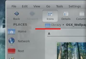
One thing i noticed about KDE is the poor UI layout. Yes in general, it's good already but when you look at it closely there are certain things that really annoy me. Take for instance, the Okular with its ugly sidebar and the Dolphin with its unbalanced elements, etc. Here i will only deal with Dolphin. Aside from oversized information panel( you can't even resize it) and the annoying autoresizing of the icons once you resize the places panel( i really want to have control as to what size the icons on panel would be regardless of the size of the panel they're on), there's a single thing which I am the only who seems to notice.. it's the placement/alignment of the header widget of the panels. i really don't how to explain it but here are screenshot samples taken with a skulpture and bespin theme styles. http://i262.photobucket.com/albums/ii11 ... bespin.jpg and http://i262.photobucket.com/albums/ii11 ... lpture.png
you notice the red line does not align with the base/bottom of the header of the places panel? it makes the header look out of place because it is a bit displaced upward. It should have been better and cleaner if the top part of where the directories are placed(i don't how to call it) is aligned with the base of the panel header. i think it's very clear in the screenshots as to what i am talking about. I don't know if it's just me, but it's kind of really annoying to me and it gets in my way.. my suggestion is to heighten up the header.. thank you!
Last edited by frustphil on Wed Dec 03, 2008 7:22 pm, edited 1 time in total.
frustphil, proud to be a member of KDE forums since 2008-Nov.
|
|
Alumni
|
Well, first of all, the things never bothered me. And I think the UI of KDE 4 is very great.
But well I'm just a stupid user and have no knowledge about graphics. Nevertheless, it's open-source you can make suggestions and collaborate. Maybe you can manipulate some screenshots, that everyone can evaluate your suggestions. Or you join the graphic team or something. Regards
TeaAge, very proud KDE 4 User and to be a member of KDE forums since 2008-Nov.
|

Registered Member
|
Huh? You can resize it in the same fashion as the places panel. :-S
[size=x-small]A witty saying proves nothing. (Voltaire)[/size]
|

Registered Member
|
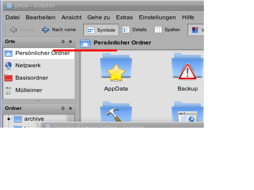
Those panels are technically called "dock windows" and they surround the main content area of the window. The problem is probably both with how Oxygen displays things and how you perceive them. You think that the main content area starts with the file view (the white area), so you think that it should line up with the panel headers. But that isn't correct. the main view starts with the breadcrumb/location bar. That is, the main view starts immediately below the toolbar. This is how it looks:
 One problem might be how Oxygen "hides" the fact that the main view includes the breadcrumb bar. But then again, there should be no reason that a user needs to know that. Although in your case, you might need to know, just to correct a misconception. And Oxygen is not alone in this, as you have pointed out Bespin and Skulpture as well. Other widget styles show this. You can try it by using this command:
for example. Hope that clarifies a few things.
Jucato, proud to be a member of KDE forums since 2008-Oct.
|
|
Registered Member
|
This is my third request already or whatever you may call it. First, I emailed someone from the KDE. Second, I made a request to the Skulpture author and fortunately he said he has a workaround for it (however I want to make it as rule across all theme styles). And this thread is the third one...[hr]
Last time I checked you can't squeeze it in the same fashion as the places panel.. You can only make it bigger from its default size, not the other way around. And things get horrible when you attached it under the places panel because because it overrides the behavior of the places panel.[hr] @Jucato thanks.. yeah i was pertaining to the main content area. I thought it does not include the breadcrumb as its part but I made my point and I think you all get what I mean. I hope the devs take notice to this because there's been so much effort alloted in beautifying Plasma while there hasn't been any meticulous effort given to the UI. They're like two things at both ends of the spectrum. Plasma is so ALL while the UI belongs to the Stone Age. They don't really compliment each other well..[hr]
Last edited by frustphil on Thu Dec 04, 2008 1:37 am, edited 1 time in total.
frustphil, proud to be a member of KDE forums since 2008-Nov.
|
|
Registered Member
|
There's one problem: the people working on Plasma are not always the same people working on Oxygen. They may intersect, but not always. People working on Plasma don't work on it at the expense of Oxygen, or vice versa. It's because they want to work on Plasma/Oxygen, not because the effort has been allotted by some mystical overlord. No one dictates who works on what or what not to work on. If someone tells Plasma/Oxygen developers "work on something else", the chances of them not working at all are greater than them working on something they don't want to work on. Bottom line: I'm not saying you shouldn't file bug reports (*hint*) or make suggestions. But please don't think that just because one part seems to be lagging behind a bit means that the KDE developers, as a whole, have decided to allot more resources into some other area at the expense of another one. FOSS projects don't (usually) work that way, and neither does KDE.
Jucato, proud to be a member of KDE forums since 2008-Oct.
|
|
Registered Member
|
I agree with frustphil. Places panel is so annoying. About the dock header, I have not noticed it until now and yes it should be changed.
So to help you guys out, I filed a new wish in the Bug Tracking System. I got a quick reply saying the dock header is not Dolphin specific and should be addressed to the creator of the theme. As for the panel, the one encharged there (Peter Penz) has reassigned the request to kdelibs. Here's the link https://bugs.kde.org/show_bug.cgi?id=176864 |


Page 1 of 1 (7 posts)
Bookmarks
Who is online
Registered users: Bing [Bot], Evergrowing, Google [Bot], rblackwell


