Call For Testing - KControl for KDE 4
Tags:
None

Moderator 
|
I've "comped" it against Qtmod 4.5 and so far no real problems.
Everything went smoothly.
Last edited by Primoz on Fri Apr 10, 2009 10:53 pm, edited 1 time in total.
Primoz, proud to be a member of KDE forums since 2008-Nov.
|

Registered Member
|
I installed an SVN snapshot of the Control Center, and here are a few suggestions:
Could the ordering be the same as in the Icon View? For example, Look and Feel is first, Personal is second, etc.? The configuration dialog is [url]http://img223.imageshack.us/img223/9199/squish.png]squished[/url] for me. And lastly, could you please override the single-click/double click? It makes absolutely no sense to double-click entries just to view a module, and it's really annoying. Other than that, it's great! I'm going to be using this from now on. 
Get problems solved faster - get reply notifications through Jabber!
|
|
Registered Member
|
Okay, one thing that's bothering me that I forgot about:
Would it be possible (in tree-view at least, since that's what I'm using the most) to adapt the size of the window/view to accomodate the module you're using? The list of different modules is fine, it's the part of the window to the right that's a bit of a bother depending on the module you want to view/change. In other words, making it unneccessary to either change the size of the window (manually or by using the KWin settings to force different settings depending on the app) or using the scrollbars to see all pertinent information?
OpenSUSE 11.4, 64-bit with KDE 4.6.4
Proud to be a member of KDE forums since 2008-Oct. |

Administrator
|
Thanks for the input Alec and Kryten2X4B.
The squashed configuration dialog, is now fixed, however since the dialog size is saved as part of the configuration, you will need to remove the configuration file ( kcontrol4rc ) to see it. The initial start size being small should no longer be a problem, since a size hint which is much larger has now been implemented. Saving of the Window size has also been implemented. I will need to discuss about overriding Single / Double click behaviour with msoeken, since it would require ignoring KDE system wide settings. I will also investigate customising the order of the modules, so that the order matches the icon view. Thanks again for the input!
KDE Sysadmin
[img]content/bcooksley_sig.png[/img] |

Registered Member
|
I'm trying to get the latest revision but unfortunately I get the response svn: URL 'svn://anonsvn.kde.org/home/kde/trunk/playground/base/kcontrol4/src' doesn't exist |
|
Administrator
|
That is because we have now moved to KDE Review, meaning we are hoping to be shipped alongside KDE 4.3.
New URL: svn://anonsvn.kde.org/home/kde/trunk/kd ... kcontrol4/
KDE Sysadmin
[img]content/bcooksley_sig.png[/img] |
|
Registered Member
|
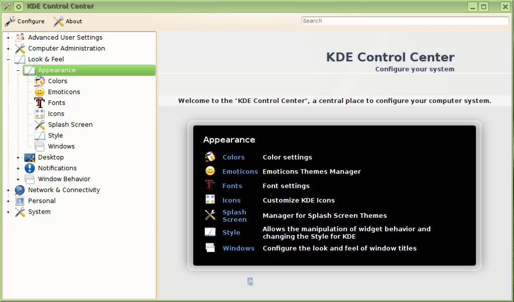
Thank you. Built and installed. There are some icon duplications but the tree view is definitely a major improvement. kcontrol4 snapshot
Last edited by tekwyzrd on Thu Apr 16, 2009 4:39 am, edited 1 time in total.
|
|
Registered Member
|
I can't try out the new KControl myself, but seeing this picture, I wonder why the icons are so large? They are larger than, for example, the icons in the tree view settings dialog of Konqueror, thus resulting in a larger distance between two setting subgroups and wasting space. |
|
Administrator
|
The size of the icons on the tooltips have been dramatically reduced in current SVN.
Screenshot: http://imagebin.org/45828
KDE Sysadmin
[img]content/bcooksley_sig.png[/img] |
|
Registered Member
|
I am sorry, I didn't expressed myself clearly. I meant not the icons in the tooltips but in the tree view, left to the title for the subgroup of settings. For example, on Hans' screenshot one can read the titles "Computer Administration", "Look & Feel", "Network & Connectivity". And the icons left to these titles are larger than in the tree-view of Konqueror's settings dialog, as can be seen in the following screenshot:
 Larger icons waste space, smaller icons allow for more subgroups accessible at once in the same amount of screen real estate. Therefore I would deem smaller icons preferable, not higher than the font of the text attached to them. At least there should be consistency among the tree-views of KControl and the Konqueror settings dialog. That being said, there is another issue: I see that the non-tree-view (should I call it icon view?) was not changed. Celeste Lyn Paul wrote a blog post about System Settings and why the current design is bad, and a step back compared to KDE 3's (actually Kubuntu's) System Settings. And there are still no different icons for "Input Actions" and "Keyboard & Mouse". |
|
Administrator
|
Unfortunately the drawing of the category lines is a KDE Libs bug, which affects Dolphin also. The icons for the two modules are also not under the control of System Settings, it simply respects the icon chosen the the module author.
I can't see much difference in icon sizes unfortunately, here is a screenshot of current svn tree view: http://imagebin.org/45827
KDE Sysadmin
[img]content/bcooksley_sig.png[/img] |

Registered Member
|
From Imagebin: Woops! That image may have been removed, remember Imagebin is for temparary image storage. Sorry.
dotancohen, proud to be a member of KDE forums since 2008-Oct.
|
|
Administrator
|
Seems like Imagebin doesn't hold onto them for very long...
Here is the screenshot again: http://i43.tinypic.com/2564al2.jpg
KDE Sysadmin
[img]content/bcooksley_sig.png[/img] |
|
Registered Member
|
How's the progress with KControl4? Will it be included in 4.3?
Get problems solved faster - get reply notifications through Jabber!
|
|
Administrator
|
Currently in kdereview, awaiting the completion of the 2 week review period.
KDE Sysadmin
[img]content/bcooksley_sig.png[/img] |


Bookmarks
Who is online
Registered users: Bing [Bot], daret, Google [Bot], Sogou [Bot]


