1 question about popups; 1 request about splitting
Page 1 of 1 (5 posts)
Tags:
None
|
Registered Member 
|
1. question: how to toggle off those annoying clip property popups (i forget what you call them) that get in the way every time i select a clip on timeline? i deselected Configure kdenlive: Timeline : Raise properties pane when selecting in timeline, but they still keep bouncing up and getting in the way of seeing where to slide a clip to.
2. request: please please please - oh PLEASE - can you not insist on all video tracks being above audio tracks (imnsho that's merely anal-retentive and does nothing for productivity) - so please, when i add a video with sound, please put the audio track directly underneath the video track it belongs to so i can see what's going on when i have a jigsaw of lots of video-with-audio snippets ? |
|
Moderator 
|
can you provide a screenshot about this popup?
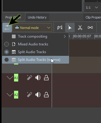
the track ordering/sorting is managed directly on timeline options. MIXED SPLIT and REVERSE-SPLIT .. do you need an extra sorting method? |
|
Registered Member 
|
it's probably not called a popup, but a tooltip; oh, i cant see where/how to upload an image, which i had to take with a hand camera cos tooltip disappears when i mouse anywhere else but its a huge great big white thing telling me clip properties which i thought id said dont show me although i just noticed it does disappear when i click on the clip fragment in the timeline MIXED SPLIT and REVERSE-SPLIT [/quote] mixed sounds like what i want but couldn't see it on Timeline menu nor on Configure Kdenlive menu... ah! found it! bottom left thingy  ok, one solved ok, one solved  i'm not new to kdenlive but i am new to version - oh! it doesnt tell me which version, anyhow, latest one, on Fedora 32 while i have your attention, a request please: the tiny buttons for play and pause etc are cramped, so i often press the wrong one. i dont recall having this trouble with previous editions. can you widen the buttons a bit please? and, instead of having to take up screen width with a permanent list of effects or whatever, can't these be dropdown from the top menu? theres plenty of unused room on it? i liked the older way of having a right click list of effects much more, but can see the advantage of having fewer things on it cos there's so many; would be nice to be able to be able to rightclick a clip fragment and drop down a favourite effects list instead of a long list of unusual things which could maybe in a topbar menu instead and one more - two more bugbears - 1. when i drag a file to the list (which i think you call bin), it doesnt leave the mouse looking at it but shoots off to another one - its always done that horrid thing, and now, 2. its also centering the name but i want to see its thumbnail and the start of its name 3. fade in and fade out are common things to want to do, but i more often want to just slide a fragment back or forth to get timing right, but when the fragments are as short as a mouse icon width, i often get a fade when i didnt want one instead of being able to mocve fragment position. so were it a democracy, i would vote for fade being removed as a default and just being on a transitions or effects list. |
|
Registered Member 
|
- - - - - - - - - - - - - - - - - - - - kdenlive 20.08.1-x86 Linux Mint 19.3 (Ubuntu 18.04) Cinnamon 4.4.8 - - - - - - - - - - - - - - - - - - - - A) I, too, would love to be able to toggle the clip popups (tooltips?) on and off easily. They are useful sometimes (e.g., how long is the current clip), but they're often in the way of editing. The item in question appears when hovering over a clip and provides the clip name, the clip IN and OUT point in the timeline, and the clip duration. B) I absolutely cannot find the "MIXED SPLIT and REVERSE-SPLIT" items. I've even grep'd the source, so any guidance would be wonderful! |
|
Moderator 
|
Page 1 of 1 (5 posts)
Bookmarks
Who is online
Registered users: bartoloni, Bing [Bot], Google [Bot], Yahoo [Bot]


