The massive issue that is System Settings
Tags:
None
|
KDE Developer 
|
that doesn't sound like being impossible. Install an event filter and react on keyboard navigation events. That's what krunner also used to do. |

Registered Member
|
Ok so then the issue is - can it be done easily or would such a thing really bust the nuts of you devs?
I wanna suggest something here - say that we do the "move stuff around in four or five columns", then edit and rework the individual settings to make them more accessible AND add a more central search function? Wouldn't that go a long way to solve the issue and pave way for future PROPER redesign of it? Plus say that you place the searchbar more front-and-center, promoting its usage and instead of just presenting a list of search hits (like the Krunner) why not use the fact that we do have all the separate icons in a box right there? Say you search for "window" and all areas which has anything to do with windows highlight while the rest are desaturated? It doesn't matter for search integration BUT what it does do is teach the user about the placement of different features within the system settings at no cost to the layout or design (since whatever is behind the search field is irrelevant). We could even desaturate the entire box of objects and the place just a tiny tiny highlight around the icons. All to help those of us who simply aren't good with text and numbers but good with spatial memory find our way around the settings the next time around.
KDE Visual Design Group - "Sexy by default - Powerful through cooperation"
|

Registered Member
|
Have you tried the search in System Settings lately?  That's exactly what it does That's exactly what it does 
|
|
Registered Member
|
NICE!
 Well ok then, one down and we didn't have to do it even! I didn't even notice it which makes the second issue so much more relevant. Lets make the search more central then so that it can be used
KDE Visual Design Group - "Sexy by default - Powerful through cooperation"
|
|
Registered Member
|
I think System Settings itself (the app) is more or less good as it is, what we should focus on instead are the plugins (kcms) that are loaded inside and how these are loaded.
Imho System Settings has so many modules with so many options that using it is a nightmare. The development has been done using an organic way of growing without control, and this has been growing wild since the KDE2/3 times. Since this is a "massive issue" I would like to propose a "massive solution", lets remove them all. I believe that we should work with an empty canvas and slowly sketch what we want to have, start to develop new kcms prioritizing the needs we consider more important using something like user driven development and slowly replace all the kcms we currently have with new ones that have been properly designed. Of course, we can continue shipping all the current kcms since this will be a slow process, but imho only by starting from scratch (from a brainstorming PoV, we can re-use code) we will be able to properly sort this mess. |

Registered Member
|
@afiestas, that's a great approach I think; clean slate of new kcms. We're happy to put together some proposals for what those could be. Of course If you or anyone else has something in mind, feel free to offer them up as well.

|
|
KDE Developer
|
|

Administrator
|
I agree with afiestas, the big issue is the KCMs themselves. A few posts in the forums have already pointed out inconsistencies between the KCMs, among other things.
The "start from scratch" approach sounds daring, but it seems like an excellent opportunity right now.
Problem solved? Please click on "Accept this answer" below the post with the best answer to mark your topic as solved.
10 things you might want to do in KDE | Open menu with Super key | Mouse shortcuts |
|
Registered Member
|
I'm all for the clean slate as well, and we should involve the wider community early on.
Oh and here is another idea: I propose to only create new KCMs for products which have a) A vision b) A target audience/persona c) Target usage scenarios (see http://techbase.kde.org/Projects/Usabil ... tual_Model) Because only then we can really do user-centered/driven design/development. I'd rather do this stuff right than rushing it. Oh and can we do that collection of empirical data I keep talking about soon, too? |
|
Registered Member
|
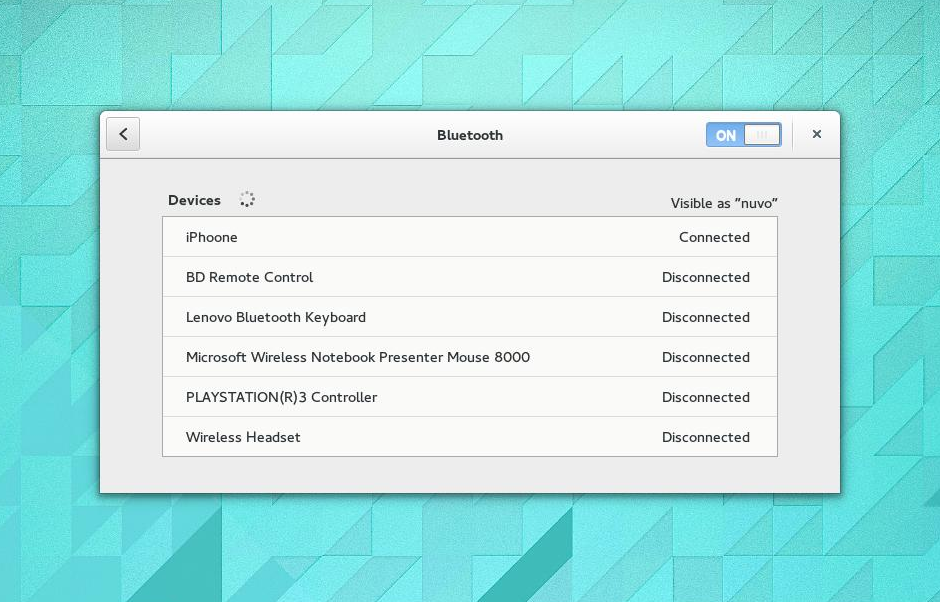
I think GNOME can be a good inspiration of how this can be done (https://wiki.gnome.org/Design/SystemSettings). They basically started from scratch and went one by one applying design benchmarking and other techniques and slowly defining what they needed and wanted. Also they have 2 templates of KCM most of the modules are based on, basically one is a big rich listhttps://help.gnome.org/misc/release-notes/3.12/figures/bluetooth.png, and the other is a panel on the left http://virtuallyhyper.com/wp-content/uploads/2012/09/bluetooth.png.
Also, I can start by modifying all the kcm I maintain (I can even do that for KDE4 if needed), those are: -bluedevil -kscreen (special one, yet interesting) -user-manager And in the office I can talk with Vishesh and David (Baloo and Telepathy) who also can chin in. Thinks I would like to technically see in System Settings is: -Proper resizing of the window (in GNOME they hardcode it, or at least they did) -Some UX changes when using search |

.png "Linux (Other)")


Bookmarks
Who is online
Registered users: bartoloni, Bing [Bot], Google [Bot], Sogou [Bot]


