[Design Help Wanted, open issue] Krita Icons
Tags:
None

Registered Member 
|
Is it ok that I'm drooling at these icons?
 legnaVI, amazing stuff! |
|
Registered Member
|
Nice, they look good together and very different between each other. Maybe to much apart form each other I don't know if its a good thing or a bad thing. here are my reasons (completely personal opinions of course):. While Krita sketch is Krita for touch enabled devices primarily it is not super stripped down and holds almost all painting functions the normal desktop version has. The icon proposal, while beautifully done I think it probably goes a bit too far into simplification. It reminds me of "ASKetch" or "LiveSketch HD" apps for the IOS, both simple sketching options. Again, I'm not sure if the difference between them is a good thing or a bad one because, in the end, the painting experience between each one is very different.
Haha, feels like it. But no. This is not the design committee, nor the official voting thread. This is only a vector for discussion. Legnavi was proactive enough to make some icons as a proposal. We are just reacting with some discussion. I understand that as a project there are bigger issues to get done first. The icons originally requested are coming into Krita slowly but steady. Doing other stuff might seem like a loose of focus, but creativity works in mysterious ways ;] Just to be back on topic, an update on the current status on the icons. Here is how the icons look in current krita master in my screen. Both over dark and bright themes. In my opinion they seem to have shrink a little. http://i.imgur.com/JlctzYw.png Cheers! Edit: Changed image for url. Icons are correct size after cleaning iconcache.
Last edited by ghevan on Tue Apr 15, 2014 4:26 am, edited 1 time in total.
Blog http://colorathis.wordpress.com, Deviantart http://ghevan.deviantart.com/
|

Registered Member
|
I guess they havent update them, and yes those where the first i gave to slangkamp to work with, but we had that same problem, they where 16x16 so i gave him a bigger set at 22x22, and this was the result
  Now about the app icons, in my opinion not being identical but not totally different at all its a good thing, that makes them more recognizable but also like from the same family between each other by keeping the basic shapes ( in this case the circle) the current ones at first glance look the same, just krita and studio look kind of different because of the colors, and that can be a problem for people with vision issues or dont have the time to stare at the app icon and see the difference between each other haha, now if we got some noticeable features in each other that wont be the case, or we can keep them like that but do the color different and more noticeable from each other.
Yep, totally agree with that, i didnt came here, saying HERE I GOT THIS ICONS, USE THEM NOW! hahaha nope, i know this is not like the official krita development forum or something, i was just passing by and saw the topic so i i thought it would be nice to give you a hand , i dont have the intention to make my ideas the offcial ones, if you like them and want to use them thats fine, if you dont thats fine too, 
|
|
Registered Member
|
The new icons are deployed  . I had to remove the icon cache to see them. Wonderful! Now I can spot the tools pretty easily :] . I had to remove the icon cache to see them. Wonderful! Now I can spot the tools pretty easily :]About the difference in icons: Don't get to influenced by my critiques there are some design needs I wasn't thinking at the moment. I just relate Krita with a colourful explosion of creativity. Hence B&W for the icon is not really into the image I have formed in my mind about the software. Don't mind me to much, let your creativity flow. -
Blog http://colorathis.wordpress.com, Deviantart http://ghevan.deviantart.com/
|
|
Registered Member
|
Im glad Hehe, dont worry its ok, i really appreciate everyone's opinion, i feel like improving my self by reading your feedback, but yeah thats my idea about the icons, not different but a unique style to every of them by maintaining the basics
|

Registered Member
|
This is true and he has actually asked for something else more important elsewhere ... a new website design. Considering that people here are very talented and this is a big call, I think discussion on this more important. I mean - I submitted my idea but no one wants to critique it or expand upon it. I know it sucks but come on guys! Discussion!
Personally, I do agree with this and I do agree that icons probably need another reboot. I like the general krita icon but dislike the rest. Also, if are going to continue discussing the icons, I think it is important to different between the tablet versions and PC. Sketch is fine (though I'm curious to why you've gone with a structured ladder rather than a more organic "sketch") but it doesn't highlight what platform it's for. Perhaps a finger or stylus. Another point, the reason why krita has a pastel scheme for the icon is that is matches the mascot here. Please also consider this when designing anything relating to the icon or website. |

Registered Member
|
As was replied on that thread: If Boud wants designers to work on the homepage, he should have posted the request here! This is where designers are, this is where he'll most likely get his request answered! |

Registered Member
|
I followed this thread only casually. But now since you apparently come to a conclusion, I wonder if Krita icons shouldn't be analysed for usability as well. That means we run an icon test with the actual pictogram and its function (the label or tootip usually), and compare the association over the complete set. We did run this kind of test successfully in several studies. The outcome might look like this one for LibreOffice' standard tool bar: http://user-prompt.com/semiotics-in-usa ... metaphors/
Prerequisite is a vivid community with a lot of users (>>100 participants) that are willing to run an online test that takes approx. 10min. What do you think, is it worth to run such a study? |
|
Registered Member
|
Totally makes sense from my POV, I'd say it's up to the Krita team to decide whether they want to do it (or have you guys do it). |
|
Registered Member
|
Of course, I will do all the work but not the test. And without a lot of participants it makes no sense. |

KDE Developer
|
Hey guys, Boudewijn has been buzy implementing a docker-lock, and it needs an icon. It will show up next to the 'undock' and 'close' icons.
This is just a basic design:  But it might be that, considering 'undock' and 'close' are pretty abstract, we'll need to rethink these guys. EDIT: Here's a link to the SVG file so you can play with it: https://www.dropbox.com/s/sw88gyqlfb2qxz9/docker_lock_icons.svg |
|
Registered Member
|
Hello everyone,
I was having fun trying to create a logo for Krita, and after sharing it on Google+ a user suggested me this official topic. I hope I'm not wrong and that my design can add some value to the conversation. Bigger resolution: https://dl.dropboxusercontent.com/u/29342726/Krita_logo.jpg Critics and suggestions are more than welcome. Cheers, Alex |

Registered Member
|
Hi! Since Krita means (among other things) crayon, and everyone seems to prefer other tools for the icon, I decided to try something with the crayons, but they turned out to be too complex and evolved to something way more simple:
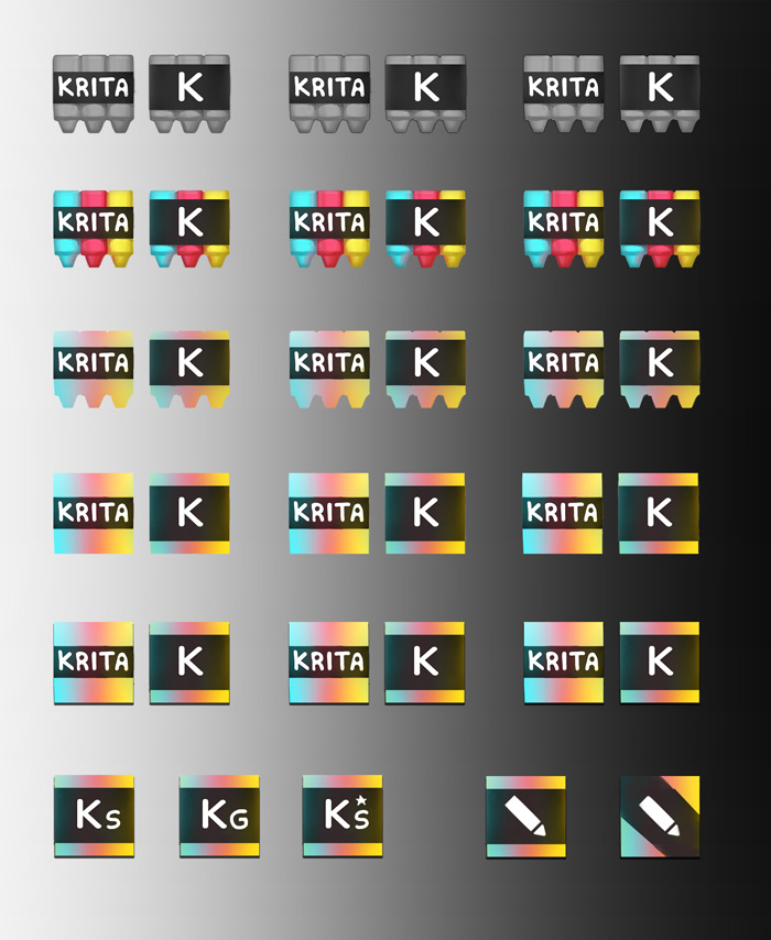 I'll keep thinking and sketching... |
|
Registered Member
|
Hi legnaVI, how it's going? Very liked your icon, standard is too "cold" for me, any possibilities to set up your logo?
|


Bookmarks
Who is online
Registered users: bartoloni, Bing [Bot], Google [Bot], Sogou [Bot]


