Plasma Theme
Tags:
None

KDE Developer 
|
|
|
KDE Developer
|
about the clock photos, i kinda like the last two, but is just my 2cents, looking forward to what you come up with 
|

Registered Member
|
do we need the white border? i'm always against them for w/ compositing. i have done my idea, with a fresh svg, because i dont like the air one, there is so much old stuff in svg and the pathes have some ugly aligns that always end up in a gap between some elements here.
https://drive.google.com/file/d/0B6x8cc ... sp=sharing |
|
KDE Developer
|
take a try to the current widgets/background in the repo, i tried to make it without white border |

Registered Member
|
Awesome thanks Marco! So if I understand this correctly, it'll look for that class and colorize to the Plasma color scheme color (background in this case)?
I went ahead and set the tracker to allow edits. Re-order away! It'll definitely be helpful understand which files to tackle first.
Last edited by alake on Wed Feb 26, 2014 6:42 pm, edited 2 times in total.
|
|
Registered Member
|
Fabian, I'm using Cardboard Grey from the Next color scheme below. 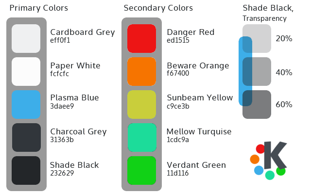
|
|
Registered Member
|
That xkcd clock would be awesome, if not as the clock applet, then definitely as a applet all it's own! That second pic or something similar would be kick ****. It should be possible to get it visually asymmetric within the confines of the technically-centered "clockface". |
|
KDE Developer
|
yes, the available colors are in the stylesheet. It should be testable and working in plasma1 as well pretty much is background color, text color, view background color (for the white areas, if we'll decide to add them) button background and text (same as the normal ones currently, just semantic difference) and button hover and focus colors (two shades of blue currently) colors like the danger-red are probably not needed to come from the stylesheet, since red would probably be red everywhere, but if they are needed could be added (would work only in plasma-next in this case)
cool
|
|
Registered Member
|
So, in support of the overall mood goals, I was trying desperately to avoid any edge highlights of any sort. The material properties we're trying to evoke is clean, flat, smooth paper (in this case with some translucency a little like vellum card stock). So the first thing I did was remove any edge highlight. A curious thing happens when I did this though: the edge starts to lose it's sharpness and soften and the panel background sort of starts to lose its impression of flatness. It's not the pixels doing this, it's mah brain. I also know we didn't want a heavy, super high-contrast shadow. So I started to add just a touch of highlight at a time back till the edge started to sharpen up again and the panel seemed to flatten out again. So I try to evaluate what I'm actually seeing in the full context of a representative environment, not just what I know about the raw pixel data by looking at it in Inkscape. I definitely don't want a bright, liney edge. If it's necessary, a well done, very subtle highlight shouldn't even be seen by the brain. All our brains should be seeing is flat, smooth, sharp translucent paper. We should totally tweak on this until we achieve that! Ooh and a quick note on shadows: Shadows under translucent objects in real life affect the light that's transmitted through those objects. Plasma 1 themeing, as far as I know, only renders the portion of shadow that bleeds beyond the edges of the translucent object. Beyond blurring, it doesn't really affect the rendering of artifacts under the translucent object. Plasma 2, based on Marco's explanations, appears to afford a more powerful model to affect how the light from under a rendered object are altered by that object and it's shadow. The reduction in light caused by the shadow affects the brightness, saturation, etc. All this to say, we have an opportunity in Plasma 2 to achieve our design goals in ways we haven't before. Which is why I think it'll be extremely helpful if Plasma devs and whoever else might be running Plasma 2 chime in to help us evaluate how things are looking. 
|
|
Registered Member
|
with 95% opacity? i'm more and more confused of all the work here :/ it would be nice to have a style guideline and re-do the widgets from scratch instead of just use air, change color, remove something. this will make the svgz smaller, better to understand for external artworker (and me) and easier to replace. Mann i just feel like a grouch >.<  now that integrated stylesheet somehow broke my svg.. now that integrated stylesheet somehow broke my svg..edit.. why does inkscape change the line: "opacity:0.8;fill:currentColor" to "opacity:0.8;color:#eff0f1;fill:currentColor" :/ |
|
Registered Member
|
Sorry to hear that Fabian!  I wouldn't worry about the technical specifics of the plasma svgs. The artwork is the hardest part. We're all part of a team and a community, so others that are more familiar with all the technical stuff can pick up where we leave off. Honestly, I think if all we delivered were files with the raw artwork, the Plasma devs would be very happy and they (and perhaps others here) have the skills to take that and run with it. Not that we won't try to do more, but I personally consider the artwork as the primary deliverable here. The technical stuff can be sorted out later. So let's spend our energy on the artwork. Our current guide for the artwork is that color palette, paper-like materials and a futurist, human, polished vibe. I say we take that and run with lots of ideas, lots of mockups, lots of tweaking. Since you have the excellent icon design skillz, would you be ok with taking a shot at the artwork for plasma icons? Just post ideas and pics for them here and we can worry about getting them into the right technical package for Plasma Next later. The current icons in need of artwork are: amarok, audio, battery, configure, device, document, edit, go, kget, klipper, konv_message, konv_message, ktorrent, list, media, nepomuk, notification, preferences, printer, quassel, slc, wallet, window, zoom No matter what, we'll always get a chance to chime in on whatever we come up with and work together to deliver something truly amazing! 
|
|
KDE Developer
|
ah, yeah, it likes to do that, i'm not sure why(especially because it doesn't always do it), in tools/currentcolorFix.sh there is a script that fixes it |
|
Registered Member
|
Ok, I pushed some more updates to the repo. For the controls I basically went with Marco's mockup as a reference with some very minor tweaks.
  The more I work on the plasma theme, the more it's becoming clear to me that the bulk of any visual refinement can only come from improving the layout design of each applet. But it'll definitely be nice to have the plasma theme done to support that. I updated the tracker as well. I'll try to tackle the tasks manager theme next. If anyone has ideas, feel free to post. |
|
KDE Developer
|
Starting to look nice:D and i completely agree that the actual layout design is the most important thing (a different theme can only go so far) On the look in particular, i would try to give rounded corners at least a 2 pixels radius? (so that when rasterized actually appears slightly rounded, not just the corner pixel appearing slightly transparent) On the taskbar, given the look in the mockups, i was wondering if it should look different in the 4 possible panel locations? (same thing would be for tabbars) in case those new elements will be added, tough it won't be possible to test drive them in plasma1 (and that's fine as well since that too will only get so much far) |
|
Registered Member
|
Great feedback Marco. That helps. I was wondering if I should do that while putting it together, but I wasn't sure how close we wanted to stick to the mockups. I think I'd prefer 2 pixel corners as well. I'll tweak that tonight.
Are you talking about the location of the active/inactive/minimized window indicator like this: panel at top:  panel at bottom:  Yeah, that'd make sense to me. Is there a prefix we should be using in the tasks.svg for the panel location top/north, botto/south, etc.? Also, is there a similar indicator for the currently selected systray Icon? Thanks again for all your help and patience Marco! |


Bookmarks
Who is online
Registered users: Bing [Bot], Google [Bot], Sogou [Bot]


