[Design Project] System Settings

Registered Member 
|
Of course System Settings should have breadcrumb navigation! Actually, when I saw your mockups I thought "Wait, isn't that already the case?" because it felt so natural to me. So yes, unless we come up with a new hierarchy that doesn't have more than two levels anymore, there absolutely should be breadcrumb navigation. |
|
Registered Member
|
So here's another general idea of how System Settings could look like. The idea is that there should be a lot of space to click on and it should make heavy use of colors and icons with labels, and that different settings-categories should be accessible even when you're deeper down into the hierarchy. So this is the basic idea:
Main Window:  Second level:  Third level:  It's a pretty sloppy mockup at this point (don't bother about sizes and details like that), but the general idea should be clear enough. Make use of icon-rearrangements and resizing to make the user able to switch between different settings modules. I'm not really sure how it should look like when more levels than three are necessary, but it's a just quick mockup to get some input about it. So tell me what you guys think.
mintlars, proud to be a member of KDE forums since 2008-Oct.
|

Administrator
|
My only concern with that is that most systems now are widescreen - so vertical space is more precious in comparison with horizontal space.
A breadcrumb based approach along those lines certainly would work though.
KDE Sysadmin
[img]content/bcooksley_sig.png[/img] |

Registered Member
|
Jens started this thread with two questions: improve consistency and create a fancy layout. What do you achieve with more levels of organization? I don't think that the basic KCM screen is really hard to use right now, it's state of the art. I have a back button which guides me one step back - not need for a breadcrumb. What is worth to think about is IMHO the content of every single KCM module. There we have a sidebar (first level grouping) and sometimes tabs (second level or something parallel to the sidebar). I suggest to remove this content area navigation and to keep the sidebar. In terms of a HIG I'd say, a piece of configuration must not consists of more than 5 items, otherwise it needs to be separated by a group box. Those groups should be assigned to semantical units that are accessible for users via sidebar. And we should keep alignment in mind, guidelines are done already.
|
|
Registered Member
|
Breadcrumb would certainly work with this kind of design as well, though I'm not sure how much Avarage Joe really cares about how much vertical space there really is? Anyway, I guess one would have to think about how important it is when actually implementet. Like I mentioned in the mockup post, I haven't really bothered about the different sizes of icons and such, so I guess you could make them as small as they need to be.
It's not that the current KCM is hard to use, it's just that it doesn't look very inviting or accessible to the avarage user. The current one is just a big window with a combination a bunch of text and icons. It takes a while to actually find the settings you are looking for because it's just to much to look at. By limiting the amount of information in each screen, it's easier to find what you're looking for in the first place, so that's the gain even if it comes at the cost of an extra click. Speaking of clicks though, a lot of people here agree that the current layout of KCM modules, and what you can do with them, needs an overhaul. It's just not consistent enough, and in some cases, down right confusing with lots of levels and also seemingly unconnected windows that pop up. This mockup is designed with an complete overhaul in mind, though it could also be used to just redesign the current set of modules. So wheather this is the design in the end or some other one, I would like propose that an overhaul of the KCM modules are designed so that there are minimal amount of levels to go down. Three is, in my opinion, somewhat of a sweet spot. If you need more levels, maybe you just need to rethink it again. That's just my opinion though.
mintlars, proud to be a member of KDE forums since 2008-Oct.
|
|
Registered Member
|
I am not sure I understand how breadcrumbs would work, at least in the current organization.
|
|
Registered Member
|
@mintlars
I like your layout idea. I would skip the second level for some sort of list but the third level is pretty cool. Good overview. @breadcrumpfans From my view breadcrumps always feels like a crutch. You can put them nearly everywhere an generate some overview and usebility but it is never the best solution. So why not try something else or at least put out new ideas? @HeikoTeize
I think both is worth thinking about. The basic KCM screen works but that goes for the most stuff in KDE. It kinda works. From that perspective why change something in the first place? The basic screen is the first thing you see and you navigate through, so it should direct you as easy and as fast as possible to the prefences you want to change. From that point of view it gives me the same pain(cost same time) as the individual KCM-modules. Greets |

Registered Member
|
As kind of a combination of mintlars idea and my breadcrumb idea, here's a couple mockups I made. I'm only showing the second level windows, Im not messing with how the main page should look right now, but I think a two level breadcrumb and mintlars idea for buttons to switch easily between the subcategories without having to keep going back to the main page and then click on a different module could make the desktop settings much easier to navigate. Please dont judge it too much on how it looks. With a little implementation polish it could look much better, but these are just mockups.
After selecting the Notifications subcategory in desktop settings, this window would be displayed. Ignore the breadcrumb text, it's not accurate.  After clicking the Application Appearance button it would easily switch subcategories to display this window.  P.S. It might even be better just to remove the breadcrumb and keep the "Back" button at the top left, though I like how it would tie everything together. With it only having two levels its not completely necessary though. |
|
Registered Member
|
Hm honestly, I wouldn't go for both breadcrumb and button-row. Switching to a different category from the breadcrumb is just one more step, and I don't expect that people want to navigate wildly all around System Settings very often. The only occasion where I'd expect users to navigate between many different modules is when configuring a newly installed system. After that, it's usually one specific setting people want to change. For that, it's only important that they get to the module they're looking for quickly.
|
|
Registered Member
|
Hierarchical data require tree navigation, basta! If you mix your tab-like navigation on top (flat toggle buttons whose state are hardly to discriminate) and the sidebar list view, users might get confused on the relation. Is "color" part of "application appearance" or can I change it for notifications too?
I'm still not convinced that system settings need extended navigation. I agree that, sometimes, it is not easy to find where the color of notification can be changed (1). But this does not makes a more complex navigation necessary. What's about some kind of link as "Are you looking for this option?", that means a stronger cross-linking between modules? But I totally agree that features should be sorted carefully into modules. Best method for analysing is a card sorting. (1) To my knowledge there is no KCM option to change the notification color, actually. It's just an abstract example. PS: As a reply to kainz.a proposal: viewtopic.php?f=285&t=120142&start=15#p305596 This is similar to Microsoft, and I always search for simple settings like screen resolution too. But they have the "see also" section. And a nice integration of your breadcrumb... http://i.imgur.com/n2Lx3tw.png |

Registered Member
|
Hey guys, I have been following this conversation and I think it is headed in a great direction. The consensus is that settings need to be more simple and easy to use. Remember that users who try KDE will want easy discoverability. By that I mean that they want powerful tools packaged in simple modules. So I wanted to take this a step further and present a bolder color idea on System Settings. I know it is not perfect but I wanted to bring flat design a little stronger. Sorry about the icons, I just gathered them at random but I hope the idea makes sense.
I reduced the amount of text and attempted to simplify organization. 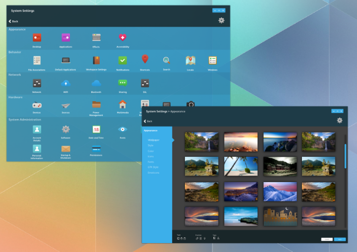 Link https://www.dropbox.com/s/c2731qjd795sshx/g4918.png
Last edited by anditosan on Mon Mar 24, 2014 8:08 pm, edited 1 time in total.
|
|
Registered Member
|
It looks nice, but you could have a bigger picture?
I love the screen Wallpaper |
|
Registered Member
|
This is awesome! The color theme will probably be different once implemented, but I think it's really well designed. Better sidebars and a breadcrumb navigation does wonders to the look as well as ease of use. After that people could then start working on a different category and organization for the modules. The only thing I would change from your mockup is to remove the "Back" button and put the breadcrumb there. The Back button isnt needed since you can click on the breadcrumb to go back. Great work!
Click the link below the image for the larger version. |
|
Registered Member
|
There is a realy nice preview for the new QT widget stlye (viewtopic.php?f=285&t=120245).
With the VDG Mockup Toolkit (http://forum.kde.org/viewtopic.php?f=285&t=120225) I'll make this preview for the system settings arrangement. This is my proposal for the system settings arrangement in the style of a file manager.  I'll also include the recommendations from the thread (http://forum.kde.org/viewtopic.php?f=285&t=120142&start=15) The sidebar for the navigation will be flexible as you can edit them like http://forum.kde.org/viewtopic.php?f=285&t=120006 |
|
Registered Member
|
That was the kind of look I was thinking of when I created my mockup. I just didn't have the the time to do such a fancy one  . Lovely use of contrast and colors. May be a good idea to color code the settings, e. g. a different color for different categories. . Lovely use of contrast and colors. May be a good idea to color code the settings, e. g. a different color for different categories.Edit: Or it may not. Just realized that it would probably be bad if the system settings look like a rainbow, hehe.
mintlars, proud to be a member of KDE forums since 2008-Oct.
|


Bookmarks
Who is online
Registered users: Bing [Bot], Google [Bot], kesang, Sogou [Bot], Yahoo [Bot]


