[Idea] On The KDE Logo
Tags:
None

Registered Member 
|
Nice work anditosan
 I don't know about the legal part, but a logo refresh/evolution would be nice. It would be nice to emphasize the distinction between plasma/kde/frameworks though, so maybe it won't be the worst idea to replace the start menu icon. I don't know about the legal part, but a logo refresh/evolution would be nice. It would be nice to emphasize the distinction between plasma/kde/frameworks though, so maybe it won't be the worst idea to replace the start menu icon.
|

Registered Member
|
So I like two of the logos that have been posted, but I wanted to play around with some different color choices. Each image below is 128px and consists of a transparent background and features cardboard grey, charcoal grey, and plasma blue respectively. The one exception is the first icon that I've been using for years and really like so I'll post it as just another option. I (or someone else) should be able to convert these to svg fairly easily.
Monochrome Option  KDE Logo Icon Set 1       KDE Logo Icon Set 2    Here's the link to the Imgur album (the white parts show up easier on the black background). http://imgur.com/a/kZEDd Edit: I tried doing ones with an outline but couldn't get them to look smooth in gimp. After Trying them all out on my current plasma air theme, I like the original blue "K" and dark grey gear that rumangerst originally posted. I just wish there was a way to make the blue K a little more prominent.
Last edited by BSmith1012 on Sun Mar 23, 2014 10:03 pm, edited 1 time in total.
|

KDE Developer
|
On one of our hangouts, Marco (IIRC) mentioned that the icon for the start menu is not of a great importance, simply because most distributions replace it with their own logo.
The current oxygen start icon is very good in that regard. It has a common, recognizable, background while allowing distributions to replace the kde logo with something else. That is another thing worth thinking about. 
|

Registered Member
|
FWIW it's been tried many times before, but no matter what the name KDE is never going away... I follow the KDE Promo list pretty regularly, and IMHO users are going to call Plasma Next (or KDE Frameworks 5 if you prefer) simply "KDE" no matter what we say. And according to KDE, the term KDE is in fact being enhanced to include the concept of Community as a whole, not just software. So the above logo is both a really good concept and also accurate. |

Registered Member
|
This is just my opinion of course, but I always found the cog of the KDE logo looks a little old-fashioned because it's so chunky.
Maybe a refresh with some finer toothed-cogs? Could work nicely now that screens are getting higher-res. Here are some ideas: https://www.dropbox.com/s/7i24kfcttl51k9k/Kcog2.png Of course a flat version would be pretty easy to do. I like the fact that community suggestions are welcome on design, gives me an excuse to play around with inkscape
|
|
Registered Member
|
So many straight gear profiles
 . .The involute profile of gears is a beautiful thing. Here's my "working together" logo of two gears close up, because one gear on its own is a terrible metaphor for community. I'd be surprised if it hasn't been done before. Who knew inkscape has a gear generation tool? 
|
|
Registered Member
|
Sorry to bust the door, i found this by making a typo, found it suspicious, and then looking up the kde logo i found this chat topic. Is this woman stealing someone's design? (and the name krita)
https://i.servimg.com/u/f39/17/38/57/12/kritya10.png 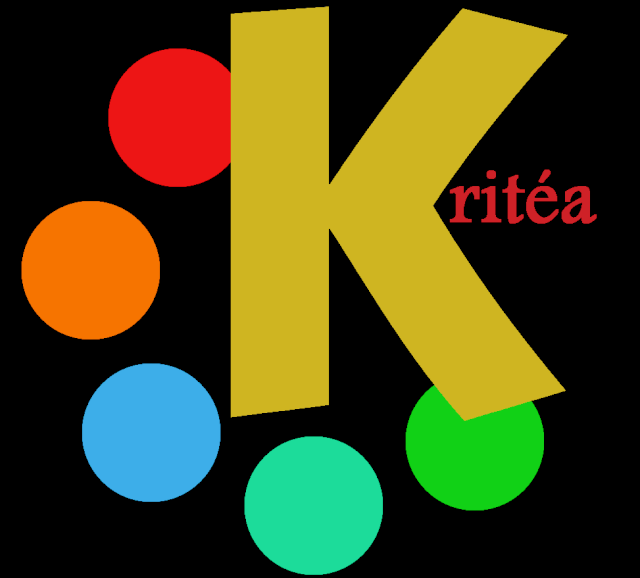
|


Bookmarks
Who is online
Registered users: Bing [Bot], Google [Bot], kesang, Sogou [Bot], Yahoo [Bot]


