The New Desktop Setting
Tags:
None

Registered Member 
|
I agree and I think it adds a nice work flow for selection. Basically, 1. What you want? 2. What will it look like? 3. Where will it be? 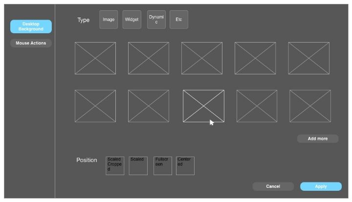
|
Registered Member
|
In my mind, is step 1 really the random user's step 1? Yes, it does make logical sense, but I don't think it is run through recursively like that. Those options are less used so shouldn't be first. But that's just my idea of what a common flow would be.
|

Registered Member
|
I agree that it's likely that a majority of users rarely change the type at all. However, the order of controls following the sequence of the workflow makes more sense than it reflecting frequency of use.
Even though the type selection is the topmost control in this mockup, the wallpaper selector is still the most prominent one since it's the biggest and most eye-catching element on the screen. For users who don't change the type at all the implicit first step of the process would be "leave type as it was". This is less confusing than the way it is now where users have to first select the type below and then select the actual background element above. Therefore, I find putting the type selection first pretty reasonable |
|
Registered Member
|
I agree with you too. I tried the model suggested before but I felt like the natural tools for selection are now broken up like this: -Tools -Content -Tools When it could just be in order of importance -Content -Tools to manipulate content That could also be reversed and probably imitate the look of other tools in KDE like Dolphin -Tools -Content From a design perspective and usage I think it makes more sense to highlight the content more since that is what the users are looking to change, and add the manipulation tools as an extra in case they want to spend more time with that. What do you think? |
|
Registered Member
|
Relatedly, I had thought of making types as tabs on the selector window. Though both type and position were given the same placement and ui, and as we've been discussing the type drop down is clearly not the same in nature as the position drop down. It is sort of an inconsistency due to consistency. But I wasn't sure if this was even more my own thoughts
 . .
|
|
Registered Member
|
anditosan, this was exactly my thinking
 . .But I want to get more feedback on the buttons/apply/preview experimenting before it gets lost. Some of it probably is out of KDE standard, but the "Okay" button was very confusing to me. |

Registered Member
|
The Apply, Okay, Cancel structure is a general "standard", it is done the same way in Windows and, sorry but I consider it rather being obvious since those are general IT terms you are constantly confronted with. If somebody can't make a sense of it after 5 seconds of logical thinking, maybe he should consider taking an IT course... |

Administrator
|
Regarding the Apply/OK/Cancel, I would keep those for consistency since you'll find they everywhere in KDE applications. Or, change them everywhere (but that'll definitely be harder to do).
I thought about having tabs as well, but keep in mind that you could have many, many wallpaper types, since they can be installed as plugins. For now I think a dropdown list is the best.
Problem solved? Please click on "Accept this answer" below the post with the best answer to mark your topic as solved.
10 things you might want to do in KDE | Open menu with Super key | Mouse shortcuts |
|
Registered Member
|
There is a realy nice preview for the new QT widget stlye (viewtopic.php?f=285&t=120245).
With the VDG Mockup Toolkit (http://forum.kde.org/viewtopic.php?f=285&t=120225) I'll make this preview for the system settings arrangement. This is my proposal for the system settings arrangement in the style of a file manager. 
|
|
Registered Member
|
kainz.a: I find your mockup very interesting, but I think it belongs to a different thread. This thread is specifically about the "Desktop Settings" module. We have another thread about System Settings in general ( viewtopic.php?f=285&t=119951 ), and I think that is where your mockup belongs.
Admittedly, I confuse the two threads due to their similar name all the time... |

Registered Member
|
Looks pretty clean, nice. My criticism it's on a very high level
 ++ Organization and look of content panel + Search right hand of breadcrumb (as discussed on the mailing list) - Selections in KDE-blue: looks like links that can be clicked - Sidebar: I'd like to have images there too. It might look strange in this case but all other sidebars are designed with icons. -- Scrollbars without rulers: Where do I have to click to "small" scroll? * If all vote for a multi-dimensional configuration, I suggest to add a "see also" section to the bottom of the sidebar (viewtopic.php?f=285&t=119951&p=305607#p305607). |


Bookmarks
Who is online
Registered users: bartoloni, Bing [Bot], Google [Bot], Sogou [Bot]


