The New Desktop Setting
Tags:
None
Registered Member 
|
This morning on G+ I have come across in the last image of the new Desktop Settings, posted by Sebastian Kugler, what do you think?
https://lh4.googleusercontent.com/-Y9fN ... earch1.png I went to look at some other DE, and I think that KDE has still needs a bit of polishing Desktop Setting window in other DE Ubuntu http://linuxlibrary.org/wp-content/uplo ... 2-04-8.jpg Elementary http://www.linux-ai.com/wp-content/uplo ... esktop.png Gnome 3 http://www.dedoimedo.com/images/compute ... arance.jpg What do you think? Mockup? |
KDE Developer
|
I think this is one of the cases that KDE actually looks slightly better than the other DEs.
The wallpapers thumbnails are big, which nice and makes it much easier to see what's on it. It also done right in the Elementary one, but the other two have only tiny pictures. I also like that there are no gaps between them. That looks more elegant and also increases the preview area. The visualization of Gnome and Ubuntu isn't needed and just takes space. The major difference between the KDE one and the rest is the lack on labels and buttons. The KDE way is usually to apply something with a button while the other simply do it. I think the major negative point about the KDE one are the two rows in the bottom left corner. There are simply too many in the same space. |

Global Moderator
|
The only problem I see here with the KDE one is that the oxygen margins still seem kind of broken in 5. Otherwise it seems fine to me, especially -- as slangkamp said -- that it properly uses the space to present the relevant information, which is the pictures.
Greetings!
I'm working on the KDevelop IDE.
|

Registered Member
|
That's something I notice every time I look at a picture of a Qt5 / QtQuick UI, too. Sebas said that they are aware of it. Hopefully this will be fixed soon, ideally before the Plasma Next release, because that's the little details that make things look "unpolished". |
|
Registered Member
|
Hi guys, I am brand new here (gnome/unity/elementary user) but I saw the new work being done in KDE and have loved it so far, decided to look into the community when I saw how nice everyone was
 I am just trying to learn about the design conventions/philosophy you guys hold, and I had a question about the Desktop Settings. I'm not sure if you already addressed this, but, why is there a whole column on the left for two things: wallpaper and mouse actions? Seems like a waste of space, IMO, especially when the rest of the windows focus seems to be on the content. |

Registered Member
|
That is actually what this forum will try to drive. Right now there are conventions and design cues that this team is using, but depending on the outcome of future releases, that can all change. So the idea here is that design drives design conventions. But I think that this time around, KDE is being influenced by a more direct and simplistic design without removing all the extra features added to it. Maybe a reductionist and more utilitarian desktop seems to be the aim. |

Administrator
|
That's very nice to hear. Welcome to our community!
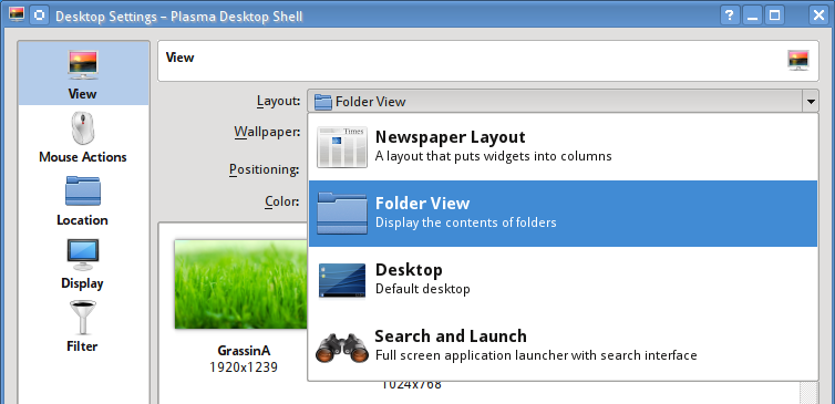
Good point! I don't know if it's going to be the same in Plasma Next, but in the current version you can have more options depending on your desktop type (called "Layout" in the settings). Here's an example I found for Folder View: http://www.binarytides.com/blog/wp-cont ... ttings.png (This desktop layout allows you to have icons on the desktop, more similar to "traditional" desktops.)
Problem solved? Please click on "Accept this answer" below the post with the best answer to mark your topic as solved.
10 things you might want to do in KDE | Open menu with Super key | Mouse shortcuts |

Registered Member
|
I think he was referring to kde using a sidepanel in the first image to display only two modules instead of just sticking them in as tabs and saving the vertical space. But if you're saying they might add another module, layouts, I now see what you're saying -so you may disregard. |
|
Registered Member
|
Okay, I've made my mock up. A bit of a rambling explanation after if you are interested.
 And then I thought, why not create more work that would simplify the user flow even more:  Some ideas applying more generally to Settings: One thing I noticed about this right away was the buttons. I think proper padding with the text has been discussed elsewhere. Also, I know work is being done on mini-icons. They are a pet peeve of mine in these settings screens. Aside from redesigning them, should there just be one or the other? I like the idea of just icons with hover text, as happens in toolbars. And why does a star represent downloading from? Makes no sense  . But I played with both. . But I played with both.Another thing that bothers me is the exceptionally tall area for tabs (especially so useless in this case), but that looks to be addressed in another thread. Here specifically: One thing that confuses me is the existence of "Okay", "Apply", and "Cancel". This seems very odd. I notice the other DEs eschew these buttons altogether. How does that work, exactly? Instant application? The user should be able to say "well, that was a poor experiment" and not lose anything. Side note, are we dropping the underlined letters for keyboard users? Those have also bothered me  . .A concern of mine with the borderless images is that you lose the titles, which are helpful when you are looking for things alphabetically. The title of “Wallpaper” bugs me. It can’t be centered without looking off from the point of view of the window title, so it is left all on its lonesome. Furthermore, I believe that properly Tabs == Titles. And this one is right next to the tab! So off it goes. This also prevents “Wallpaper Type” from seeming redundant. Functionally, having a "monitor" giving a slightly larger shrunken picture is a bit silly. A proper previewing would be best. As of now one can try using the "Apply" button, but that is messy and as I mentioned above not clear to the user. The way I see it, the typical use is that a person picks an image, and then needs to see how it looks on their particular desktop. I would think Plasma has the technology to do this, what with the "Show the Desktop" and "Show the Plasma Dashboard" functions. And why are those two options on top? Maybe “Wallpaper Type”, because it changes the selection zone, but I think the selection zone should be front and center for the user. So my mock-up is actually two screens, but imagine the second one as the desktop with a temporary background and “Exit Wallpaper Preview” as a popup or a tab at the top like in “Show the Plasma Desktop”. The Apply button should naturally be auto grey when no changes are made. I thought about changing the words to “Save” and “Close”, but decided against it in the end. |
|
Registered Member
|
Actually, I think both "Close" and "Cancel" have bad cases. The option with best coverage (for people who just hit "Apply" and for people who don't want to save their changes) would be to have it change to "Close without saving" or something similar when appropriate.
|
|
Global Moderator
|
Ok / Apply / Cancel is used all over KDE, and I consider it good practice personally. It makes it much harder to accidentially change a setting, and also provides an easy way to revert all changes if you're not happy with them.
Please don't remove keyboard accelerators by default -- the theme could provide an option to turn them off if people are bothered by it 
I'm working on the KDevelop IDE.
|
|
Registered Member
|
Is it? I was comparing with Settings windows, which only have "Apply". "Okay" seems to be "Apply and close", which is not really indicated. Also, there is a pop up if you try to close the window/navigate away without applying changes. Actually, I think those pop ups are bad UX too, but that is another discussion.
Aw .
|
|
Registered Member
|
How about something like this? I feel that hiding the many options in menus obscures the forward approach to selecting wallpapers. The idea with this mockup is to be able to click on buttons or icons that show what will happen with the images you choose. Each box can be replaced with a special descriptive icon. Also think of not enclosing the images inside a field but think of something along these lines
http://dribbble.com/shots/1217353-Vizhual The idea is to highlight the images in this section and not the controls as much. I chose a dark background on purpose to make the images stand out. Also, simplify the text. The current one shows "wallpaper" then you need to select a "wallpaper type," "positioning," while other icons have no description. So it would be better to call it something more generic like "desktop background" since it can be a wallpaper, video, etc. Then in type you choose the wallpaper type as image, etc. Just an idea on wording too. What do you think? 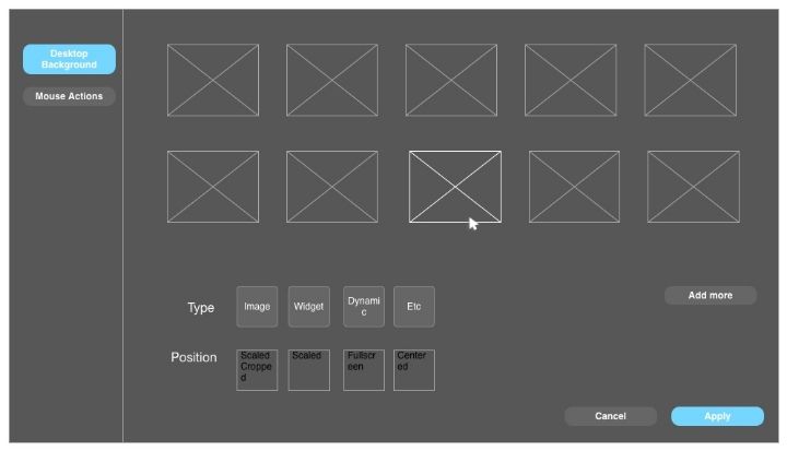
|
|
Registered Member
|
I like the idea of having icons for "Type" and "Position" somehow. Just not sure how they should look
.
|
|
Administrator
|
Considering that the "Wallpaper type" setting will affect what's shown in the "box", wouldn't it be more logical to have it above (like how it is currently)?
Problem solved? Please click on "Accept this answer" below the post with the best answer to mark your topic as solved.
10 things you might want to do in KDE | Open menu with Super key | Mouse shortcuts |


Bookmarks
Who is online
Registered users: bartoloni, Bing [Bot], Google [Bot], Sogou [Bot]


