[Idea] New QT widget style for KDE 5 by mcder3
Page 1 of 1 (12 posts)
Tags:
None
|
Registered Member 
|
Hello all the KDE community and VDG members I am here to show you the new QT widget style mock up created by my friend mcder3, the design is flat and is beutyfull, can be modified with colour schemes, the design is based on oxygen but with a flat and customizable style, mcder3 hopes you like it for the KDE 5's default style
 This can also be Oxygen 2, wath do you say? do you like it? |

Registered Member
|
sorry that I have not shown them personally, but my english is very bad 
|
|
Registered Member
|
Hi mcder3 i am Lazy, i not speack english but i reading whit browser ad-one to translate and for writing use http://translate.google.com
Maybe don't is the best but the people understand  I like it, but maybe I see too much color, and I do not like ^ and v simbol for park and expand the windows, I prefer windows style, with square and _ 
|

Registered Member
|
I like it because is superflat!
Suggestion: If you put the tabs over the blue section, they would be more pronounced. |

Registered Member
|
Since the new toolkit is out I wanted to give it a spin of my own and see if it catches attention. The idea here is to highlight what takes prominence in the folder in question. I tried reducing the shadows and also changing the blue frames around windows. I like the Oxygen font and I think that if we use it properly with a good typography ideal in mind, some great things can come out.
I also took the shadows from the active window minimize, maximize, close button. I believe it gives a 3D impression that seems foreign to the rest of the window subject. I also shrunk the fonts on the side to leave an idea of space and room for the rest of the window. In the case of the first image the idea was to make what is clicked a blue highlight and remove a more subtle blue rim around the pause button. The idea here is to make colors and actions visible. With flat design, frames are not as important as the color so highlights are done through strong colors in most cases. In the case of the wallpaper window idea. I gave it a dark background so that the images presented have more importance. I think it works well. 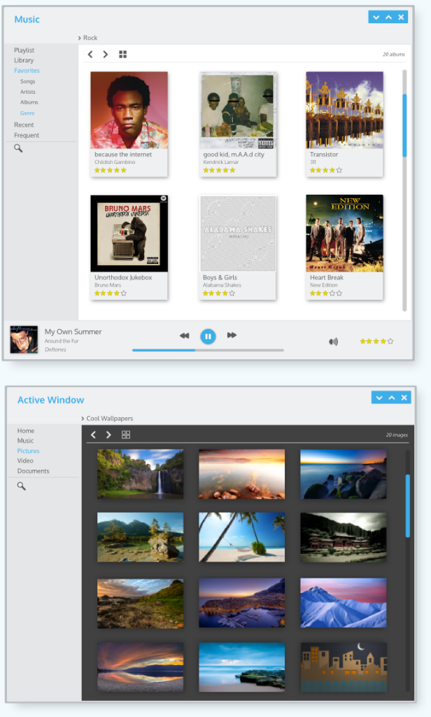
|
|
Registered Member
|
[anditosan] Realy cool. wow
|
|
Registered Member
|
|
|
Registered Member
|
the design is beautiful definitely want that out, but the only drawback I see is that the style "square" is very common in the GTK themes nice work 
|
|
Registered Member
|
mcder3 good job
I like the design
|
|
Registered Member
|
this will be my last mockup

|
|
Registered Member
|
Awesome! |

Registered Member
|
Mcder4: Beautiful work!
We should set up a second library of suggested styles and ideas and how-to's ... seriously like some kind of "Plasma Next" library of Qtcurve styles or something. I know there is the KDE Look page, but to be honest it can be a bit confusing and I would love a collection for this summer when Plasma Next comes out with unique and stylish ideas and libraries. Perhaps combine that with the various Icon designs being set up. About English: it's ok. Just go for Google-translate  The idea here is that we should make a point in being inclusive - that means understanding that it's ok to not have perfect grammar and spelling. That it's ok that it's gone through google-translate at one point and might look a bit weird and that it's perfectly ok to ask "Sry I didn't get what you said, could you rephrase?". The idea here is that we should make a point in being inclusive - that means understanding that it's ok to not have perfect grammar and spelling. That it's ok that it's gone through google-translate at one point and might look a bit weird and that it's perfectly ok to ask "Sry I didn't get what you said, could you rephrase?". We're in this together so respect is key.
KDE Visual Design Group - "Sexy by default - Powerful through cooperation"
|


.png "Linux (Other)")
Page 1 of 1 (12 posts)
Bookmarks
Who is online
Registered users: Bing [Bot], Google [Bot], kesang, Sogou [Bot], Yahoo [Bot]


