KCM Design Ideas

Registered Member 
|
Hello team,
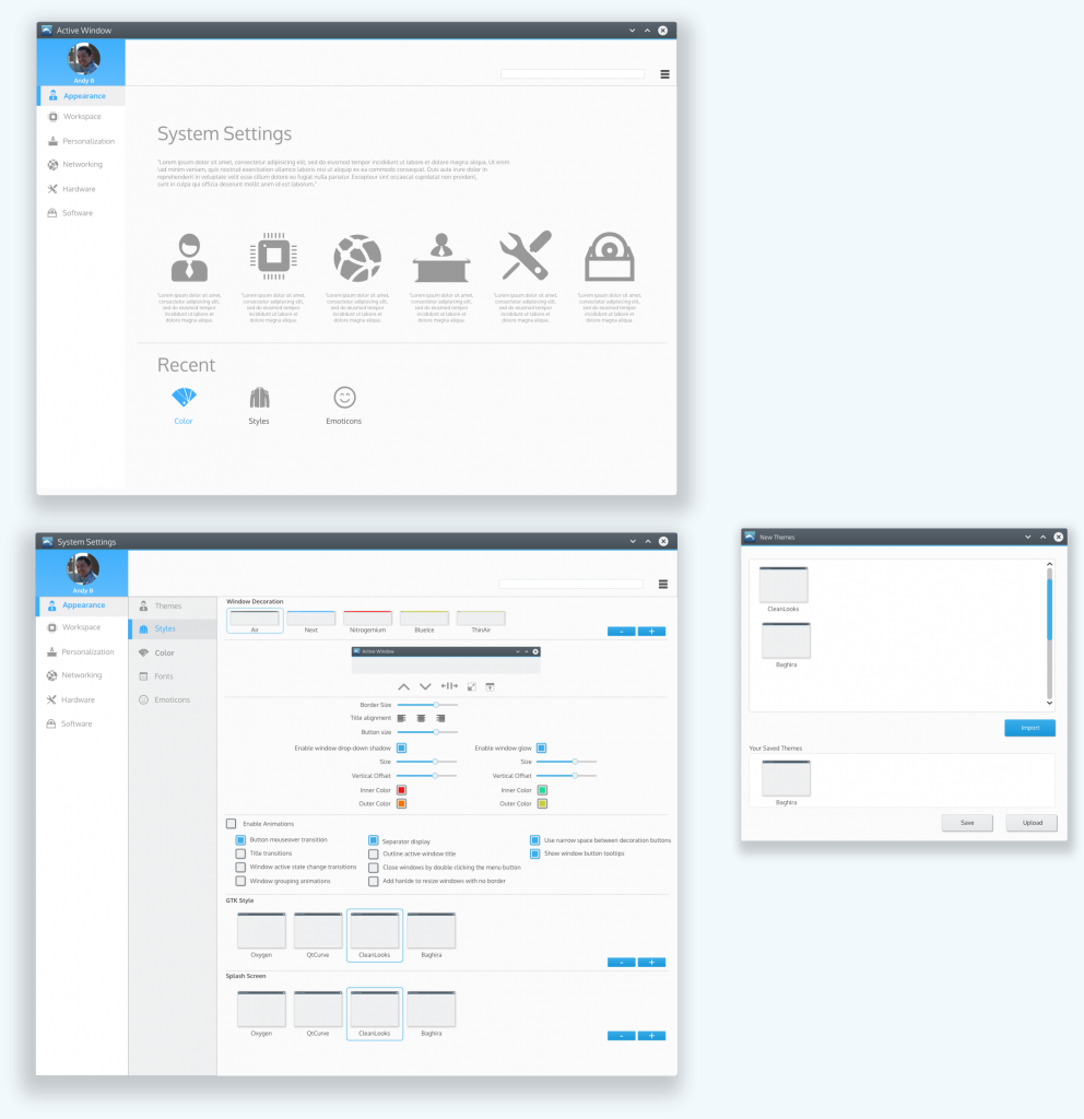
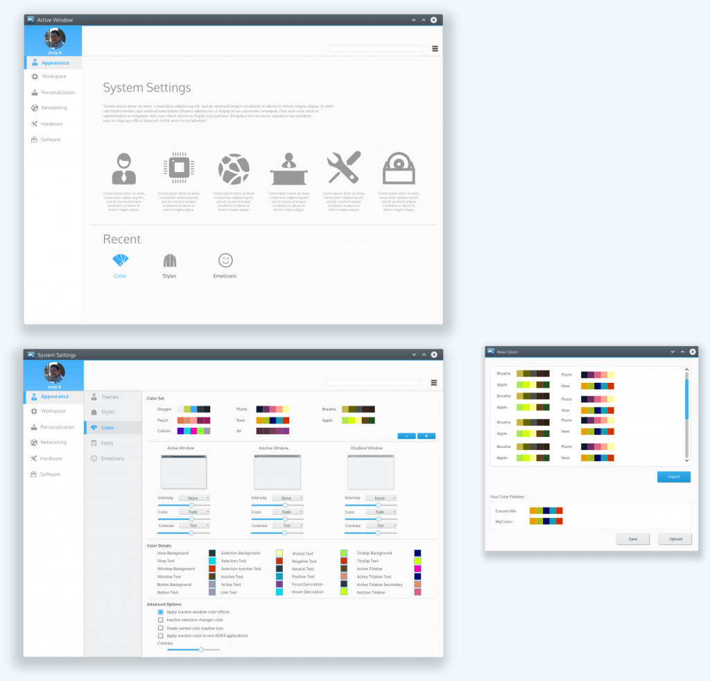
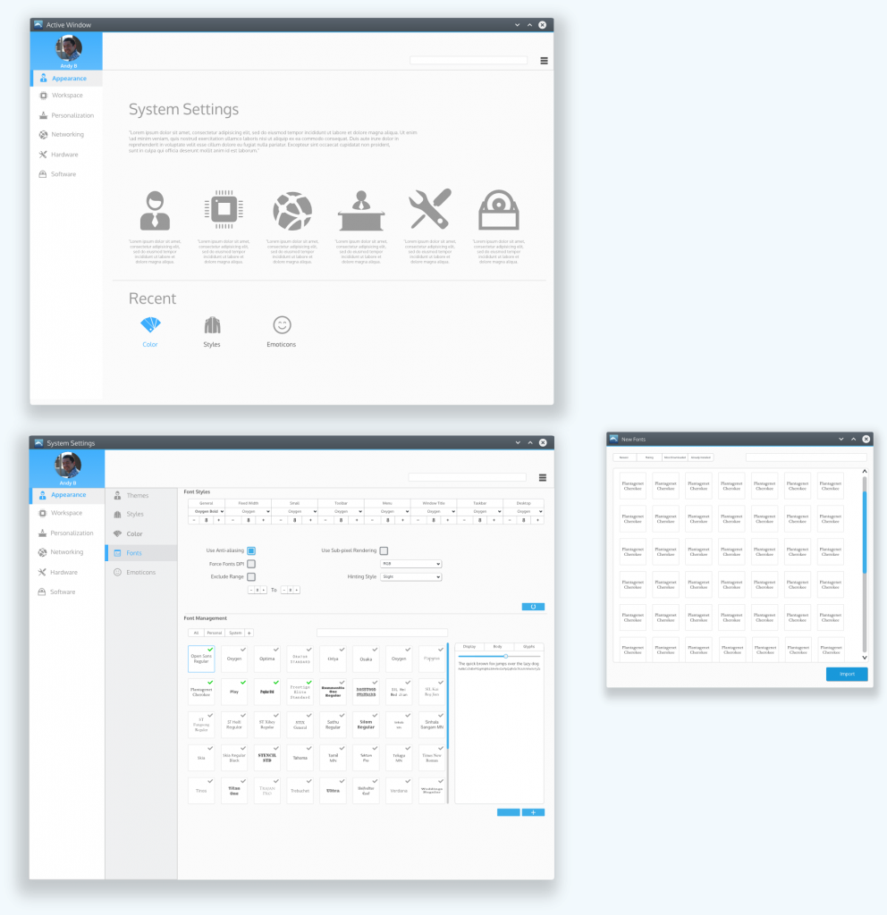
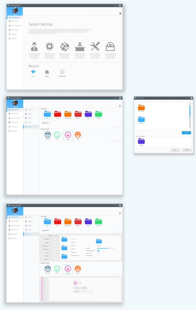
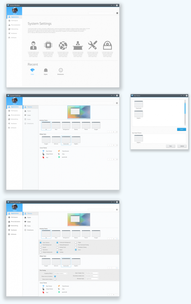
I wanted to show you what I have been working on as far as the appearance tab KCMs based on what I posted on the last thread. I want you to catch the logic behind these mockups. The first idea is to show the user that there are no tabs needed to display information. Also, flat design takes over a little stronger than in other iterations. I wanted to push the envelope on this idea to make a strong impression. Please also notice that you only have 2 levels of categories and then 1 KCM that includes "all" data used in extra tabs and extra menus. I also tried to streamline the idea of expanders for advanced settings and added universal Add/Remove buttons for anything related to adding themes, icon themes, font families, etc. I also tried to concise information with other useful buttons such as the minus-value-plus, or the minus-plus-expand. I hope you like them and then, lest work on making a few more that deal with other KCMs. Medium Size http://i1108.photobucket.com/albums/h41 ... e49e7a.png http://i1108.photobucket.com/albums/h41 ... 90dfb9.png http://i1108.photobucket.com/albums/h41 ... f4d814.png http://i1108.photobucket.com/albums/h41 ... 23578f.png http://i1108.photobucket.com/albums/h41 ... ac2ff7.png http://i1108.photobucket.com/albums/h41 ... 3abf44.png Full Size https://www.dropbox.com/s/43a58teqq63qz ... evised.png https://www.dropbox.com/s/bwx8tosgesbff ... pander.png https://www.dropbox.com/s/nz12x8ozh4wxb ... -Fonts.png https://www.dropbox.com/s/orvcgj51v4pk3 ... -Icons.png https://www.dropbox.com/s/203gjnw47fpne ... Styles.png https://www.dropbox.com/s/bjzg3m1vwcgbu ... Themes.png Sorry I could not include them here, they are too big and resizing them would have taken details out. Hugs everyone! |

Registered Member
|
I really, really like it, it'd be a great idea for a more future Plasma Next release.
Really nice, would you be interested to help at Nitrux instead? (yes, I'm blatantly stealing you from KDE  ) )
|
|
Registered Member
|
YES, anditosan you are the right guy!
One thought though: Could the sub categories be shown by a vertical expansion (you click on the category and it expandes and shows the subcategories indented => that would use the vertical space in an optimal manner) ? It seems like a waste of space if you have for example only two subcategories. Unfortunately I have no time now to do a mock up of my idea. I do not understand the logic of the user shown in the top left corner. Will other users settings be shown besides that? If not I would prefer the top area would be revamped. Small detail: Why a round picture? Does not really fit in the square style imho. Please do not get me wrong, I love your work! |
|
Registered Member
|
This is really appealing! I appreciate your work!
To bring it one step ahead I would like to raise some questions: How will it adjust to smaller screens? The design is pixel perfectly fitting with a rather large minimum width. Can you hold the high quality in design on smaller screens too? Why do you allow only 2 category levels and 1 KCM level? I totally agree with your idea of removing the tabs. But the KCMs for me should keep a certain level of complexity, e.g. show complex / advanced configuration options (and perhaps even more than now), allow Activity specific setting in the KCMS, ... - So I do not think that 1 level for each KCM will work out in the end. Suggestion for a solution Consider to strengthen the drill down navigation idea in you design. You are already using it. You could save a little horizontal space if you would use a breadcrumb and only one navigation box on the left-hand side. At the same time you can now allow KCMs to add more level if they need them. Breadcrumb + one navigation box are able to represent (almost) any complexity without the need for Tabs. Hope this helps & keep on rocking! Björn |

Registered Member
|
This what we have right now, more or less. With six categories, every has to hold about 12 sections for the approx. 70 KCMs. Sounds reasonable to me. The trade-off of another level is that you have to focus more on navigation. It brings flexibility on cost of ease of use. I'm curious about other opinions. But questions about the general navigation are discussed rather in the other thread (terrible back and forth  ): viewtopic.php?f=285&t=119951&start=255 ): viewtopic.php?f=285&t=119951&start=255
|
|
Registered Member
|
|

Registered Member
|
Nitrux would benefit from his work on KDE as well, wouldn't it? |
|
Registered Member
|
Right now yes because we're using it, but if it was up to me KDE..err Plasma would look totally different. More akin to what I've designed previously. |

Registered Member
|
|

Registered Member
|
anditosan,
These are all fantastic - really good! The only thing is have you considered how they'd appear on the minimum 1024x768 screen from the HIG (what bjoernbalazs was getting at i think)? Really great work though. |
|
Registered Member
|
Okay, but the more elements of Plasma look the way you'd want them to look, the more you can directly use for Nitrux, right? |
|
Registered Member
|
Mockup amazing, I hope you pass early in the development
|
|
Registered Member
|
Yes. |

Registered Member
|
|

Registered Member
|
This is one of the most beautiful idea I've ever seen.
|


Bookmarks
Who is online
Registered users: Bing [Bot], claydoh, Google [Bot], markhm, rblackwell, sethaaaa, Sogou [Bot], Yahoo [Bot]


