[Design Help Needed] Muon Discover design
Tags:
None

Registered Member 
|
Then we'd have two search fields on the same screen. That would be redundant, wouldn't it? |

Registered Member
|
Of course the search button is pointless now, simply forgot to remove it 
Have fun  , I haven't used vector graphics in years. , I haven't used vector graphics in years.https://dl.dropboxusercontent.com/u/633 ... -04-08.svg This is the more recent version and i'll update it instead uploading a new file.
The only issue is space. So two questions 1) How many levels deep do the categories go 2) Should the installed and source be visible in all situations I was thinking of making those buttons(in toolbar) being represented only by icons when inactive and just the active button would have a title. |
|
Registered Member
|
I think I expressed myself poorly. My idea was/is that when the user e.g. clicks on something on the front page then "installed" and "sources" would disappear in favour of a breadcrumb bar. If they click on something else then either the same should happen or it's not needed to hide them. |

Registered Member
|
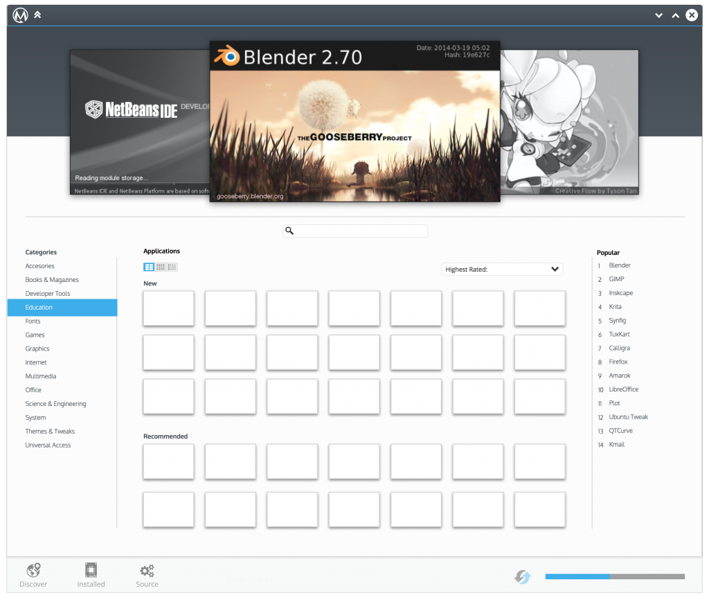
I wanted to contribute to this discussion with a mockup of my own for this app center. My main focus here is applications/software. They are the central place for the installer and I think that the design can be geared towards that instead. I added a central search and made the extra settings be placed at the bottom of the app. The center is taken by a grid of icons representing a software. You could also work more with a certain software once clicking on it. I didn't make a mockup of that but maybe later. I also moved the categories to the side and added a list of popularity on the right. I tried making the app images at the top a tad smaller to allow more space for the rest.
 Full size http://i1108.photobucket.com/albums/h41 ... 4f7b3d.png |
|
Registered Member
|
|

Registered Member
|
|

Registered Member
|
Hi, I'd like to discuss some of the solutions. EraX and andisotan, would you be able to have an IRC/Hangouts meeting one of these days?
|
|
Registered Member
|
Just add me on G+ and then we can work a time to get together! |
|
Registered Member
|
Ok, so I'd really like to start pushing these forward, but if we want that to happen we will also want to get a bit more pragmatic.
For starters, it would be good if the mockups used exclusively the MockupToolkit [1]. We need to implement this using the QtQuick Controls and the graphical resources we have available are _very_ limited. We can workaround things, but let's not consider it the norm. Also it would be _very_ good if we can follow the current workflows. I know it's less fun, but it will also help to make it possible to find the time to implement this. Thanks a lot guys! [1] https://techbase.kde.org/Projects/Usabi ... kupToolkit |
|
Registered Member
|
I see, well, I am not sure that I can change much of that as far as the changes using the toolkit, but I can try!
|

Registered Member
|
Apart from the Carousel at the top (which I think is worth keeping), most of this design shouldn't be too difficult to use the standard controls. Holler if you or EraX could use an extra hand to get the bulk on this design to using standard controls and colors or capturing using the mockup toolkit. I'd be happy to help! 
|
|
Registered Member
|
I'll be back on 20 october and than i will play with it. But if it's urgent and someone is willing to tackle with it sooner than that would be great to.
|
|
Registered Member
|
So I went ahead and took all the great ideas shared during the brainstorming phase here on this thread, and took a stab at putting some more pragmatic designs as requested for this next phase of the design. In order to help understand how to best use the brainstorming ideas, I took a stab at a vision, personas, scenarios as well as the organization of the application to help pick appropriate layout patterns. Then I took the brainstormed designs with an eye to the current Muon Discover design and, per apol's request, used the Mockup Toolkit to put together designs that will hopefully be achievable. The result are captured here: https://community.kde.org/KDE_Visual_De ... n_Discover. Feel free to review and provide feedback. Here are some initial visuals based on that effort so far:  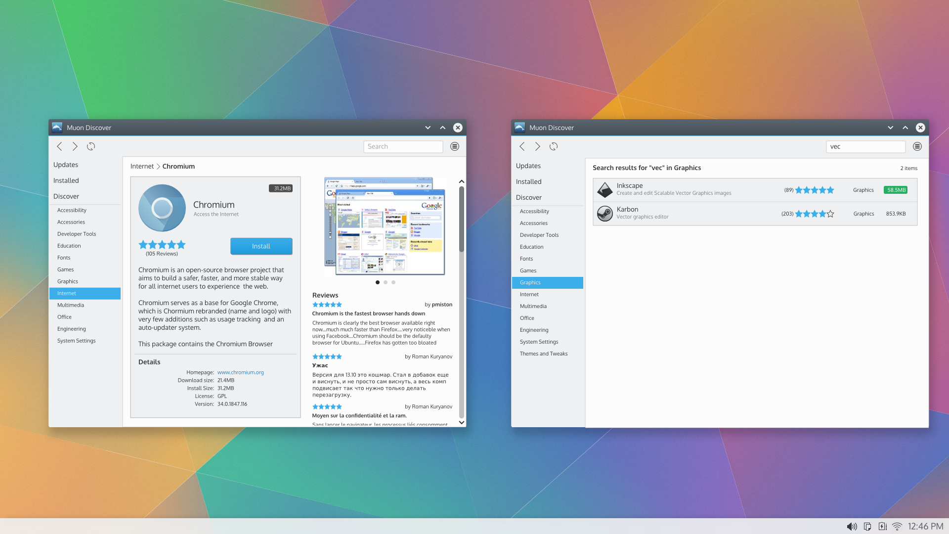 Please be sure to read the vision, personas, scenarios and organization stuff in the link above. Hope this helps!
|
|
Registered Member
|
+1000 Can't wait to see this in action. P |
|
Registered Member
|
Would be useful to have a clear indication that an application is alread installed.
|


Bookmarks
Who is online
Registered users: Bing [Bot], claydoh, Google [Bot], markhm, rblackwell, sethaaaa, Sogou [Bot], Yahoo [Bot]


