[Design Help Needed] Muon Discover design
Tags:
None

Registered Member 
|
I really like it! Hope to use Muon soon!
|

Registered Member
|
I love the direction you took. It seems streamlined (only graphics talk here) and direct. I like the reductionist approach you took. The interface is clean and I don't think there is anyone feeling lost in the interface. My personal opinion would probably be to see how thumbnails would look instead of lists. A little like this 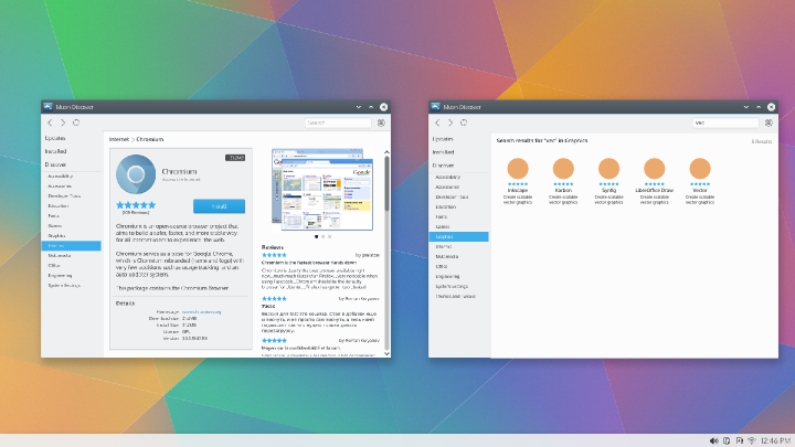 Any thoughts? |

Registered Member
|
IMHumbleO, having icons instead of lists may make the Muon window look a bit too similar to Dolphin (I don't think the list style originally proposed suffers from that issue). I'm not saying that I think users will start getting their windows confused in normal use, but when they're shrunk down to previews as they would be when using the updated Present windows/Desktop grid being discussed in this thread: viewtopic.php?f=285&t=123481 then they do start to look similar.
In that thread, the issue of where on the preview to put the icon & window title is currently up in the air - if those things are sorted so it's really, really obvious which is the preview of a Dolphin window which is the preview of the icons view of Muon then it's a non-issue but if they're not then it could lead to a bit of annoyance. Hardly the end of the world but not great if we can avoid it  My suggestion for the mockup: I REALLY like the extra 'room' & white space created by the Breeze theme. The left hand screenshot in this pair looks a tiny bit like the content area (Where it's telling you all about Chromium and showing you the reviews) is a little cluttered with lots of text: 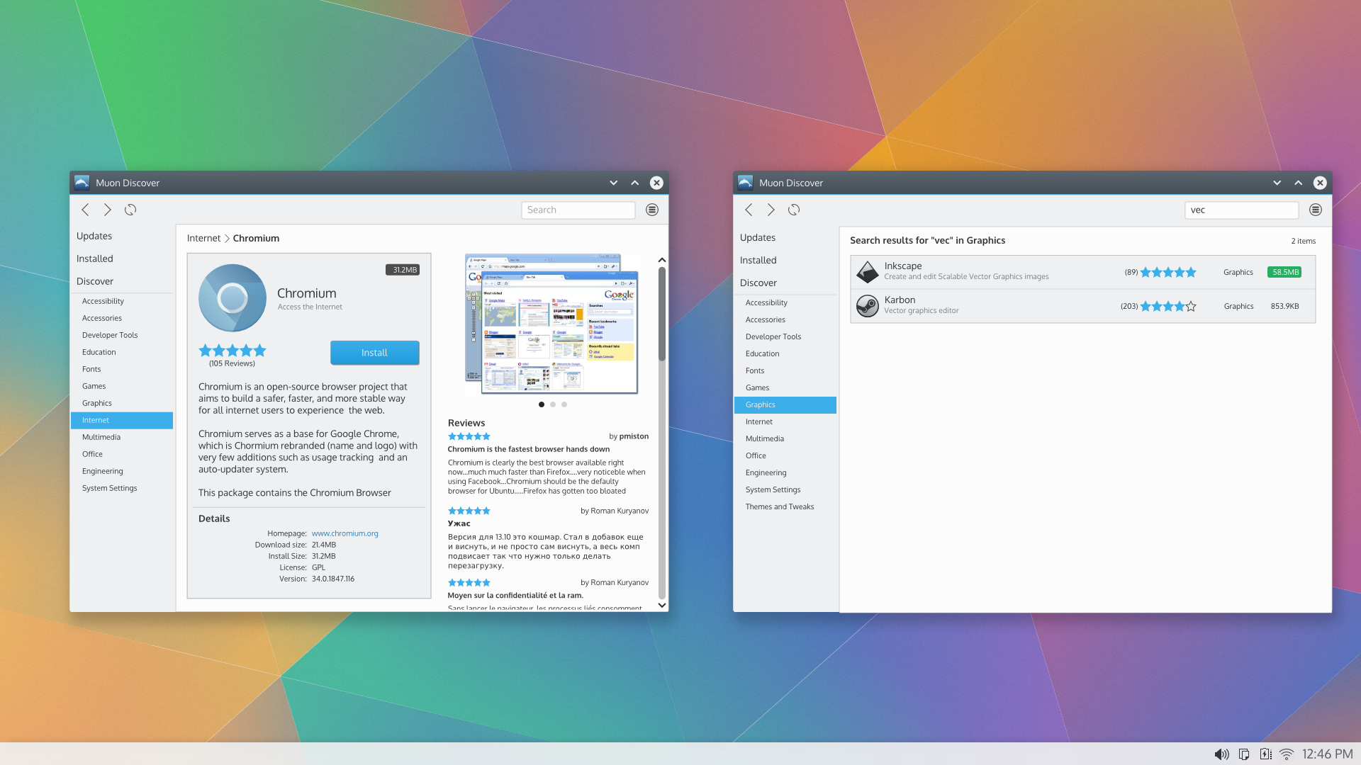 What about rearranging the things a bit so that the reviews aren't displayed on the page when it's first displayed? Two ideas that are 'inspired' by the layouts that seem to be more & more common on the internet are: 1 - Tabs - have the grey box that's telling you all about Chrome and has got the 'install' button on it, on one tab and the reviews on a separate tab. Maybe the 'Details' section at the bottom of the grey content area could be moved onto it's own tab too. Then at the top of the page & above the tabs so it's always displayed could maybe be the icon, screenshot & install button. 2 - Move the reviews to the bottom - I'm used to reviews being at the bottom of the page (Amazon & loads of other shops do it), I know that if i want to read reviews just scroll down & they'll be there. We'd put a link to scroll down to the reviews section near the top of the screen too. Of the two ideas, i think the 'tabs' one might be a bit easier to navigate round and the easiest to make the design look really polished - but tabs aren't the most popular round here  . However Muon is accessing the internet and maybe using ideas that are common on the 'net would be the best bet for this rather than trying to keep everything exactly the same as 'core' applications. I think people might be disappointed if it wasn't a web-like experience & they'd say that it was old fashioned. . However Muon is accessing the internet and maybe using ideas that are common on the 'net would be the best bet for this rather than trying to keep everything exactly the same as 'core' applications. I think people might be disappointed if it wasn't a web-like experience & they'd say that it was old fashioned.
|

Registered Member
|
Hi,
I really like how things are getting into shape! Good work! One thing I don't really understand is the move of Updates/Installed/Discover to the right and having the Categories over there. In general it shouldn't be that common to be browsing an application in a category and decide to jump into something completely different. That's why we currently keep narrowing the scope when the user decides for some (sub-)category. If the user wants to restart the search, he presses the home button (or any of the buttons in the breadcrumbs bar). |
|
Registered Member
|
apol,
The only time i can think of when I personally would want to keep switching from one category to another within the 'Discover' section would be if i'm doing a fresh install, i've got a list of applications that i want to install & for some reason want to navigate around using the mouse. In reality i'd just use the search function. Although i can imagine that if you wanted to browse around, especially if you're a new user & were looking to see what's out there, then having the categories always visible when you've gone into the Discover section could be useful - after all it is called Muon Discover. What i don't get is why the sidebar shows 'Updates', 'Installed' & 'Discover'. Wouldn't it be better, and lead to a cleaner more elegant design, if we tweaked the front screen so you can click down into either one of the 'Updates', 'Installed' or 'Discover' sections. From what i can see when playing with the current Muon Discover, the sidebar wouldn't be of any real use in the 'Installed' section - wouldn't it be better to just have the sidebar in the sections that need it & leave it out of those that don't & remove the links to the other sections from it (so remove the 'Updates' & 'Installed' sidebar links when you're in 'Discover') to make it cleaner? When you're in a section and want to switch to another one (switch from 'Updates' to 'Discover' for example), instead of having a link permanently shown in the sidebar, you could have links in the menu accessed by clicking on the 'Edit' button (if that's what it's called - the one just to the right of the search box - the circle with 3 horizontal lines in it). I don't know if you'd want to hide a home button / menu item in there to to get back to the front screen, i suspect that you'd want that button always on display so that it's more easily accessible. |
|
Registered Member
|
Well, the menu is for settings, not for navigation. In fact now you don't do any navigation there.
Furthermore, now we show Updates within Installed, the 3rd tab we show is Sources. |
|
Registered Member
|
But i still think that having the application a tiny bit more 'divided up' so that not all the navigation destinations are visible in the sidebar at all times (only the ones that are relevant to the current section) - and we don't have a sidebar at all if it's not needed in the section that you're in - will lead to a nicer & less cluttered design. Some way needs to be found of navigating between sections - if the menu button isn't suitable then we need to come up with something that is. For example you'd have the sidebar displaying the categories when you're in the "Discover' section but no sidebar if it isn't needed in the 'Updates' section. |
|
Registered Member
|
Can you create a mockup? |
|
Registered Member
|
anditosan,
I'm a bit tied up at the moment - my Nan's not firing on all cylinders bless her & needs sorting out (I'm not being lazy - honest)!  I know from being on the forum for the past few months that my graphic design skills are vastly inferior to you & others on here so one of my 'quick & dirty mockups' will add little to the text descriptions above - having said that of course i'll have a go if I get time between hospital visits etc but apologies in advance if i don't!! |
|
Registered Member
|
Oh no worries Ken, that is not a problem. I mostly ask because I don't always picture the comments. A shortcoming of mine. Maybe you could use mockup diagrams instead of full svg design. It is easier and many times, cleaner  PS: I think we could use a UI dictionary, because I always end up calling UI elements by the wrong name. |

Registered Member
|
Good question apol. There are several things going on so I'll try to provide each of the considerations that went into this:
Thanks much for your patience on this while we work on refining the design. |
|
Registered Member
|
Interesting idea anditosan.  I'll take a look to see what a "grid" style view might look like. My bias towards a list is a practical one - it just provides more space to display and compare content. |
|
Registered Member
|
I agree as well. What attracts me to the grid system is mostly because of the idea of an online store. Maybe a bit extra info can entice the user to take a closer look to an application. I think of really all the stores out there, Amazon, Chrome, iTunes, etc. |
|
Registered Member
|
Great ideas Ken, thanks. UI design is always a balance between providing enough information to be immediately useful (minimizing the interaction steps required to get information) AND providing so much information that it becomes prohibitive to interpret and act on. For as much as I'm an advocate of breathing room and spacing, I'm also an advocate of minimizing interaction steps necessary to get useful information. That often means I'm first always looking for creative ideas to present as much useful information in the available space while keeping things uncluttered. Then, if we run out of ideas, I'll start looking for interaction mechanisms to reveal additional information. Checkout this great article called Magic Ink that I've mentioned elsewhere on the forums. Sorry for the rambling, but sometimes I think it's worth it to share some of these thoughts. In the design above showing Chromium, the box representing the application is intended to remain static while the column containing the screenshots and reviews are intended to be scrollable. Application add-ons, if any, would appear above reviews. The visual design intent is to try to establish a clear visual hierarchy (where to look first, where to look next) with the application as the anchor. Based on your feedback I'll revisit that second column to see if there are ways to improve the feeling of clutter you expressed. Hmm.. maybe just showing the review summaries by default... I'll come up with something. Holler if you have any ideas there. As always, thanks so much for the feedback! 
|
|
Registered Member
|
alake,
Oh .... I really like the idea of having the grey box static (the one with the big Chromium icon on it), and the area to its right scrollable, i hadn't noticed the scrollbar. It's a great idea to to have any available add-ons shown too - i always liked that about Ubuntu. If the bit where the add-ons are was in the scrollable are below the reviews, it would easily get hidden away, buried under them all though! I do still think that if we can come up with some a way of making the right hand (scrollable) area less 'wordy' that would improve the look. One possibility to clean things up a bit, might be to leave out the name of who's left the review (to the right of the stars). Personally when checking the reviews, i'd look at them (the No. of stars & the comments) to get an idea of what people think - i'm not really that fussed about who posted it. I can see that people think that it's nice when you've posted a review to 'see your name in lights' but i can't say that i've ever really paid much attention to who wrote one myself! |


Bookmarks
Who is online
Registered users: Bing [Bot], claydoh, Google [Bot], markhm, rblackwell, sethaaaa, Sogou [Bot], Yahoo [Bot]


