[Design Help Needed] Muon Discover design
Tags:
None
|
Registered Member 
|
Why not just limit to the first two lines of text of each review instead of showing the entire review and add a "expand review" button at the end of those first two lines? |

Registered Member
|
@ken300 and @prosmaninho reat ideas for cleaning up the review area, thanks!
Oh Ken, the add-ons would go below the screenshots and above the reviews. 
|
|
Registered Member
|
So after considering the feedback provided and Thomas providing a review of the Scenarios (thanks Thomas!) the updates have been posted to the wiki here:
https://community.kde.org/KDE_Visual_De ... n_Discover Again, please review the Concept section there since the proposed design is based on what's captured there. Here are some updates to the layout design: Reduced the review section to 2 lines, removed the reviewer name, added the review date, show how addons might look 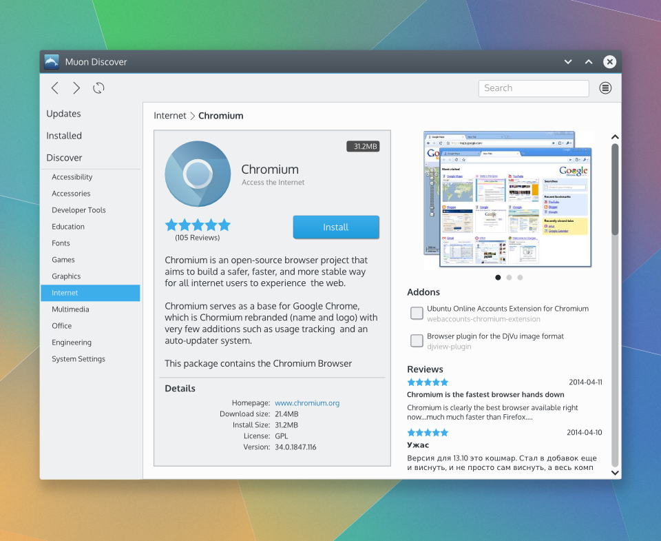 Updates section and menu button to access software sources, update settings. Installed section, sort button and progress bar showing installation in progress. 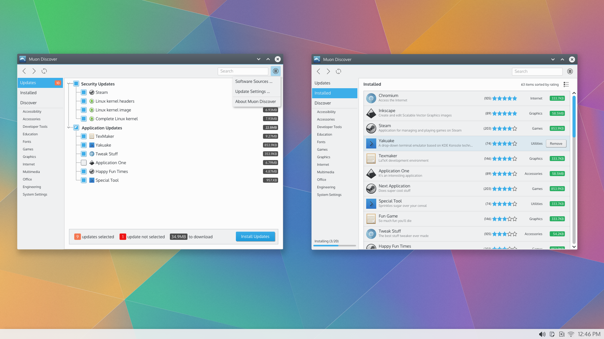 To the dev team, feel free to use as much or as little of this design as desired. The collection of all the design work for this effort is available at the wiki. Beyond providing targeted support as requested going forward, and unless there are any objections, I'll consider my efforts here complete. Hope this has been helpful! This was a fun one.
|

Registered Member
|
Hey guys! I'm loving this!
 Regarding the global UI I still feel like the categories are on the left panel because somebody said there should be a panel on the left, but I still don't see why we want the categories over there. Also I see that it steals quite some horizontal space, which makes the application description area (as displayed in Muon_Discover_mockup_4.png) quite cramped. Could we move it back to the toolbar? Maybe as a first iteration? Regarding the updates, I love that it's starting to see some love, it's definitely needed. One thing I'd like to hint at over there, is that we don't really need to be so verbose. The fact that we have some information doesn't mean we should be displaying it. I'm saying that because I'm seeing download sizes everywhere (I don't think people really care nowadays) and it's allowing for very fine-grained upgrades. Neither Susan or Santiago need that, they just want to discover new things and when there's updates, make sure they fall in. The feeling I'm talking about, it's quite well represented here: http://www.stickycomics.com/wp-content/ ... mputer.jpg Please reconsider the de-coupling of updates and installed software. They're essentially the same thing, except that sometimes, some software can be upgraded. The normal action to take there should be to upgrade all packages, if not is that the distro or provider is malfunctioning. If anything, there can be an option, somewhere, to hold upgrades, but please let's hold the checkboxes. Does that make sense? Cheers! |
|
Registered Member
|
Hi apol,
Don't spend too much time thinking the design has to be implemented precisely this way in its entirety or not at all. Even though these are hi-fidelity mockups, ultimately these are just a collection of design ideas. Thomas did share with me that this is the way that hi-fidelity mockups are sometimes seen. It's totally up to you to implement what ever elements are most preferred. So if you really prefer the navigation via the toolbar instead of the sidebar, go for it. The same goes for re-merging the updates and install.I will say for the design that I've made an effort to produce designs that aim to satisfy the HIG for this kind of content structure, as it mentions in the wiki. Ultimately though the HIG is just a set of guidelines. While they're intended to help encourage consistency in UI designs, I totally expect there will be times when maybe the goals of a particular project might compel a different approach. Hopefully it doesn't happen with every project but I accept that it is going to happen from time to time. So, no worries at all on doing the navigation as you prefer and keeping updates and install together. Hopefully there are enough ideas in these designs (and other ideas shared here) to help you proceed.  Also feel free to share any progress on your implementation or when you run into particular jam that you might need some design help to get out of. Good luck! |

Registered Member
|
Hello there,
I wanted to offer some visual changes to the great work that Andrew put together for Muon. These are suggestions only for a more streamlined interface. I reduced font sizes, aligned a few elements differently and removed backgrounds. I hope it makes sense what I wanted to share.  Full size! http://i1108.photobucket.com/albums/h414/anditosan/MuonDiscover_Anditosan_Edits_zps53870781.png |
|
Registered Member
|
Well, my plan is to come up with a result that both the VDG and I feel like it's what we were going for. I wouldn't want you to feel like I just went another way, so I prefer to reason things here rather than say A and then do B.  I appreciate the flexibility though . I appreciate the flexibility though .
|
|
Registered Member
|
Lowly user chiming in for a second...
I'm not sure I agree with this - I see myself mostly browsing around the categories to find applications rather than searching... this isn't exactly Google. It's an organized list of applications.
I didn't really understand. Are you saying no checkboxes to allow for selective updating? I sometimes update on a case-by-case basis, especially if I'm worried that updating will remove certain functionality or change the user interface significantly. If the package is important, I'll wait a week to update and update everything else immediately. One of my issues with Muon Discover (running 2.2 in Kubuntu) is that it seems a bit too simple and seems to lack configurability. I also don't really understand how it is managing the packages underneath and I wish there was the option to see more of that. Linux users like to know the nitty-gritty details of their system. I haven't been able to find good documentation on Muon Discover or a "homepage"; I know where to find the source code (but haven't read it; I'm not up on C++ and Qt) and a couple blogs but otherwise Googling "site:kde.org Muon Discover" isn't giving me much. Also I like to see statistics. How many applications per category (in a number next to the category), and so on. The statistical sharing option in Kubuntu (and other platforms) should be made more apparent on first use (popup box or default optin) as I didn't notice it for a long, long time. Most Linux users want to give this information to help prioritize development and find popular software. Not to distract from the visual design focus too much further, but on a more big-picture note: I think abstracting up from packages to applications (while allowing for viewing of underlying packages when desired) is essential and there seems to be a possibility that this project combined with packagekit could be revolutionary in the long-run by abstracting away the packaging differences across platforms. I've always wondered why there's such an emphasis on packages when half the time the packages are all bundled together to form a single application; there can be thousands of packages on a typical install supporting just a hundred or so applications, yet coming up with a simple list of installed applications as opposed to packages is often so difficult! Also, I noticed that Alex Poi is using Arch Linux... if Muon Discover works in Arch, that would be sweet. Apologies if my comments are derailing the productive conversation and work, but this seems to be the happening place for Muon right now. |

Registered Member
|
But, but... what you are describing is more along the lines of package manager front ends like Synaptic, Yumex, Octopi, PacmanXG and so on. Muon Discover gives me the impression of being an application store like the Ubuntu Software Center, The Mac App Store, Google Play and so on. Very different software in terms of functionality and their GUI. Muon (the package manager) would be better off having those extra options of knowing the inner-workings of the packages that you mention. Definitely not Muon Discover. |
|
Registered Member
|
As far as "Muon (the package manager) would be better off having those extra options of knowing the inner-workings of the packages that you mention", I don't understand how Muon could possibly be used without that? Muon is a GUI package manager. Muon Discover is not, but that doesn't mean it should be like Windows or Mac and completely hide all the details from its users. I realize that's the Ubuntu (and Mac) style, but there's a reason I prefer the KDE world to the world of GNOME and Unity.
Muon Discover is a layer of abstraction above a package manager. In the long-run, if Muon Discover works out as I expect, people will largely use it instead of Muon. That doesn't mean they won't want the option to see the packages being installed or sometimes have to muck around in those packages. But they should have the option to know if Muon Discover is installing Suggested packages by default, or if by installing a little game all the sudden they are installing dozens of new packages as dependencies. Many people, myself included, prefer to keep their number of packages low if possible so that they aren't overwhelmed by a list of thousands when they do have to dig into the package system. In addition, many people, myself included, routinely use apt-get or aptitude. If I'm using Muon Discover, I want to understand how it interacts with these applications and if it's going to leave orphaned libraries and other stuff lying around. This is just my opinion and preference. Maybe in the long-run LInux users will be happy to use this blissfully unaware of what it is actually doing, but I doubt it. |
|
Registered Member
|
But that's why there's two of them no?, Muon Discover for users who want to browse, install an app and forget about it; "basic" users. Muon (the graphical package manager) is for those who want to keep their packages in check; "power" users. Thus why I'm saying that Muon Discover doesn't have to have that.. granularity of showing the packages to the last dependency. An option is to simply have a simple and an advanced mode. The simple UI being the default. Lost in translation, perhaps, I meant that Muon (the package manager) should be the one to have such advanced options, not Muon Discover. |
|
Registered Member
|
I don't want to derail the visual design discussion so maybe we could move this elsewhere if you'd like, but Muon (package manager) is a package manager. It is not an application manager. It does not have any real abstraction. Packages are not applications. Applications are bundles of packages. Muon (the package manager) doesn't seem to know much of anything about applications. Even advanced users are often more interested in applications. It's generally easier to navigate and understand a list of 10 applications than 200 packages with assorted databases, libraries, and so on which are ultimately bundled into 10 applications. So advanced users can also use an application manager with advanced functionality.
|
|
Registered Member
|
Very nice suggestion, Andy. This looks a bit breezier (*g*) and overall friendlier. My only suggestion would be to use insert the screenshot area above the summary on the application paged. I agree with apol that we should probably not show package size in the application list. I think, however, it's quite sensible to show it on the updates screen. One concern I have though is that the mockups show that we write out what's going on more often or use ellipses. We should keep in mind, however, that English is a very information dense language and has a rather simple inflection system. Sentences can get quite long when translated into other languages.
I'm sure our translators could come up with an a bit shorter translation, but I hope you can see my point. Another thing is the use of inflections. The inflection system is rather basic, but also requires changes depending on the content being shown.
As you see "item" is inflected to reflect the plurality of the items shown. Now other languages can require such changes depending on the gender of the word, animacy, number, sound, case, position within the sentence or all of the above. This can consume more space or less, depending on the language. I really like this idea, but I just wanted to bring this up. Maybe some of t he translators can comment and tell us what they think. |

Moderator
|
@Aleix
I am happy the rework is going forward. I'd like to ask about a small but visible bit of the app: the Comments (score) functionality of Muon Discover, before the design is set in the stone. Are there plans of reworking it? Visually it's OK but its meaning is a bit "blurred": - years old score is visible, it does not always reflect the current status of the app; I may want to use Foo App 7.0 but see rants about Foo App 0.1 from 2008... one reason for this is maybe because 1. people use many other means to install software, and 2. people cannot rate the app from within the app (eg. the Help menu, right?) - no info about app version and date of comment, so no way to address the above issue - people tend to rate the overall experience, so also the distro in use is important, which may sometimes fail to provide the software properly and update it on time for user satisfaction - finally, psychology: people use the field to complain, not to praise Constructive proposal for the UX: show the score after 30 or 50 or whatever have been submitted, I think some app stores do that. Otherwise, only show comments without any score. I know a side effect would be be that nearly all apps wouldn't show the score but that's actually honest IMHO if we want to respect statistics. The topic interests me because I'd need similar mechanisms in Kexi itself for its extensions. Thoughts? |

Registered Member
|
That's a good point - at the moment the current version of MPDroid on Android is broken but if you go to the Google Play store & look at the reviews there's no mention of the current version not working, you just see loads of glowing reviews of the older versions. The older versions that worked were great but if you installed the latest version now you'd be disappointed. Maybe have the reviews arranged so that only reviews of the current version of an app appear first and then a separator or something to say 'from here down are reviews for old versions' and then the old reviews?? |


Bookmarks
Who is online
Registered users: bartoloni, Bing [Bot], Google [Bot], Sogou [Bot]


