[Design Help Needed] Muon Discover design
Tags:
None

Moderator 
|
Makes sense, maybe even some tolerance would make it better, it all depends on the release cycle of the app. There are apps with entire life sitting in 0.0-1.0 range, other like Firefox or Chrome lead to 100.0. One nice heuristics is to use release dates, but that requires manpower to collect historical data. Many reviews are negative. Among them there can be *new* reviews that are related to *ridiculously old* versions of apps. (The software distribution of Linux is here to blame first of course, pretty recent Ubuntu LTS offers truly outdated Calligra for example; who would wan't to use LTS if actively developed apps aren't easily accessible...) The "Useful Yes/No" function does not quite work for me or there's no visual feedback. Moreover if the review caption is "Sh*t" and content is "This app is sh*t", it would be nice to have moderation function (social one?). A "Report this comment" button like we see on the web 2.0. I guess a bugs.kde.org wish shall be filled for these? There can be even a general guideline "don't forget about these functions if you add comments to your web page or app" I guess. So requiring version of software is almost all we can do, moderation can address corner cases. Maybe silly (non-spam) comments can be hidden by default, so nobody will claim comments get removed randomly. A link "Show reported comments" could reveal all. And rating from reported comments would not be counted. |

Registered Member
|
After some great feedback from Aleix at Akademy I've attempted to incorporate some updates to the proposed design. Here's a sample:
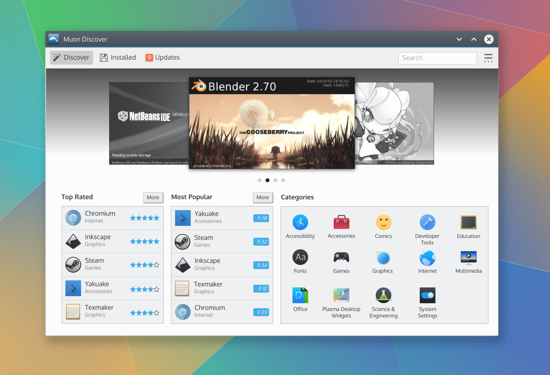 The complete set of proposed designs are on VDG community wiki page for this effort: https://community.kde.org/KDE_Visual_De ... out_Design As always, these are subject to change as needed to support the implementation. Hope this helps!!! 
|
|
Moderator
|
Very cool!
Details: 1. How about not using icons on the top bar. The save icon introduce uncertainty rather than adds value. Then the [9] icon could look as more prominent. 2. How about the Categories section also being a list, with each category showing number of apps in it? 3. Not sure but looking at competing app stores, categories may be more flat or hierarchical. Muon's one is more flat. E.g. I can imagine I am looking at Apps for some office apps or education apps, single app can be in both categories. Actually tags is an interesting approach solving that. 4. How about more clearly splitting of resources and apps? Like: desktop widgets + fonts + ... would go to resources. This is just example. Just like comics + games would go to Entertainment. 5. Since this is a Discover app: I miss a What's new section. 6. The overall layout. Excuse me that I refer to one example but look at https://play.google.com/store/apps?hl=en. It has one natural vertically scrollable area. Our design so far suggests that the three panes are not scrollable. And if they are, the result would be a bit less convenient than a globally scrolled area. I do understand changes like these are more complex. |
Registered Member
|
It looks very nice!!
 However as jstaniek said, the icon of updates could be more prominent. And IMHO having Top Rated and Most Popular seems redundant to me. Maybe we could have only one and the other could be What's New. |
|
Registered Member
|
Thanks!
Yeah, that was my initial choice , but it wasn't anchoring very well without an icon. We may need to come up with a more appropriate toolbar icon for "Installed" though. The "save" icon is the closest metaphor I could find at the moment. If some has a better idea from the current icon set I'm all ears. 
I'm trying hard to keep the clutter low and the visual balance on that landing/home screen. I'm also trying to ensure an installable app/item is visually represented in a distinct way (different from a category). So for now I'd like to keep the grid. Besides, I'm not sure how useful such information would be to the personas and their scenarios at this point in the workflow.
Actually the content structure/information hierarchy of Muon's library content was assessed as part of this effort and captured on that VDG Muon community wiki page. Basically the library has a 3-deep content structure.
Those are interesting suggestions. Though they belong with how the content itself is categorized, which I'm not sure is under Muon's control. But Aleix can better speak to that.
Sounds good to me. I'm not sure how that kind of content is exposed to Muon technically since I'm not sure typical repos add content or expose metadata in that way. But design-wise, it should use the same visual language as the Top-Rated or Most Popular lists. Maybe even replace the Most Popular list with it.
The content in those panes are not intended to be scrollable. The whole landing/home screen can/should be scrollable if the window height doesn't fit the content though. The Top Rated/Most Popular list probably does need a "See More" affordance at the top of the list though. I'll update it to include that thanks.
|

Registered Member
|
Love the direction this is moving, and here's my $0.02;
The large shadow / dark gradient in the background is extremely odd; I haven't seen it anywhere else, and it's visually overpowering. Looking at several of the designs in the Link, one thing that's bugging me is some internal inconsistency with content width; some displays are full-width, some are locked into a max width. I don't think this should be treated like a web-page (with fixed-width content); I'd like to see more traditional widgets used, which always make the most use of the space provided by the window. On some pages there are frames sitting above the content, which look like they would be scrolled along with the content, some are, others aren't; should these be presented as a persistent bar on the bottom of the application?
Reformed lurker.
|

Registered Member
|
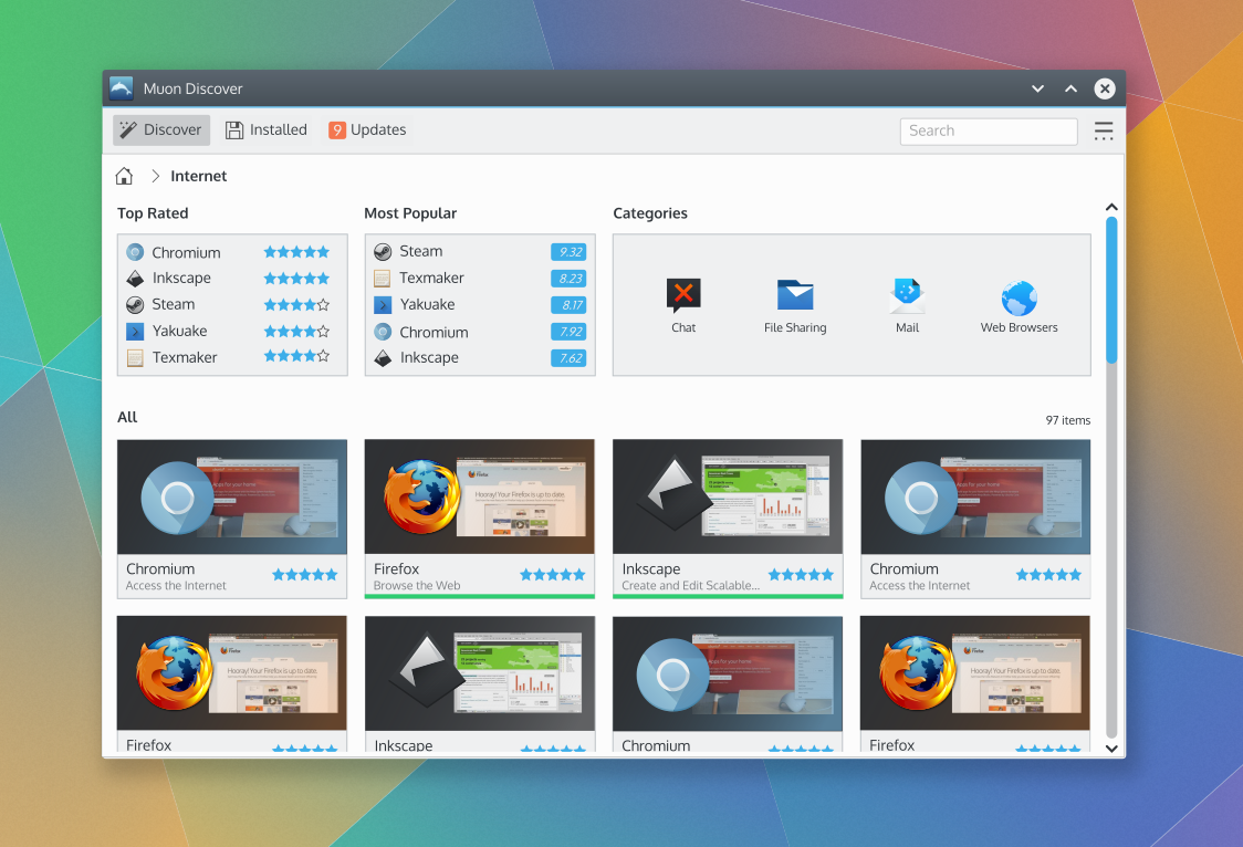
Here's a video of what you can find in the "redesign" branch.
https://youtu.be/8-W4UdkiBcc So far it includes most of the elements brought in the design wiki, except for the Application page, because there's some issues I still don't know how to solve. https://community.kde.org/KDE_Visual_De ... n_Discover |
|
Registered Member
|
Wow, really awesome progress Aleix! Wow, that's a lot of work! Let us know if there are changes on the design that would help.
As you work towards polishing here are some things I think might be worth considering:
Anyway, those are minor things that really shouldn't overshadow the great progress on this. We'll all work together to help polish both the design and the implementation into something you and the rest of the community will be super happy with. |
|
Registered Member
|
Done.
What do you mean by "Application Cards"?
Done
I had that for some time, it looked a bit off when the background wasn't solid. I could try tinting* the hover color, so that it isn't the same as the one in the Label. *http://doc.qt.io/qt-4.8/qml-qt.html#tint-method |
|
Registered Member
|
Also, here's a screenshot with the changes you requested and the tint (actually using "Qt.lighter")
http://i.imgur.com/w8Ee14l.png Question: Now we have this chromium-like bar for installation progress. There's nothing in this regard in the design I think. Should users just go to the "Installed" section then and show the progress there? |
|
Registered Member
|
|
|
Registered Member
|
Yes, that's the intent. Also notice the text of the install button intended to provide a simple asynchronous hint on installation progress: https://community.kde.org/images.commun ... up-A-6.png
The items in the grid under "All" here: https://community.kde.org/images.commun ... up-A-3.png Otherwise the updates look great. Couple more items to consider:
I do apologize for the delay in responding. |
|
Registered Member
|
That's not really possible, the spacing they have now is the actual padding within the icon. They have 0px spacing between them currently. I already checked because it also looked weird to me. I could force them to overlap, but that could break when changing the icon theme. |

Registered Member
|
which icon size do you use? 16px icon have a 2px padding I can make an 12px rating icon with 1px padding or 8px with 0 px padding. don't know which size do you need.
|
|
Registered Member
|
The requested icon is 20px (on the screenshot I showed). But it's using the svg, I'm unsure why it makes a difference...? |


Bookmarks
Who is online
Registered users: bartoloni, Bing [Bot], Google [Bot], Sogou [Bot]


