[Design feedback wanted] Converter plasmoid
Tags:
None
|
Registered Member 
|
I don't know how elegant these designs are, but this is my knee-jerk multi-selection approach. I had to drop a lot of information from the graph; instead of showing the rates relative to the current unit, it shows the rates in relation to themselves. Select the currencies to display  Displaying the currencies (with the current exchange @ $1.00)  Displaying the currencies (without the current exchange @ $1.00, cleaner but less info) 
Reformed lurker.
|
|
Registered Member 
|
Comparing multiple currencies is a different (but as well valid) use-case. I thought about the exchange rate in both directions: "Susan wants to buy a book and compares prices in UK and US, that are either 12.43$ (7,36£) or 6,93£ (11,61$)."
|
|
Registered Member 
|
I must admit I'm having trouble wrapping my head around what exactly you're looking for; you want to find out which currency has more overhead by comparing their direct exchange rates? I'm not not sure how I would represent that flow elegantly in my current mockups, and the need you're presenting is also a bit situational too, and adds extra inputs/complexity... Do you think int'l price comparison should be its own dedicated widget? That's the direction I'm leaning personally, since I think the currency converter design hit that "sweet spot" with the last revision handling functionality vs complexity. What about a dedicated "value comparison" widget? 
Reformed lurker.
|
|
Registered Member 
|
Hmm, yeah I can see what you mean Kver, it is getting a little complex..
Maybe just adding a "swap" control that simply swaps the from/to units would make it relatively easy to quickly check the conversions the other way around. Or maybe just showing the base unit conversions in each currency (e.g 1$=0.75€,1€=1.25$) in addition to the main currency conversion. One note; the currency conversion design has become quite different from the more general unit conversion design you posted. That's fine I think. I just wanted make the observation out loud in case it wasn't intentional, or in case two different plasmoids might be warranted (you mentioned that). I'm not sure of the answer, i just wanted to make the observation.  In any event cool stuff! |
|
Registered Member 
|
I'm all for splitting them into separate Plasmoids because for other units, you have only a very limited amount of units to convert to (therefore they can easily displayed all at once), whereas for currencies, there are way too many to show them all at once. |
|
Registered Member 
|
In a beautiful, ideal, utopic world where I called the shots: I would probably actually have 3 plasmoids based on the discussion of this thread;
In a less than ideal world (where I still called the shots) I would drop the Value Comparison plasmoid; I'm not proficient in QML or the plasma API so I can't exactly take any *real* work in programming these things; and with a currency converter, there's nothing stopping the user from doing an extra lookup to solve the issue addressed by the Value Comparator. That, and frankly the value comparator makes my head hurt, and I designed the thing - I can't imagine a user intuiting the thing. I meant to design the list of currencies outputted as links; if a user were to click the link, it would swap out the from/to, so if the user was comparing CAD=>AUS/GBP/USD, clicking the AUS value would make the comparison AUS=>CAD/GBP/USD.
Reformed lurker.
|
|
Registered Member 
|
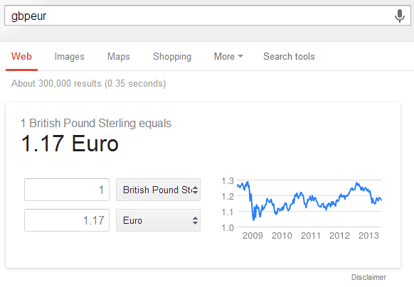
I think the Google currency converter does that job pretty well, actually.
Try entering "1 GBP in EUR" in the Google search bar, for example. What you get is something similar to this:  first, you get the value of 1 Pound in Euros. Below that, you have a spin box for each currency, where the other is automatically set to the converted value to the one you entered. That makes two-way conversion easy. And it shows an exchange rate graph, too! |
|
Registered Member 
|
Two-way conversion is the perfect name for the use-case. And either alake's swap control or the dual input should work well. In respect to the scope I'd focus on unit conversion, and create an additional plasmoid for currencies with all features including the trend graph on a separate views. |
|
Registered Member 
|
Love the idea, love the good use of typography to point out emphasis. I think the revamp looks now a lot better than the original. The easier we make it for the user to gather the data the wanted to get the better. Good design! |
Bookmarks
Who is online
Registered users: Bing [Bot], claydoh, Google [Bot], markhm, rblackwell, sethaaaa, Sogou [Bot], Yahoo [Bot]


