Extended HIG for tabs
Tags:
None

Moderator 
|
Hi,
Could we have some extra bits for tab widget guidelines? I am sorry the HIG isn't meant to be so detailed. For a "quick" start: 1. In the Appearance section: 1.1. Add "Don't just set all the tabs to the same width". The same is stated by the recent GNOME HIG. To me it makes sense even if it only codifies what's the default for Qt/KDE apps. I have checked many QStyles. 1.2. Add "Do not expand tabs to use empty space of the widget. Having the tabs expanding can lead to violation of the previous rule." ("expanding" property of the Qt tab bar, unfortunately true by default. 1.3. Add "Make tabs movable (possible to reorder) only if their pages contain documents, but not if their pages contain static application's user interface." ("movable" property of the Qt tab widget, false by default) 1.4. Add "Make tabs closable only if their pages contain documents, but not if their pages contain application's user interface." ("closable" property of the Qt tab widget, false by default) 1.5. Add "Make the tabs use scroll buttons to scroll tabs when there are too many tabs." ("usesScrollButtons" property of the Qt tab widget, by default style-dependent.) 1.6. Change "Use nouns to describe the content" to "Use nouns with header capitalization to describe the content" 1.7. Add "Avoid long tab names" advise. 1.8. Add "Do not use abbreviations (acronyms such as HTML are allowed)" advise. 1.9. Add "Avoid too long tab names". 2. In the Behavior section: 2.1. Add "Adding new tab by the user is allowed only if their pages contain documents, not static content. In this case "Add Tab" button should be used as a corner widget placed on the right hand of the tab bar. The "Add Tab" button should not be displayed in the application toolbar." (Corner widget attribute) 2.2. Add "Keyboard shortcuts or menu items should be added to provide easy access to the "Add Tab" action, if it is present." 2.3. Add "Provide a context menu on each tab if their pages contain documents. This menu should only include actions for manipulating the tab itself, such as Move Left, Move Right, Move to New Window, Close, Close All, Reload." 2.4. Change "If you want to group static pages, e.g. in case of configuration content, use a list view with icons." by moving it to a separate item as: "Do not use too many tabs. Use a list view with icons and associated pages if there are many pages or if you want to group static pages, e.g. in case of configuration content. This also gives ability to present hierarchy of pages as a tree." 3. Change "for only one page (but do not hide the tab when more pages are expected)" to "for only one page (but do not hide the tab when more pages are expected, for example in web browser)" 4. Other more open questions: 4.1. How about allowing icon-only tab widgets placed in a sidebar when it's too narrow for placing text-based tabs? 4.2. Vertical tab bars - special case: how about explaining if they are allowed to control visibility of side panes (example for Kate: http://i.imgur.com/q5yVXCU.png). Or is it already mentioned by the HIG elsewhere? 4.3. We shall decide on which side to put the "Add Tab" button (see 2.1. above). My proposal is right hand, because this reduces differences to existing solutions: Rekonq (http://i.imgur.com/p6ZrQ8y.png), Firefox, Safari, Chromium/IE/Opera (these three not quite in a corner though but as a small extra tab). Konqueror (http://i.imgur.com/G6HXvJH.png) and Konsole (http://i.imgur.com/qf5fZ3I.png) are different, they put the button on the left hand. 4.4. How to provide the Close Tab action? I propose "place the button on tabs, instead of a corner widget". Again, symmetrically, Konqueror and Konsole are different (compare to 4.3). All browsers mentioned above provide Close Tab buttons placed on the tabs by default (see also 1.4. above, Qt provides means for that, off by default). Firefox is particularly clever by hiding the Close Tab button when tab is too narrow (http://i.imgur.com/fDernal.png), while Rekonq browser does not (http://i.imgur.com/Mw9dNdC.png). This Firefox's behaviour probably helps avoid potential risk of accidental closing the tab when user wanted to just change active tab. If possible I'd like to propose Firefox's behaviour as an recommendation. 4.5. Maybe add a recommendation regarding tab shape ("do not use triangular shape"): http://qt-project.org/doc/qt-4.8/qtabwi ... Shape-prop 4.6. Maybe add recommendation regarding document mode (when to use) http://qt-project.org/doc/qt-5/qtabwidg ... tMode-prop 4.7. Maybe add recommendation regarding elide mode (when to use) http://qt-project.org/doc/qt-5/qtabwidg ... eMode-prop 4.8. Do the implementation details (links to the Qt APIs for example) fit to the Implementation section? |

Registered Member
|
Thank you for working on this! For the sake of readability, consider everything I do not comment on as a "+1" from me.
These two points are redundant, aren't they?
What's the difference to 2.4?
Hm, I'm not sure. Vertical tabs have the disadvantage that one has to read vertical text, which isn't very comfortable. Other takes on this?
I'd vote for right-hand side, too. Browsers are the most used applications, so being consistent with them makes sense, especially since there is no strong argument for the left-hand side.
Yes, totally makes sense. In the "new" Australis interface, Firefox doesn't make the tabs very small anymore, but still removes the close button once the width goes below a certain value, which makes sense. Having the close button cover most of the area of a tab is a definitely thing to avoid.
Waitaminute, why is the shape of tabs defined in the widget? Shouldn't the style decide that?
Yes and yes.
Yes they do, that's what this section was meant for (it's only empty in most HIGs because we lack developer involvement in the HIG. These are great suggestions, really, thank you again! |
|
The "shape" includes position (NSWE) as well as "triangular" or "round". This is mostly a windows thing. The Qt builtin styles actually honor this, but no 3rd party style (Breeze, Oxygen, QtCurve, Skulpture and certainly nothing i've ever written) makes a difference. And the triangular variants in the builtin styles are particularily ugly. |
|
+1 for ltr:right, and probably ensure it's put at the end of the bar and not behind the last tab (moving around all the time...) |
|
Moderator
|
@colomar thanks so much for so prompt review! Right, one paste too far... (below skipped OK'd items)
I am sorry, I planned to paste an example from KDevelop, but couldn't find a good fit, so here's one from Kexi (and below also other Calligra apps):  Notes: - there are 3 tabs, if all of them present names, even with a small font set it would be overkill for the horizontal size; compare to the Calligra Flow app: https://www.calligra.org/flow/attachmen ... screenshot (lower-right side of the window, 3 text tabs) or MS Visual Studio http://core0.staticworld.net/images/idg ... 5-orig.gif - many apps such as advanced graphics editors or modellers, CAD apps, use this concept - it saves more space than a toolbox, and if you look at the Calligra Flow app example, to implement hierarchy one would have to nest tool boxes -- insane idea If there's a big NO, I'd be grateful for alternatives. (By the way, Breeze doesn't too style these icon-only tabs too well, but once this or different solution is approved I plan to make sure it's perfectly implemented)
I mentioned these elements in the context of Tabs HIG but perhaps this do not fully fit here. These tabs' purpose is not only to switch between the pages but also to let the user to return from the "collapsed" mode, example for Kate: - sidebar page visible:  - sidebar page collapsed by clicking the Documents tab:  In case of Kexi, it's a bit different: - side page visible, tab is not, [x] button provided to collapse the sidebar:  - side page collapsed, tab appears on the side (like in: sidebar has been minimized), clicking it will restore to the original state:  Notes: - In theory, there may be so many tabs that they form 2 rows: https://www.youtube.com/watch?v=T_HyS23mekA. The number depends on how many plugins have been enabled by the user. In practice it's rather rare except for the most complex apps and use cases. - The tabs of this sort can be aligned to left/right/bottom (any number of them), what can lead to this state (MS Visual Studio again): 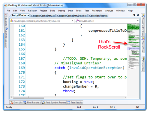 - In fact the tabs look like buttons. - For example one can imagine these tabs displaying only icons, and no text. On the other hand as you can see in the MS Visual Studio example above, there are also horizontal tabs of this kind, where text is perfectly readable. Qt Creator app uses the tabs only at the bottom side: http://shinnok.com/rants/wp-content/upl ... ages-2.png and again, they look like buttons
Historical reasons in Qt  But also this type was intended to use for document pages and the default type for GUI pages. So the same app may want to use both types for given Qt Style. But also this type was intended to use for document pages and the default type for GUI pages. So the same app may want to use both types for given Qt Style.See the Calligra Sheets' sheets tabs at the bottom:  Newer Excel drops this style for normal shape of tabs (that are still differently styled, white, more like a part of the document): 
Cool I can paste the implementation hints then when we finish with this thread. Thanks for the review again! |
|
Moderator
|
For everyone not getting this bit about Add Tab, it's this:  vs this:  Initially I had the same perception as you. After some more research I am more in favour of the former. And here's the research here:
and here:
If the former is approved I can't wait to see the Designers to present branded solutions for this concept:   (how about a narrow and a slightly bit shorter tab?) Tech note: I believe this can be delivered in a Qt-style friendly way by adding extra tab. Of course a new class (KBrowserTabWidget?) in KWidgetsAddons lib is needed (and for Qt Quick controls) but the widget is useful anyway because Qt's QTabWidget/QTabBar has no close button / new tab button setup. Delivering this will be a means for consistency in app that use tab widgets for displaying documents (see e.g. inconsistences between the KDE browser and Konsole). |

Registered Member
|
thanks for doing this. This thread is quite interesting jstaniek.
I'm for consistence for the tabs. And as I read your post and saw the screenshot from Flow and also from visual studio I have a second question  Make tabs movable and closable. We have on every widget this icons, but does it make sence that the user can close tabs every time. for me simple by default - would be without the close/movable icon for every widget powerful when needed - on right click you can say unlock and than you can close/move the tabs. it would also be the same behavior than at plasma widgets. the gui would be much easier to understand. |
|
Registered Member
|
that you have two close buttons is for me more strange, but +1 for new tabs on the right to the last tab. |
|
Moderator
|
Thanks. If I understood correctly: on this screenshot there are no tabs that present document pages. I proposed the HIG recommendations for movable/closable only for tabs with document pages. The same goes for the "Add tab" button. That's the "powerful when needed" brings the question when (and if) something is "needed". It's easy to add. But sane usability studies lead us to decide when *not* to add If you ask, there's no point to close tabs of static "GUI" pages. I've not seen that in the wild and it feels dangerous. Some history. Regarding reordering, I know in the times of IDEAl interface of KDE3 there were options to move tabs used in sidebars for example, used e.g. by IDE-oriented guis of Quanta and KDevelop and Kexi, tab/tabbar/toplevel modes, both usability and tech mess, really (I've been among people who debug it) . For a long time newer MS Visual Studio had it. I don't believe this gives a lot to users; the modified GUI also quickly departs from what's explained in the application's documentation (we have it and read it right??  ). ). Now if you run even just Qt 4 Assistant, there are like 4 tabs, you can undock them, then dock again. They seem to always go back in the order expected, based on hierarchy of tabs designed by the authors. I think the intention was to keep the order, so moving using drag & drop isn't available too.  Qt Creator, with its distinct UI is very usable, I have never seen a need to reorder, the needs are covered by ability to hide any dock (and thus tab). It numbers the bottom-side tabs, gives Alt+1, Alt2, .. shortcuts, so reordering them would maybe cause more trouble than good. Also let's look at KDE Multi Tab Bar (still discussed here) for example in Kate (http://wstaw.org/m/2014/10/23/plasma-desktopRi4023.png). Its button-like tabs are only clickable, not closeable nor available for reorder. They can disappear if a plugin is unloaded/disabled by the user, but this is different level of interaction (a pattern of GUI/feature-set customization through plugin management). These tabs can be actually moved across window (a consequence of enabling floating docks) but this differs from app to app, I recently disabled this in Kexi knowing it can cause more mess for the user than flexibility. Anyone who experienced vertical dock displayed across a horizontal surface, stealing the precious document area (for example in Calligra), knows what I mean. Calligra contributors spent months on tuning this stuff after reports from users that they messed the GUI by accidental drag & drop. False flexibility is also a trouble for setting defaults, I spend weeks to implement loading/saving states of Kexi panes so user isn't surprised on the first and subsequent run on the app. We give ability to customize toolbars (using quite useful but already dated toolbar editor) but not to customize menus and 'static' tab widgets. (actually perhaps this could be noted down in the HIG too at different level such as a Customization chapter?) |

Registered Member
|
I wrote a long reply - and lost it on post since I was logged in the meantime.
In short: I added your proposal to the HIG with a few changes, using blue font for now. In general I would suggest to keep guidelines simple. Therefore I would not recommend to use icon only or vertical tabs being aware that Kate and KDeveloper violate the HIG. But any new application should not need to read all the if-thens. Open questions are functions with tabs (where to place and when to show). An option is to not show the close button at all relaying completely on short-cut and context menu. If we go with simple/powerful we should have an overall setting for it. PS: Great and well elaborated contribution, Jarosław! As always 
|
|
Registered Member
|
when I saw this floating design first time, I say whow that is so cool you as the user can change your apps in every part. But when I read your post, I have to say you are right. I don't change the standard arrange of dolphin, amarok, ... Olso the HIGs say keep the GUI simple only complex apps should use tabs, ... And when the development of moving widgets are complex, also this complexity should only used when needed. |
|
Registered Member
|
You have the tab with the tab name and on button the widget name with extend and close icon. Do we need the Search header and close button in the widget when there is a tab with the same information 
|
|
Moderator
|
A mockup follows. Konsole before:  Konsole after: 
|
|
Registered Member
|
-1 for both (with little advantage for the new option) +1 to have it as hidden feature (context menu, shortcuts, main menu) |
|
Moderator
|
Thanks so much Heiko. The blue edits look ok. I am all for simplicity, only universally useful recommendation, otherwise devs won't bother to visit the pages. There are links to implementation, would it make sense to move them to Implementation section? They also depend on Qt Widgets, eventually hints for Qt Quick Controls (maybe can be presented in a table). Also, how to refer to atomic recommendations is still a question for me, maybe number them like HIGTABS-1, HIGTABS-2 ... ? Like is used in requirements analysis. Please share your habits, proposals, easier, better. I'd just love to be able to refer a defect by number, e.g. in a wiki page, mail, or bugs.kde.org, without pasting entire sentence of recommendation. As for the vertical tabs, I am curious what could be proposed, I understand HIG is not a place for pasting discussion, rather final recommendations. Regarding the Close button, it's a matter of scenarios at hand. On request I recently added Close All in Kexi and it'd enough to put it in a context menu. However I have learned that users may want a fine grained control, say, they have 10 tabs opened (closely related to their workflow, and want to selectively close 5 of them. A small close button for each tab is handy then: 5 clicks and 5 movements and they're done. Context menu requires 10 clicks and 10 movements. It's interesting that with the "close button in the corner" approach there are also 10 clicks and 10 (potentially even longer) movements too, plus more difficult user's focus (from the tabs to the Close button and back). Looks like such a corner Close button approach kind of violates principle of task locality. Now a bonus. If the corner widget on the ltr:right hand is used neither for the Add Tab button not the Close Tab, we have a spare place for a nice stuff like a button with a drop-down list of opened tabs, presenting full names (that often are shortened within tabs using elide): http://main.makeuseoflimited.netdna-cdn ... png?f875ef Thanks! |


Bookmarks
Who is online
Registered users: Bing [Bot], Google [Bot], kesang, Sogou [Bot], Yahoo [Bot]


