Design Request: a new Present Windows and Desktop Grid
Tags:
None

Registered Member 
|
If you were to present this graphically, what would it look like? |

Registered Member
|
I was actually attracted by this mockup:  It reminds the windows swticher, presenting the list of workspaces vertically and on the left - which is in my opinion the best choice. But if i could make the effect configurable (which takes as 'doable' the fact i can make it at all - task that i might not be able to accomplish  ) the best thing would be to leave the user the chance to configure the layout of workspaces list. As in: display it on top, left, etc... ) the best thing would be to leave the user the chance to configure the layout of workspaces list. As in: display it on top, left, etc...Also, i would just set a margin only on the side of the screen where the WS list resides. So the lineedit would appear only on input events, and within the wall area. |

Registered Member
|
To make it a more uncluttered what about:
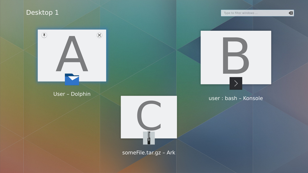 When 'Present windows' is triggered you see the above view with the windows on the current desktop only with the name of the current desktop displayed in the top left - in this case Desktop 1. If you hover the mouse over the title Desktop 1 then the Desktop switcher is displayed - the desktops can either be selected with a mouse click or the scroll wheel. If you had a small number of desktops & they could be displayed in a column, it would look like this: 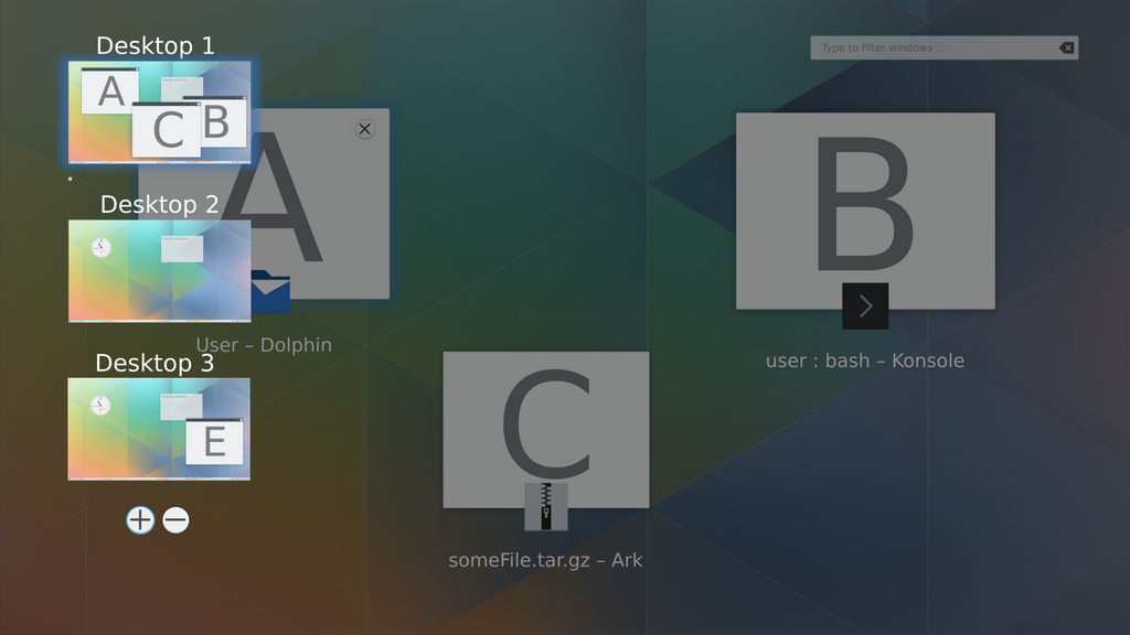 If you had more desktops & they were displayed in a square then it would look like this: 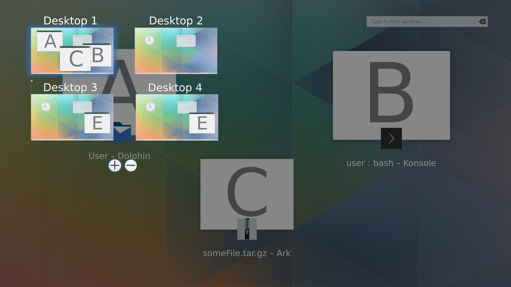 I've uploaded the .svg of the mockup to share.kde.org in the folder 'Visual design group > svg_mockups', filename: Present_windows_and_desktop_switching_idea-123481-Ken300-1. There's only one file so that storage space isn't wasted - the file contains layers that can be turned on & off to show the views above. Apologies but i didn't have a lot of time to do these mockups so please ignore any alignment issues! 
|
|
KDE Developer
|
I like the first mockup. With the second and third I'm not sure. Out of experience I know that the windows in the desktop thumbnails are too small to be recognizable which then raises the question on why show them at all.
|
|
Registered Member
|
@ken300: the idea of displaying the desktop list on hover seems not bad at all. But instead of hovering just the WS label, wouldn't be better to just display them by hovering the edge of the screen? (Kind of a cheap electric border)
@mgraesslin: indeed it's not much useful, and to me we can just display a rect showin' just the wall of the desktop and its name/number. Although a possible use of applications thumbs inside them would be DnD windows from a desk to another. But well, doesn't sound useful if one can't recognize the app
|
|
Registered Member
|
sorry, posted twice.
|
|
Registered Member
|
My thought was to have the tiny preview windows on the Desktop switching screens only showing the icon of the application and not the actual content of that window, so something like: The larger windows of the initial Present windows screen (so the larger windows in the background with A, B & C on them in the mockup above) would show the content though. One problem with that idea is that you wouldn't be able to differentiate between multiple windows of an application on different desktops but at least as the previews are so small you'll be able to switch between desktops really quickly to find the one you're looking for. Wouldn't the filter/search on the Present windows screen take care of looking for a particular window of a particular application though? On the Present windows screen you'd just type for example Dolphin & it would show all the instances of Dolphin from all the desktops with thumbnails that should be big enough to tell which window is the one you want. |
|
Registered Member
|
This looks great, but I still miss Activities in the equation.
In any case, kudos for tackling this and all the best of luck fleshing it out! 
It's time to prod some serious buttock!

|
|
Registered Member
|
Here's an idea!
I wanted to take a lot of your input and also include activities into it. In this mockup, the interaction goes like this. 1. Active applications and recent applications show in the center area, from which you can drag into a virtual desktop or an activity. 2. Recent applications section will display recently closed applications that you could bring up. Like a dock idea. 3. You can add/remove virtual desktops or activities using buttons at the top right of each section 4. Click the settings menu to bring up System Settings to tweak the behavior of the present window application 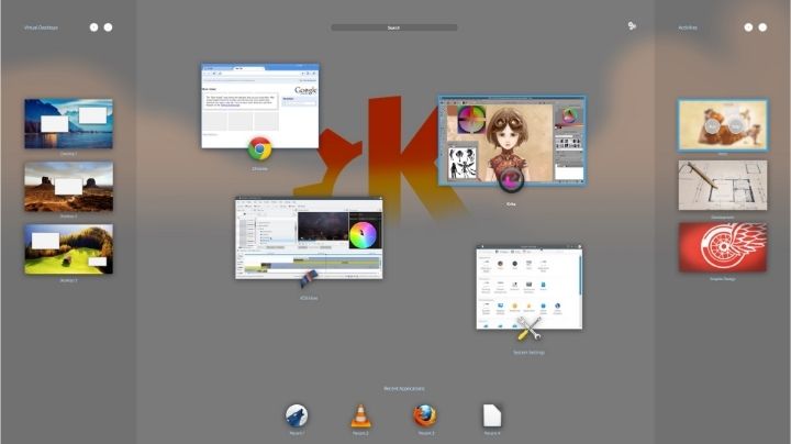 And then the annotated version 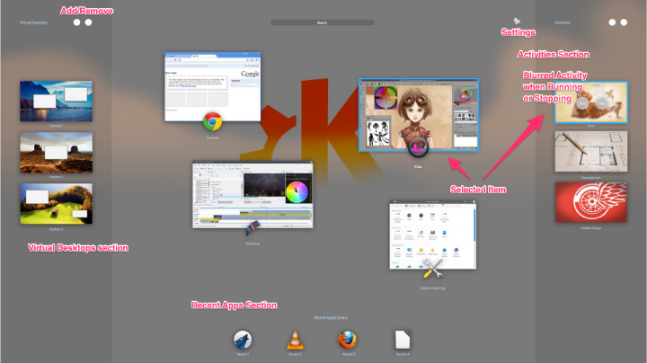
|
|
Registered Member
|
Ah! Brilliant! Just a few remarks, which you may feel free to ignore, if it complicates everything too much.
I find this really neat and in my use case a must! But the way I use Activities right now, I sometimes share a window between more than one Activity (e.g. KMail at the same time in “Communications”, “Work” and “Current project” Activities), and I can’t see how I could do that with your solution. Another question is what about the “sticky” window option, where a window is present on all Virtual Desktops (personally I rarely use that, but some might).
Ah, I would have expected the recently selected (running or closed) windows instead. Kind of as a replacement for alt-tabbing, but transcending Virtual Desktops and Activities at the same time. If your suggestion was implemented as a default and there were options in the settings to select whether to include/exclude closed/running windows (or even change to “most commonly used”, for those who like that), it would be even cooler.
Neat! I love that – one place to rule them all!  P.S. It would be even better if you would host the pictures on KDE’s ownCloud (see this thread for details)
It's time to prod some serious buttock!
|
|
Registered Member
|
|
|
Registered Member
|
Anditosan,
Let's get the moan out of the way first: I think that your design skills are brilliant and i love almost every mockup that you've ever posted on these forums but IMVeryHumbleO, the mockup below seems to me a bit complicated & fussy and IMO doesn't seem to fit in too well with 'Simple by default....' idea. The rest of KDE is becoming more elegant by default but if i saw this as a new user i'd think 'this KDE is a bit complicated just like people said..' - sorry. At first glance i really liked the Recent Applications idea but after a bit of thought came to the opinion that it would just provide another unnecessary way of launching apps. We've we've already got a Kickoff/Kicker menu that's always on screen on the taskbar and whatever shortcuts you've chosen to add to the taskbar or desktop and Krunner too. Why would you trigger the Present windows screen & launch apps from there when there are so many other ways?? I think we should leave that idea and make the Present windows screen simpler - just my thoughts. The way Activities and Desktops interact is currently being discussed on the thread viewtopic.php?f=285&t=126253&p=334536#p334536 & depending on what the outcome of that discussion is it might not make sense having them so separated with Activities on one side of the screen and the Desktops on the other, to my mind they'd maybe be more intuitive and usable if they were more 'together'. The positive bits: One thing that your mockup addresses that mine doesn't was how to move windows to different desktops or activities - being able to drag & drop them is essential i think and something that definitely needs addressing in my mockup. I do like the way you've done the icons & text below for each application window that's running (in the middle of the screen), they're great! Again apologies if i sound too critical! |
|
Registered Member
|
anditosan, beautiful mockup design wise.
However I do not like the recent apps section, as it clutters things. Activity switcher and desktop grid combined is very nice and should be the way to go, though I think the representation design wise in your mockup, is not the easiest to understand. Virtual desktops are orthogonal to activities, so the desktop switcher should look embedded in the activities switcher, which is not the case in your mockup, both look equivalent. I would suggest to make either of the switchers horizontal and make the virtual desktop switcher visually sunken, so that the hierarchy is visible. My idea: Activities are hard to present visually, to not confuse them with desktops, since an activity consists of one or more desktops. I would represent activities as tabs, like in a web browser and the "pages" would be the desktop grids. Space efficient and rather easy to understand imho. Implementation wise I am still missing independent numbers of virtual desktops for different activities. Activities are a really nice concept, however the implementation currently still leaves a lot to wish. Maybe I'll come up with a mockup, to show my idea. Though please try to be constructive and don't simply say "too complicated", rather suggest how things could be made easier to understand. |
|
Registered Member
|
Anditosan,
apologies, i've just re-read my earlier post - i still stand by the criticisms that i mentioned in that post but i felt i should post again to clarify that i do like the style of the mockups. I understand that your mockups are complex because of having access to both Activities & Desktops in them. I do think though that if the relationship between Activities & Desktops is being discussed elsewhere (see that Rethinking Activities thread) and this thread is discussing how Activities & Desktops are presented to the user on the Present windows screen, then doesn't it make sense to consider both together so that we end up with a well thought out system that's intuitive and easy to interact with (and not overly complex)? |
|
Registered Member
|
Here is my proposal :
 The main purpose of this concept is to quickly see the opened windows, and organise them in desktops and activities. Desktops and activities are no longer considered orthogonal. A desktop belong to an activity, and is only a group of windows. This means that a desktop is deleted as soon as there is no window on it (just like Gnome-shell). All desktops in the same activity have the same wallpaper, and it is impossible to give them a name anymore (feature reserved for activities). To create a new desktop, drag it to the right desktop with the "+" sign. You can rearrange the order of desktops by drag-and-drop. The search fields search a window in any desktop of the current activity. Hovering a window highlights it in the thumbnails. If more than one activity is started, the left panel appears, showing only running activities. Only switching between running activities is possible inside the effect. For more advance management (start, stop, rename, create, delete), a link to the existing activities manager is provided at the bottom right. You can move a window to another activity by drag and drop on the left panel. You can also move a whole desktop to another activity by drag and drop. You can switch between desktops using the shortcut Meta + Left/Right, and between running activities with Meta + Up/Down. If only one activity is running, the left panel doesn't appear to not bother users who don't use them. Comments are welcome ! |


Bookmarks
Who is online
Registered users: Bing [Bot], Google [Bot], kesang, Sogou [Bot], Yahoo [Bot]


