[Design Help Needed] KCM for pointing devices
Tags:
None
|
Registered Member 
|
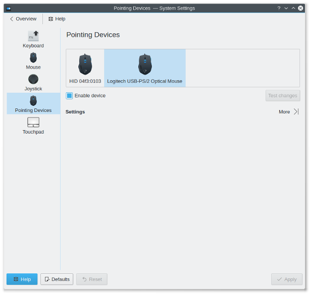
Brilliant. That's how it was supposed to work including the 'abuse' of the preview section for a secondary selection. (The concept of a preview was controversially discussed with the notion that we cannot provide a good preview with every KCM.)
However there is still some room for improvement - presuming this solution has common consent (I''m still waiting for more opinions). Preview * Did you take into consideration that more than a few devices are shown? Meaning, is the list a scrollarea? * Question to the designers: Add padding, round corners? Content * The complete content should be left aligned with 8px indention to Settings. The implementation within the content area is close to perfect. * What happens when the window is resized, or contains of more options? Is the content scrolled well? * The concept includes an expandable settings area. Although it might work without in this KCM it would be weird if any other KCM has this option. And this brings me to the next issue... Test * The button is aligned with Settings, so it cannot be part of the expandable section. I would move it down a little bit. But... * The problem with Test in general remains: What is the difference between Apply and Test? It has to be clear to the average user that Apply also saves the settings (and can be undone via Reset, whereas Default restores the factory settings), and Test doesn't save. It's too complicated. At least the button needs a different label or more static text like 'Press Esc or click...' (which is a good solution during the test). BTW: What happens when I change an option while in test mode? I expect that test is being disabled. An alternative but similar solution would be a checkbox '[ ] Live preview' (better word for preview perhaps) that applies any setting to the system when checked. At least it doesn't interfere with Apply. As a drawback the escape option, which might be necessary when settings make the system unusable, is less intuitive. I'm looking forward the next iteration. |
|
Registered Member 
|
Yes. The frame actually belongs to scroll area.
So, everything should be left-aligned and have fixed width? It looks worse
Everything under "Settings" is actually in a scrollview. When the window height is small enough, scrollbars appear.
I don't like the idea of "expandable" area. Because I don't have enough things to show outside of the area. 1-3 checkboxes only.
"Test changes" currently applies enable/disable settings too. Maybe I should do the opposite - move it to top?
Isn't "Test changes" good enough?
Test isn't disabled (settings aren't reverted). But "Test changes" button is enabled again. "Press 'Esc'..." doesn't disappear. Should settings be reverted? For me it will be counter-intuitive, to be honest.
I am unsure whether it will be better... At least for me the button is more convenient. And similar dialogs in Gnome and Unity have a button, not checkbox.
There is one problem - there are few "global" settings, they don't belong to any specific device, but affect all devices at once. Currently the KCM doesn't have any UI to change them. What do you think about adding a fake device called "Global settings"? |
|
Registered Member 
|
Just move the content area to the left, don't change anything else.
I don't want to insist further. Rather we change the guideline from: * Show advanced options when user expands the section. to * In case of many options to fine-tune the module consider to hide the less relevant per 'Show more' option that expand all expert settings. But I want to point out once again that our vision 'Simple by default, powerful when needed' is exactly what 'Show more' would represent. Guidelines with 'consider to' are very weak. It would be easier if your KCM wasn't the first with the new layout since exceptions are always possible. But please not from the beginning.
That could be an option. But at the moment I like the idea of a checkbox more. (And it was only a problem for the expandable section, anyway.)
It sounds as if a window pops up and let you type text, drag icons, scroll pages etc. It's the same for screen resolution where you can run a live test that applies all settings, which might be used immediately or are reverted automatically.
With a checkbox any setting would be applied immediately. The checkbox state isn't disabled.
Buttons execute a function, at least a toggle button is needed for two states. From the HIG: * Use a command button to initiate an immediate action. * Do not use a command button for navigation to another page (prefer a link in this case). * Do not use a command button embedded in a body of text. * Do not use command buttons for a group of actions. Consider to use radio buttons with one 'Apply' option or a menu button. And the argument Gnome/Unity is contraindication. 
Picture to let it happen. If not, the complete preview-as-selection idea would be wrong. |
|
Registered Member 
|
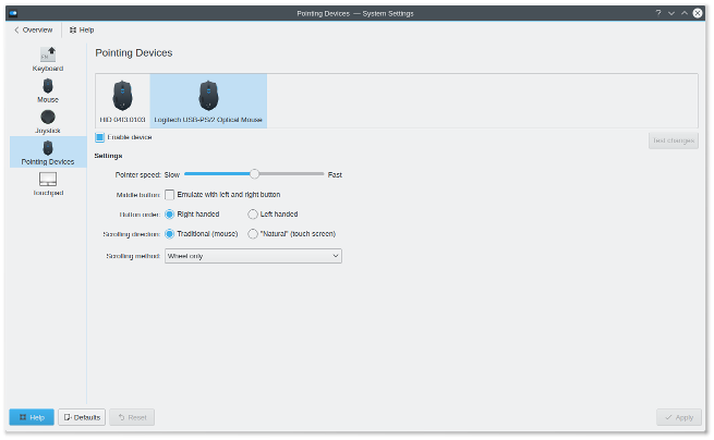
Left-aligned content:
 Should it look like this? "Show more" with a simple mouse:  For me it looks like somebody will likely want to adjust mouse speed rather than completely disabling the mouse... |
|
Registered Member 
|
Perfect!
I understand why you dislike it but you have to admit that this UI focuses on the most important things. What we can do is to ask the users in a blog post. Would be good anyway to report about the progress. What do you think? (BTW: I'd vote against 'more' in this case myself.) Apparently I couldn't convince you with using a checkbox instead of the test button. That's a pity. 
|
|
Registered Member 
|
I dislike how it looks, but if you think it's perfect, I'll leave it left-aligned
No, I don't agree that completely disabling the mouse is the most important feature of this KCM  I think it's better to ask users, and I'll do it. As a user I'd vote for "show more" for synaptics driver (look at current touchpad kcm), and against it for other drivers (evdev is even more "basic" than libinput). Hm, we completely forgot about that feature-rich synaptics... Do you have any idea how to make a good UI for it? You can look at touchpad KCM as a feature list
I just didn't try to implement it yet, give me some time 
|
|
KDE Developer 
|
The question on what is the most important piece for the mouse view is difficult to answer. So far it was not possible to actually disable it, so e.g. I always only used it to change the acceleration. If we come from that thinking it makes more sense to show all.
On the other hand: now that we support more mice at the same time I might start using it differently: e.g. to go there and turn of the "thinkpad knob". So blog post sounds like a good idea 
|
|
Registered Member 
|
Access rates at blog post decline so it's time to wrap up:
* replies as well as voting reveal problems with the distinction between 'frequently used' and 'expert setting' * only 12% support the idea of consistency first * neither criticism nor appraisal of the KCM itself (except from agreement with having preview icon equally sized) It's a pity that users don't care about consistency for such a core navigation, IMHO the expander should remain disabled at least. But we have to accept this and I'll change the guideline respectively. The advantage for the libinput KCM is that 'more' can be removed. Especially wrt the abuse of the preview I wanted to get more opinions. Anyway, I'd say we treat the result as silent acceptance and go ahead. To do for you, Alexander, is to take care about the device' item size. I suggest having max two lines captions, horizontally and vertically centered. If the caption is longer use ellipsis. Icons should have always the same size. The other to-do, IMHO, is the checkbox instead of button thing for having a preview (wasn't discussed in the blog post). PS: Not to forget:
|
|
Registered Member 
|
Currently, I'm a bit busy with few other things... Most probably I'll be busy till mid-September, hardly there will be any big updates. But don't worry, I'm not giving up the project.
|
Bookmarks
Who is online
Registered users: bancha, Bing [Bot], Evergrowing, Google [Bot], lockheed, mesutakcan


