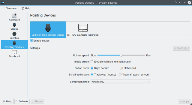
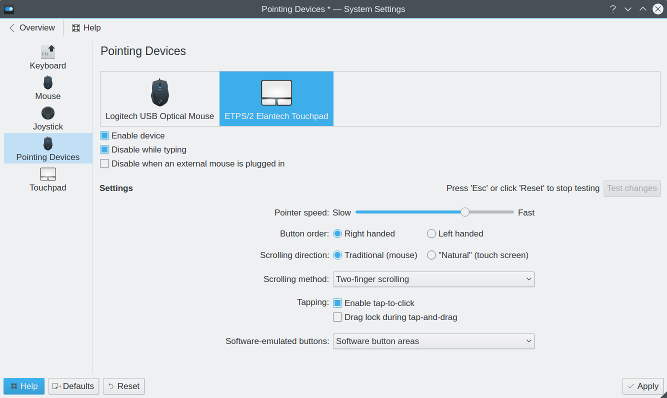
[Design Help Needed] KCM for pointing devices
Tags:
None
|
Registered Member 
|
Hi.
I'm working on new KCM for pointing devices (mouses, touchpads, etc.) One of it's main features is support for multiple devices. For example, it will be able to remember different configurations for different mouses. Or configure ThinkPad's pointing stick, that isn't accessible with current set of KCMs. Another goal is reducing code duplication and getting unified configuration UI for similar devices. The first problem I encountered is behavior of standard "Reset" and "Defaults" buttons. Usually they reset settings for entire module. But as a user I'll expect only currently selected device to be affected. I thought about dynamically creating a separate instance of KCM for every device (so that there will be a separate icon on the left for every device), but looks like it isn't technically possible. Another problem is number of available settings. It could change drastically between different device types and platforms. In touchpad KCM widgets are simply disabled, but it doesn't look good when more than half of UI is disabled. And even without disabled widgets, number of available settings is a problem. I heard multiple times that UI of Touchpad KCM is too complex, but looks like there are users of every widget in its UI. And, finally, so-called "testing area". Definitely, there should be a way to test settings without saving them. But testing area isn't big enough sometimes. And it makes UI look complex and ugly. I see these options: 1) "Test" button - apply settings but don't save. And provide an easy way to revert (like pressing "ESC" key) 2) Countdown, like KWin and KScreen do. This solution should be the simpliest. 3) Rework the "testing area" somehow. Though I don't see how. I am looking forward to any feedback. Including what you like or what you think is wrong with existing KCMs. Currently this KCM looks like this: 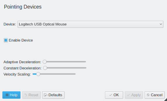 It's just a small demo to test that backend code works |
|
Registered Member 
|
There is a thread about Mouse cursor theme kcm where we discussed the basic layout. It's based on the thread [Crunch] SySe and KCM layout respectively the wiki page KDE Visual Design Group/System Settings Application. (Please report if you miss some information in the guidelines or if you need points to be more descriptive).
Your layout should fit the guidelines, i.e. we need to find some kind of simple preset. How about 'Default' (enabled, normal sensitivity, etc.), 'Gaming' (fast, high res), and 'Grandfather'? Without a comprehensive list of requirements and functions it's not possible to layout a complete mockup. Basically the buttons depend on whether you run the KCM standalone or within the SySe. From left to right Help, Defaults (insert 'factory settings'), Undo (store settings when the dialog is opened the first time and offer reset after any Apply), and Apply (make the current setting active). The dialog is closed by clicking the widow decoration button (or via Close/Exit when running within the SySe). About the test area I would think about providing the functionality after Apply since the whole system is in some test mode, Otherwise an expanded section would correspond to the design rather than opening another dialog or the like. |
|
Registered Member 
|
Thanks for these links
I don't think any simple presets are possible. Different hardware has different comfortable settings. For one mouse you have to set pointer speed to max, for another you have to set it near minimum value. Also, it looks like people open Touchpad KCM to change just one or two parameters. Maybe instead of providing presets we can select some basic functions, and hide others somehow. Regarding comprehensive list of functions: the problem is that the list of functions depends on the platform (Wayland or X11). And, even worse, the list will change over time, especially for Wayland. I'll try to prepare the list though.
I know how standard buttons behave. But I am not sure about their "scope" - only selected device or all of them. Probably I just shouldn't allow users to select other device if there are unsaved changes - ask to either apply or revert changes.
[/quote] Sorry, didn't understand the "expanded section" part. Could you provide more details? |
|
Registered Member 
|
I know that most people expect the preset and preview for visual settings only. But to make the system settings nice and coherent we should try to adopt the concept as best as possible, IMHO (more replies = more opinions). What you provide with the preset is up to you. So it could be as well a preselection from the extensive list of manufacturers. Some ideas: Keyboard: the most sold or just one out of the category Mouse: left/right hander Joystick: maybe like keyboard? Touchpad: KDE style, Microsoft style, Apple style (reverse scrolling, for instance) or KDE plain (no edge associated) vs. KDE activity etc. Basic settings vs. advanced is another major aspect of the new KCM design.
Depends on your layout. Changes within one page (switched via left hand icons) are neither applied nor stored unless the user selects another page or closes the module. You should ask for confirmation if changes haven't been applied. (However there are people in the VDG who want to apply automatically since everything can be undone. I disagree: that's Apple style.)
The KCM examples do contain of a green expander icon (double checked the wiki: only my mockups (scrollarea: click for interactivity) have this feature). Basically the test area could be hidden until needed. PS: Funny bug: You can rename the drag me icon (double click). But dragging this renamed icon crashes the app. |
|
Registered Member 
|
Joystics and keyboards are out of scope. The KCM we're talking about will support mouses, touchpads, and devices like pointing stick. And left/right hander doesn't look like a preset for me. It is one of basic options. A single checkbox. And the same for reverse scrolling. I think it will be easier to understand with an example. The KCM currently looks like this: For touchpad: 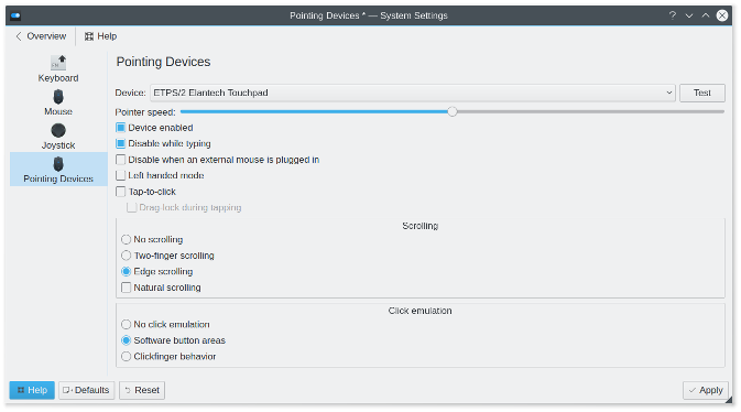 For mouse: 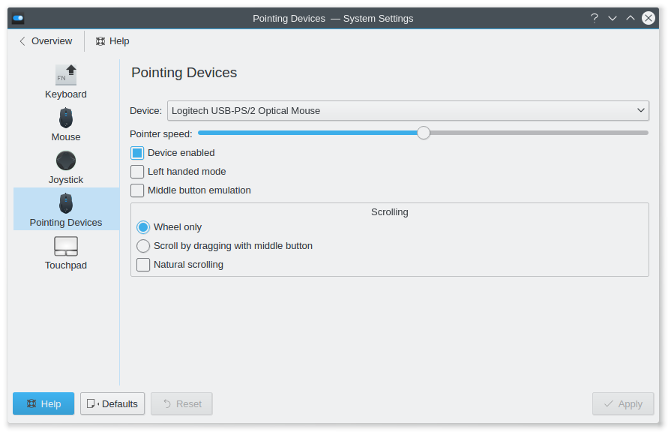 On these screenshots you see settings of libinput driver. For other drivers there will be different set of options, and different UI, but my main focus is libinput. Libinput support is almost complete now, so you can consider these screenshots as a complete feature list (for libinput). How it works: You can select a device from the top combobox and adjust various options. "Test" button is visible when something is changed (compared to currently active hardware settings). And when you press "Test", it is replaced by another button - "Revert to saved settings". 'Esc' key reverts settings too. For me it looks better than some "testing area". Size of any area is limited. And this way you have entire screen. Also, it doesn't add much UI elements - doesn't make it look complex. So, could you give an example how can I improve UI from these screenshots? If you use Arch Linux, you also can try the KCM in action: https://aur4.archlinux.org/packages/kcm-pointing-devices-git/ |
|
Registered Member 
|
Local test doesn't work since dependency libxcb-git cannot be found (AUR seems to have some problems recently).
Okay, got it. Now I wonder what happens with the mouse and touchpad KCMs. Is the pointing device KCM the replacement for both?
When you anchor the slider to both left and right it becomes too large, aesthetically. More problematic is the fact that no labels are shown, the position/value is completely arbitrary. The HIG on slider says: "Mark significant values... Label the minimum and the maximum... " etc. I understand that Qt doesn't present those features out-of-the-box. Another issue is the natural scrolling. The average user might never heard about how scrolling is done at Mac OS X so the opposite is not clear. I'd suggest to use radio buttons here and to think carefully about the labels. My first ideas may not be the best: natural/inverse scrolling or touchpad/mouse style or Linux/Mac OS X style (natural scrolling could be used in the tooltip). Despite from the label, two radio buttons make sense to illustrate the opposite sides of the medal as for wheel only/middle button. And it offers the option to solve the next issue. Controls are crammed to the left side. The concept includes up to three columns and I'd suggest to use two columns for the alternative radio buttons. Would be nice to have a better layout for checkboxes too but I'm afraid that you generate them dynamically from the libinput output, depending on the device. And "enable device" should clearly be separated from the rest. From the usability POV a classification of options is required here. Finally, the test button is, at least, somewhat strange placed. It's okay to start the test in an extra window but to locate the button next to the input where usually reload/import/apply etc. is started isn't a good solution. It looks like trying to spare screen real estate. But whitespace is not our enemy. That's why the concept is build around a (potentially large) scroll area. However, if you want to stick with your solution I have to admit that it isn't a big issue since the button is labeled with "test" in large friendly letters. |
|
Registered Member 
|
Hm, libxcb-git was missing... Added the package to AUR, now it should work.
It should completely replace Touchpad KCM, and partially - Mouse KCM. Mouse KCM has few options that aren't actually related to the device (like double or single click to open files/folders). Currently you can choose the device from combobox, but I plan to make it look like every device has its own KCM.
Hm.. When the slider has limited size, it doesn't look good too. For me, at least. Regarding labels. Will labels like "Slow", "Fast" and "Normal" (or "Default") be fine?
I didn't think too much about labels yet... Some of them are just identifiers with underscopes replaced by spaces  I'll replace them with something better soon. The same for tooltips... I just need to copy-paste some text from libinput docs, I think. I'll replace them with something better soon. The same for tooltips... I just need to copy-paste some text from libinput docs, I think.
Yes, I generate UI dynamically. But two-column layout is still possible, I don't see any problems with it. How can I separate the "Enable device" checkbox from the rest? Add whitespace after it?
Testing area in Touchpad KCM looks ugly to my taste. If you think that testing area is a good solution, could you create a mockup? Thanks for your feedback. |
|
Registered Member 
|
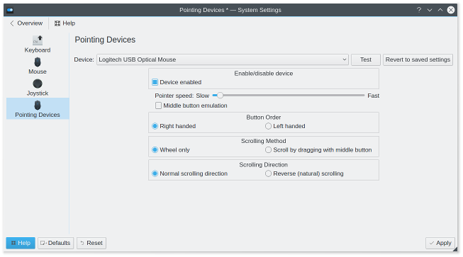
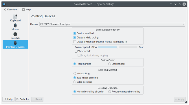
Tried to implement some of your suggestions
|
|
Registered Member 
|
No success. Currently I have KDE running in a virtual box. It's a completely new installation and almost every tool is being installed new. As a dependency to libxcb-git, xcb-proto-git is needed, which cannot read from the remote repository.
With pleasure:  (I don't manage to share the pictures from https://share.kde.org/index.php/s/ZmA91iyMSL93fPi in this thread. Any idea someone?) Some nitpicking comments to your latest solution (good progress, anyway): * Content area should be left aligned (Alignment HIG) * Text in section headers (group box I guess) is also center aligned, which doesn't look nice * Please add more whitespace between controls (Placement HIG) * Consider to use three column layout for the three radio buttons, or maybe a dropdown makes sense as well * Revert to saved settings next to test for the mouse is the same as reset, isn't it? Anyway, it doubles my complains about the test button  In general, we should enhance those dialogs by visual stuff. For instance, button order could be very well illustrated. But I'm not the right person for this. |
|
Registered Member 
|
Hm.. I've successfully cloned xcb-proto-git repo few seconds ago.. Do you build everything by hand or use something like yaourt? I do everything manually and it works. Wow, it looks really cool. I'll try to implement it. But I see one problem here - "Test" button doesn't belong to "Settings" group. It doesn't look like "Test settings", but some abstract "test"...
Yes, they are group boxes. And, unfortunately, there is no way to change text alignment for them in QML currently. Though I can replace group boxes with simple labels, as in your mockup.
It doesn't look good when some groups have two columns and some have three. So I think I'll use comboboxes.
I choose wrong label for the button, it's misleading. It should mean "cancel test" - reset hardware settings to saved, but without touching KCM UI. Again, if you have better idea of test mode implementation, please, show me the mockup 
Hm... I am not sure whether it can be postponed... One thing that I missed before: current mouse KCM has some global settings that don't belong to any device. Like "double click interval" or "drag start time". Do you think they should be available in this KCM, or as a separate KCM? And if they should belong to this KCM, how should it look like? |
|
Registered Member 
|
Gaah, never click somewhere before submitting.
 The average user would expect devices to run out-of-the-box. She likely wants to get just a few information about the device and perhaps an option to enable/disable and to test it. So I placed all those stuff within the preview area. 'Test' itself opens an overlay, or the like. Properties can be tweaked for personal or situational demands after clicking 'more'. Options that might interest the average user should be placed above the expert settings. The preview contains of icons/images right now. But if it was Microsoft they would request the manufacturers to deliver an actual picture of the device. Then the preview makes really sense 
|
|
Registered Member 
|
I think you overestimate the importance of enable/disable option. Neither of current KCMs had it, and I didn't hear any complaints. "Test" button isn't shown until you change any of the settings. Though enabling/disabling the device will show it too. |
|
Registered Member 
|
In this case make the scrollarea a little bit smaller and move the test button below that section, within the more area but out of the properties scrolling.
On the other hand, why do you want to restrict to 'test' a device unless changes have been made? It is maybe a safe playground to check if the middle button works. Having the button at the suggested place has an advantage for the visual balance. Which is the least argument, of course. |
|
Registered Member 
|
Because everything it currently does is "apply settings without saving". It is a no-op until something is changed.
I can show it, but in disabled state. |
|
Registered Member 
|
Bookmarks
Who is online
Registered users: bancha, Bing [Bot], Evergrowing, Google [Bot], lockheed, mesutakcan

