This forum has been archived. All content is frozen. Please use KDE Discuss instead.

Breeze Polish for 5.5

Tags: None
(comma "," separated)
User avatar
alake
Registered Member
Posts
591
Karma
3
OS

Re: Breeze Polish for 5.5

Fri Aug 14, 2015 4:58 pm
Can't say I agree about returning to a traditional tickmark for the checkbox (we went through a lot of design iteration on these forums to get to that point that I think works well and is distinctive to Breeze, and I have not yet heard of a credible reason to change it - beyond familiarity which, after well over a year now, I don't see as a credible argument). My own sentiment is strongly against this and consider this statement me waving folks off to go look in another direction for things to change.

That said, I don't have any objections to trimming them down just a touch.

Additionally, while I'm open to improvements to the animation, removing them altogether would be a no go from my perspective. From the outset we specifically did not want a yet another dead and dimensionless "flat" style and those animations were purposefully chosen to preserve some depth and life to the style.
hugo.pereira@free.fr
Registered Member
Posts
133
Karma
0

Re: Breeze Polish for 5.5

Fri Aug 14, 2015 5:59 pm
alake wrote:Can't say I agree about returning to a traditional tickmark for the checkbox (we went through a lot of design iteration on these forums to get to that point that I think works well and is distinctive to Breeze, and I have not yet heard of a credible reason to change it - beyond familiarity which, after well over a year now, I don't see as a credible argument). My own sentiment is strongly against this and consider this statement me waving folks off to go look in another direction for things to change.

That said, I don't have any objections to trimming them down just a touch.

Additionally, while I'm open to improvements to the animation, removing them altogether would be a no go from my perspective. From the outset we specifically did not want a yet another dead and dimensionless "flat" style and those animations were purposefully chosen to preserve some depth and life to the style.


+1 on the way checkboxes are draw, their size, and the animation.
* hugo.pereira@free.fr loves them.
The only (potentially serious) downside is the 'selected' checkboxes in menus and lists ...
Sogatori
Registered Member
Posts
209
Karma
1
OS

Re: Breeze Polish for 5.5

Fri Aug 14, 2015 6:01 pm
alake wrote:Can't say I agree about returning to a traditional tickmark for the checkbox (we went through a lot of design iteration on these forums to get to that point that I think works well and is distinctive to Breeze, and I have not yet heard of a credible reason to change it - beyond familiarity which, after well over a year now, I don't see as a credible argument). My own sentiment is strongly against this and consider this statement me waving folks off to go look in another direction for things to change.

That said, I don't have any objections to trimming them down just a touch.

Additionally, while I'm open to improvements to the animation, removing them altogether would be a no go from my perspective. From the outset we specifically did not want a yet another dead and dimensionless "flat" style and those animations were purposefully chosen to preserve some depth and life to the style.

Personally I just find them confusing. I have to take a second to think if what I am looking at is a checkbox or a radio button. They just look too much alike. I don't think it's just getting used to it either. I have seen them from day to day for half a year now and I still get confused regularly. But that's just me though :)
hugo.pereira@free.fr
Registered Member
Posts
133
Karma
0

Re: Breeze Polish for 5.5

Fri Aug 14, 2015 6:05 pm
Kver wrote:
hugo.pereira@free.fr wrote:I am confused.
From the screenshot, are we talking about the shadow ? Or about the titlebar vs content background color ?
In non-dark breeze, there is a strong contrast between titlebar background and window content background for the active window.
Why is it not the case for the dark-breeze color scheme ? (From what I understand in the dark breeze, the active and inactive decoration's titlebar color is the same)
Maybe one should start by setting a "light" titlebar color for the active window in breeze.

For the shadow, implementing a "glow" for the active window (as in oxygen) is also doable of course, and this, disregarding whether we use a dark or non dark color scheme ... The only difficulty with this is: what color should we use for such glow ? The selection (=blue) color ? A completely different color ? Where should is be set ? as part as the color palette (which is not so trivial to implement) ? As part as the decoration's settings (as was the case with oxygen, but then people complained it was disconnected for the color palette) ? etc.

Oppinions welcome

Hugo


Ah, I was thinking of the overall problem that title-bars blending in was a result of no contrast between the higher and lower windows as a whole. If someone likes the 'slate' look where windows are a single colour, then I was making my provision based on that. But I may have been confused about what you meant.

Anyway, for the settings of the thing, I would default to whatever colour the widget outlines are (the ones found on buttons); which tend to be dark for light themes and light for dark themes. If we want to get 'crazy' with it maybe have a dropdown or a checkbox in the settings which toggles between "traditional shadow" (always dark), "smart shadow" (uses outline colour, new default), and "glow" (focus colour). I don't think we need to implement a full-on colour-picker like Oxygen did.

Alternatively, we could keep the shadow dark on any setting, and only apply these colours to the subtle 1px outline around the window. So, here's some specimens for what I was thinking with shadows. These aren't 100% accurate, but here's what I've got:

A) The current shadow style. 10% black outline, 20% opacity shadow.
B) Doubled the opacity of outline and shadow.
C) Pulls the outline colour from the button widget outline colour.
D) Same as C, only the outline fades out at the top, avoiding "muddy looking" titlebars for non-slate variants.
E) Oxygen-style glow based on "focus colour"
F) Outline uses focus colour, but keeps dark shadow

Image
Image

My personal favourite is a combination of C and D. Just like we decide to draw the separator based on whether or not the windows are using a "slab" colour scheme, we could alternate between C and D based on that as well. Use C when we have slab-style windows, and D when the titlebar is different than the window background.


I think the breeze-dark C and D variants indeed loop very nice and probably can be implemented. Will give it a shot. Need to figure out the logic though.
(technically, the decoration does not know whether a color scheme is dark or not. It has to find a color role that works for any color scheme)
User avatar
Kver
Registered Member
Posts
326
Karma
2
OS

Re: Breeze Polish for 5.5

Fri Aug 14, 2015 6:57 pm
Sogatori wrote:Am I allowed to copy your mockup as a task on phabricator, Ken? :)

Of course. Anything I post anywhere is fair game. :)


Reformed lurker.
rumangerst
Registered Member
Posts
58
Karma
0
OS

Re: Breeze Polish for 5.5

Fri Aug 14, 2015 7:31 pm
Is the default user icon of sddm a part of Breeze?

In my opinion the "default user" icon is not very beautiful

Example:


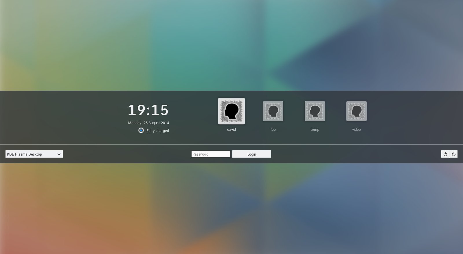
it should be "breezified" and look like this:


Note that I took just some screenshots from somewhere as I am too lazy to make proper screeenshots myself :P
User avatar
andreas_k
Registered Member
Posts
561
Karma
0

Re: Breeze Polish for 5.5

Fri Aug 14, 2015 7:51 pm
I like the arrangement (A-D). it should be used in systemsettings. it would look good in desktop with more columns and on mobile with one column.
User avatar
Kver
Registered Member
Posts
326
Karma
2
OS

Re: Breeze Polish for 5.5

Fri Aug 14, 2015 7:55 pm
I think the breeze-dark C and D variants indeed loop very nice and probably can be implemented. Will give it a shot. Need to figure out the logic though.
(technically, the decoration does not know whether a color scheme is dark or not. It has to find a color role that works for any color scheme)[/quote]

C and D don't need to care about the colour scheme; they only need to care if the titlebar matches the window; if they don't match then use D, if they do match use C. Hope that clarifies the logic.

EDIT: Below is an example of the C/D method;

A,B,C are 'slabs', so they have no gradient in their outlines.
D,E,F have different title colours, and if you look carefully their outlines fade out at the tops to avoid muddiness.

All the windows derive their outlines from the outline colour of buttons.

Image

I'll note that Wonton Soup actually looks better with a real background...

Last edited by Kver on Fri Aug 14, 2015 8:43 pm, edited 1 time in total.


Reformed lurker.
User avatar
alake
Registered Member
Posts
591
Karma
3
OS

Re: Breeze Polish for 5.5

Fri Aug 14, 2015 8:13 pm
hugo.pereira@free.fr wrote:The only (potentially serious) downside is the 'selected' checkboxes in menus and lists ...


Yup, definitely think we have some opportunities there. :-)

Perhaps we could use the normal palette rather than the selection/highlight palette to draw the checkbox + make sure inside the checkbox boundary is filled (with the normal background color) not transparent?
User avatar
Kver
Registered Member
Posts
326
Karma
2
OS

Re: Breeze Polish for 5.5

Fri Aug 14, 2015 8:25 pm
alake wrote:Can't say I agree about returning to a traditional tickmark for the checkbox (we went through a lot of design iteration on these forums to get to that point that I think works well and is distinctive to Breeze, and I have not yet heard of a credible reason to change it - beyond familiarity which, after well over a year now, I don't see as a credible argument). My own sentiment is strongly against this and consider this statement me waving folks off to go look in another direction for things to change.

That said, I don't have any objections to trimming them down just a touch.

Additionally, while I'm open to improvements to the animation, removing them altogether would be a no go from my perspective. From the outset we specifically did not want a yet another dead and dimensionless "flat" style and those animations were purposefully chosen to preserve some depth and life to the style.


I honestly believe we can have our cake and eat it, too. Lets wait until we start looking at those buttons individually before we start to worry; we have months to iterate until we reach something which hits the trifecta of unique, usable, and consistent. And I don't mind making dozens of iterations for each widget if that's what it takes. I'd make a hundred designs if it came to it.

On the animation, I'm not keen on dropping the animation or switching to a simple fading animation - we can do better - but my main thing is to find an animation which can be applied to more than just check/radio boxes. And again we have months to iterate, if we can't find something genuinely better there's no reason to rush it to change for changes' sake.


Reformed lurker.
Sogatori
Registered Member
Posts
209
Karma
1
OS

Re: Breeze Polish for 5.5

Sat Aug 15, 2015 7:20 am
For cleanliness I would suggest to use this thread exclusively to gather ideas and discuss the solutions to these problems in dedicated threads.

Also I created tasks on phabricator for the issues that have been brought up so far.
https://phabricator.kde.org/project/view/33/
User avatar
andreas_k
Registered Member
Posts
561
Karma
0

Re: Breeze Polish for 5.5

Sat Aug 15, 2015 11:49 am
I love the A-F arrangement and would like to have this in the SystemSettings HIG. It fit's large desktop screens and mobile screens.
hugo.pereira@free.fr
Registered Member
Posts
133
Karma
0

Re: Breeze Polish for 5.5

Sat Aug 15, 2015 2:04 pm
alake wrote:
hugo.pereira@free.fr wrote:The only (potentially serious) downside is the 'selected' checkboxes in menus and lists ...


Yup, definitely think we have some opportunities there. :-)

Perhaps we could use the normal palette rather than the selection/highlight palette to draw the checkbox + make sure inside the checkbox boundary is filled (with the normal background color) not transparent?


Yeah, I remember you suggested something like this in the past already in the corresponding bug report. I 'think' I tried it locally and was not happy with the result, but I should probably try harder and possibly share the result with others.

Note:
for menus at least, this is in fact a non issue: since checkboxes and radiobuttons are on the extreme left side of the menu item, one could just start the selection rect to the right of it, with no overlap with the checkbox. I do not think that it would affect usability, but it would definitly fix the issue (in a way that is similar to what we had when selection was only a line below the active text).

The case with checkboxes in lists is more problematic: the solution above would definitly not work ... So ... will try yours again :)

Best,

Hugo
schnelle
Registered Member
Posts
47
Karma
0
OS

Re: Breeze Polish for 5.5

Sun Aug 16, 2015 1:06 am
Sorry if this thread is wrong place to report these Breeze issues.

Breeze is flat. Very flat. And yet this thingy is 3D glossy looking:
Image

This part of plasma theme appears Air styled on every plasma theme:
Image
User avatar
Kver
Registered Member
Posts
326
Karma
2
OS

Re: Breeze Polish for 5.5

Sun Aug 16, 2015 1:13 am
schnelle wrote:Sorry if this thread is wrong place to report these Breeze issues.

Breeze is flat. Very flat. And yet this thingy is 3D glossy looking:
Image

This part of plasma theme appears Air styled on every plasma theme:
Image


That's... Super weird. Usually I have those turned off, but yeah, those are totally wrong. I don't think they're using the standard at all. I'd say that 100% qualifies!

The second one is also something that needs correcting. Thanks!


Reformed lurker.


Bookmarks


Who is online

Registered users: bancha, Bing [Bot], Evergrowing, Google [Bot], lockheed, mesutakcan