Design Contest for Plasma Logo
Tags:
None

Registered Member 
|
I'm not sure I see the connection between a desktop environment and the sun. Yes, the sun is made of plasma, but how many people actually know that? And even if everyone knew it, why should we associate our desktop to celestial objects?
|

Registered Member
|
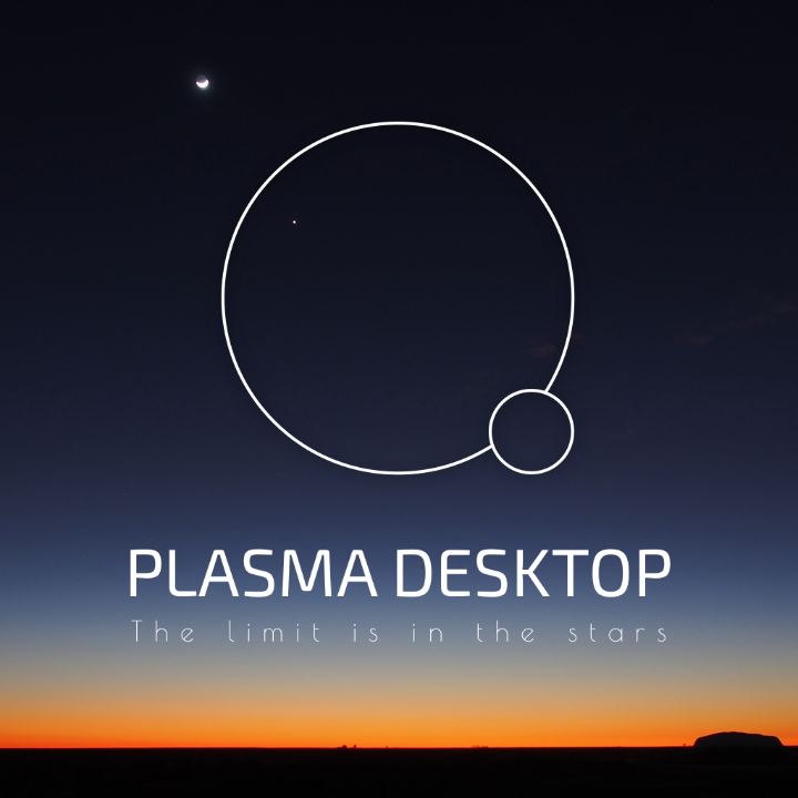
The theme for names in Plasma is Nature and physics, that's why we have Dolphin, Muon, Baloo, Ion. People don't knowing what plasma is would have to be a point discussed when the name "Plasma" was suggested. Now we can just remark the meaning of Plasma using the logo 
|
|
Registered Member
|
I think this is probably my favorite, but I'd change the circles to gears with a second gear of another color inside done the same way as the > in the "material" fashion. I'm referring to the color version of course. Thoughts? |

KDE Developer
|
Do you see a connection between a desktop environment and a foot (gnome), a mouse (xfce) ...? The project logo is not an iconographic representation of the application. 
|
|
Registered Member
|
This doesn't imply that the icon has to necessarily resemble a sun. For the same reason why the Dolphin icon has nothing to do with the animal.
Last edited by elvisangelaccio on Thu Jul 21, 2016 12:13 pm, edited 2 times in total.
|
|
Registered Member
|
Good point, and I don't like those icons either. Don't get me wrong, I appreciate all the proposals posted so far, but I think that the Quiralta's logo might be the best fit for the job. It just makes more sense in my head because I think of a desktop when I look at it. |
|
KDE Developer
|
@elvisangelaccio
Different people have different preferences ofcourse. And (unfortunately) all proposals have thir strengths and weaknesses. VDG and Plasma teams will have a really hard time choosing 
|
|
Registered Member
|
I'm trying to put something together right now, but I'm wondering if someone could tell me what font the "K" in the KDE logo is? The one shown in the logo at the top of this page.
EDIT: nevermind I found it in the resources, must have overlooked it. |
|
Registered Member
|
Obviously it doesn't imply that, I didn't want to say we are forced to use the connection with plasma/Sun. I was just trying to say that it's OK to use that connection  As Ivan said, many projects doesn't have a logo that represent the app. Often when the project it's complicated. I like Quiralta's logo too, but I don't think the window management is enough to represent Plasma. It would be perfect for KWin, that is only one part of Plasma  I'd add to the list of projects with logo based on something else instead of their features: Amarok, Android, Choqok, Clementine, Cuttlefish, Docker, Drupal, DuckDuckGo, Eclipse, Firefox, Gimp, GNU, GoLang, Grunt, Inkscape, Jenkins (this one it's a good metaphor though), MariaDB, Mint, MySQL, OpenSUSE, Pidgin, PHP, PostgreSQL, Python, React, Ruby, Rust, Tor, VLC. |

KDE Developer
|
i quite like the second, the > inside the pieces of gear. i would like to see a version with one single piece of gear, maybe playing a bit with its orientation |
|
KDE Developer
|
I like it more than the previous one with only the gear.. i think would be a bit better if the gear was somehow not complete |
|
KDE Developer
|
it's still probably my favourite as well. the issue i always had with it is how it looks "disconnected" , the other 3 dots in it, looks like a bit estraneous, if they would be a bit more connected, belinging to the same overall shape, it would look better (and btw, not having a gear is a plus for me) |
|
KDE Developer
|
+ looking a bit more organic, explores a logo with no gear - looks a bit overly generic, is just 2 circles, it could be anything |

Registered Member
|
+ simple + fit's the breeze icon style with 1px elements + recognizable as PLASMA instead of KDE + work in small size as icon and in big size as logo also with different backgrounds + explain the word plasma + you can make wonderfull animations with it +/- new no element from the kde icon/logo |
|
KDE Developer
|
+1 the second one (with one piece or two) looks very nice. One of the things that I like about it is that it is open to modification. For example, if we had an aKademy or Plasma sprint in Paris, the nudges on the upper gear could become Eifel Tower, and two other famous buildings. (Paris taken only as an example)
|


Bookmarks
Who is online
Registered users: bartoloni, Bing [Bot], Google [Bot], Sogou [Bot]


