Design Contest for Plasma Logo
Tags:
None
|
Registered Member 
|
Dear KDE visual design community (that is: everyone who reads this!),
Plasma would like to tap into your creativity once more! Although there is a current logo for Plasma 5, during discussions with the Plasma team we found that while they are not exactly unhappy with it, they would like to see if the community could come up with a logo that they could identify with even better. That is why we are now hosting a Plasma Logo Contest! These are the rules:
A jury consisting of both long-time VDG members and Plasma team members will decide which logo to wins. Notice: Winning the contest does not guarantee becoming the official logo, however. We're looking forward to your proposals!
Last edited by colomar on Tue Jul 12, 2016 1:19 pm, edited 1 time in total.
|
|
Registered Member 
|
 - It's the Sun, because it's the bigger amount of natural plasma near us; - The ">" comes from the current logo, so it doesn't look like a simple gear in monochrome. The ">" looks like a "P" for Plasma and like a "play/start" symbol, it should be good as start menu icon; - The gear is the one from KDE logo. Feel free to edit it and re-submit it here. |
|
Registered Member 
|
Ooh, me loves! I can't wait to see what else the community comes up with. 
|
|
Registered Member 
|
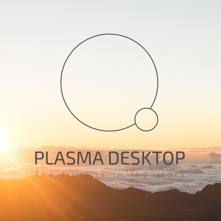
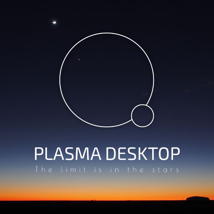
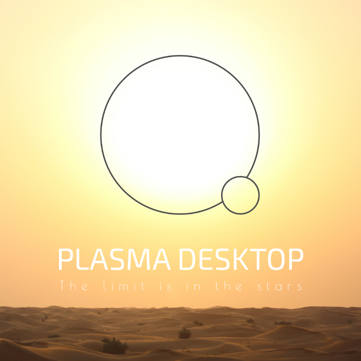
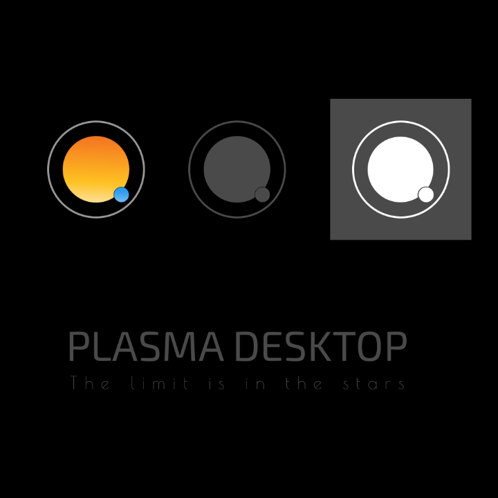
Hey guys, here is my proposal. I reviewed a few things out there and was inspired by plasma, which is the most abundant element in the universe. It is produced in the stars. I wanted to show the connection that we have to the universe of ideas that we come up with. I went through a few iterations and then reduced the result to the most basic of shapes. I hope you like it!
   
|
|
KDE Developer 
|
A few comments (some with a +, and some with a -
 ) )(don't think that the number of +s and -s has any meaning) @alex + The thing I also liked with the previous one is that it provides continuation from the current KDE logo - It is a bit crowded now, I don't really see the connection between the gear and the > @anditosan + Looks really nice + Its simplicity - Might not be distinctive enough as a brand - Not sure how fitting it would be for the menu icon, though it could be a nice base for building plasma-related icons - Please remove gradients from the last picture, or make them subtler |
|
Registered Member 
|
Surprised that there's only 2 entries so far, I'm thinking about giving it a go myself.
|
|
KDE Developer 
|
@Inverge
Please do. The more, the merrier  @colomar Maybe this needs more coverage than just a g+ post? |
|
Registered Member 
|
Maybe. I'll write a blog post. A dot article seems a bit too high-profile to me, unless the Plasma team would like that. |

Registered Member 
|
Hi, here is my idea, is inspired on previous logos, for instance the current Plasma logo. I was looking for something very simple that says "desktop", thus in a way it represents applications in an array, this in turn can easily (I'm thinking
 ) represent the dashboard, that would be use to open applications, documents, settings, etc. the array can also be seen as the Plasma ability to have virtual desktops and activities (but that's beyond my intentions), the position of the "squares" are inspired by the circles in the current Plasma logo, I tried to also place them in a position that sort of makes the middle square a representation of the letter P (for Plasma) in a very subtle way, same can be applied to its contour (the white/empty space between the middle square and the other two), this line is also meant to be seen as or part of the P. ) represent the dashboard, that would be use to open applications, documents, settings, etc. the array can also be seen as the Plasma ability to have virtual desktops and activities (but that's beyond my intentions), the position of the "squares" are inspired by the circles in the current Plasma logo, I tried to also place them in a position that sort of makes the middle square a representation of the letter P (for Plasma) in a very subtle way, same can be applied to its contour (the white/empty space between the middle square and the other two), this line is also meant to be seen as or part of the P.Notice that I had the left upper corner of each square in a rectangular manner, this I think helps to interprete them as application windows, the middle square has a juxtaposition squared angle (at the bottom right corner), to help it been seen as the letter P. The little triangle (which is empty space, a hole) is meant to emphasize a "window decoration". In these mock-ups I presented the logo in different sizes, positions around the Plasma title and with different colors. 
Self educated by a very bad teacher!
My Stuff |
|
Registered Member 
|
Very interesting approach! |

Registered Member 
|
Thank you!, I was afraid it wouldn't make any sense to others besides me 
Self educated by a very bad teacher!
My Stuff |
|
Registered Member 
|
|
|
Registered Member 
|
Here's what I've got. The first is the sun/earth/moon; the gear being the corona and a tieback to the "K" logo, and the earth/moon being a blatant ripoff of Anditosan's variant - but inverted. The second is a blatant ripoff of Alex's work, but using the corona, and using a few minor tweaks. The third is a "gear crown" on a background, skipping to the fifth is the "gear crown" alone. The "crown" aspect mainly referring to Plasma Desktop as a "flagship" project. Fourth, which is kinda growing on me, is a mashup of Alex and Andito's respective works. Edit: sharing is caring, here's the source (plus many, many extra bonus scraps) for anyone to play with: https://share.kde.org/index.php/s/8CuAV33rGhgLAwy
Reformed lurker.
|
|
KDE Developer 
|
Heh, you beat me to it. I wanted to create spin-offs to show people that it is also allowed
 P.s. They look really nice 
|
|
Global Moderator 
|
I like anditosan's stuff. Very simple, very memorable.
But as we all know, one cannot argue about taste. One either has it, or nor  Putting on me coat, and I'm off...
Debian testing
|
Bookmarks
Who is online
Registered users: bartoloni, Bing [Bot], Google [Bot], Sogou [Bot]


