A Klassy twist to the Breeze window control icons!
Tags:
window decorations, window controls, breeze, oxygen, classic, redmond, minimize, maximize, close, restore, float, window decoration, button icon style
window decorations, window controls, breeze, oxygen, classic, redmond, minimize, maximize, close, restore, float, window decoration, button icon style
|
Registered Member 
|
I think Breeze is beautiful, however, I have outlined elsewhere where I think there are serious usability issues with the current Oxygen-style window control icons still used in the Breeze theme.
These issues annoyed me so much every time I looked at a Plasma window that I created a fork of the breeze library at https://github.com/paulmcauley/klassy to try and implement a design which would try to address most of these issues. EDIT 2022: Here is the default Klassy (originally Classik) look as of August 2022 (Klassy v4.0):   The earlier defaults from v. 3.0:  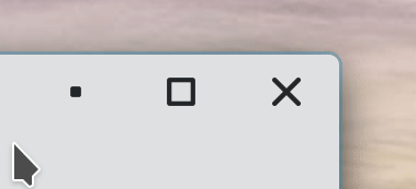  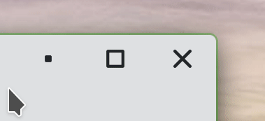  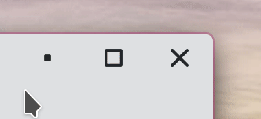      Below is the look from my early attempts to implement this in January 2017: Here is a screenshot of my design which I have called "Classik" for now (EDIT 2021: the particular theme in the screenshot is now called "Kite" ; "Classik" now has Windows-like restore buttons) : 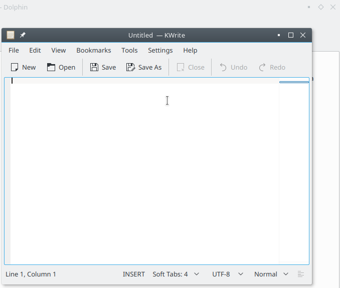 Here is also a video of my code in action. As you can see, my code affects both the kdecoration library (for the window decorations) and kstyle library (Application Style for dockable panels within applications) -- I refactored slightly for a common code base for the icon style between the two (it is currently just copied and pasted code). The "Classik" look should be familiar to any KDE aficionado as they are partly inspired by the window decorations used in KDE 1, hence the "Classik" name. Here is a screenshot of the 20-year-old-this-year KDE 1.1 for reference:  Here is the window decoration configuration on Redhat 4, KDE 3.3, where options for "KDE 1" and similar (but uglier IMO) "KDE 2" were given (now missing in Plasma 5):  My "Classik" design is not identical though, as the flat look means I need a different restore icon to KDE1 - in "Classik" I use a Windows-like restore button, and in "Kite" I kept the diamond "restore" icon from Oxygen. The original KDE 1 theme, as well as CDE, used an embossed/engraved styling to switch between maximized and restored windows, but I do not think this makes clear which is which and hence wanted to distinguish. The only problem, however, with the "Kite" diamond is that, unlike the other window control icons, it doesn't have a direct visual mapping of the function. I like the "Kite" "diamond" though because it looks elegant and if you instead think of it as a kite it reminds you of "floating" in the Breeze -- I think "float" would be a better descriptive term than what most desktop environments call "restore" (what you are "restoring" to depends upon context and will not always restore). I have no idea if this is what the original designer of the Oxygen icons was thinking! (while I am on this topic, it reminds me that there are also no tooltips in the current Breeze implementation -- I think it would be a good idea to add them as "Minimize", "Maximize"/"Float" and "Close"). I also added a new configuration item to the Breeze Window Decoration settings called "Button icon style" to allow you to choose between Classik, Kite and the existing Oxygen style if you wish: 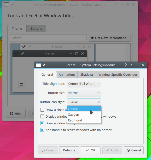 You can still toggle the option of "Draw a circle around close button" if you wish, but I feel this adds too much distracting visual clutter if used with the "Classik" design. While I was at it, for those who want familiarity, I also created a fourth "Redmond" Breeze sub-style which gives a much fresher and more modern Windows-like style than the outdated and ugly (IMO) "Plastik" Windows-XP-inspired theme:  I would be great if you could include my code in a future release, at least to give people the options. I do feel though that "Classik"/"Kite" would make a better default than the existing "Oxygen" style as addresses most of the issues I have listed, viz: 1. There is a direct visual mapping of the function of the buttons. Minimize = make compact without window = compacted square. Maximize = make window into large square. "Classik"'s restore/float = show floating windows. The exception is "Kites" restore/float diamond/kite but I have explained why I still like this above as being visually appealing. 2. It is now obvious that maximize and minimize are not direct opposites of each other. All have clear and distinct icons. 3. We no longer use yet another (!) arrow. The window controls now do not look like they signify "move down" and "move up", nor does minimize look like a drop-down menu which is likely to occur frequently in the window titlebar with the upcoming client-side/dynamic window decoration plans. 4. Not all users have their panel/taskbar at the bottom of the screen, especially with the advent of horrible 16:9 widescreen displays. The existing Breeze minimize icon points downward. The "Classik" minimize button is more universal. 5. Last but not least, it gets rid of that horrible Windows 3.1 vibe, and has a unique and less cluttered looking style with true KDE heritage! What do you think? Paul
Last edited by paulm on Tue Aug 09, 2022 4:58 am, edited 10 times in total.
|
|
Registered Member
|
Hi,
Nice work. I like your "classic" buttons how did you deal with the "shade", "unshade", "stay on top" and "stay below" buttons ? Hugo |
|
Registered Member
|
Hi Hugo, I just left those the same as they were. My main concern was to get rid of the over-used and ambiguous single arrows. "Classic":  "Redmond":  I think the shade/unshade is one place where the arrow is appropriate as the window body actually does move, so is probably good to keep shade/unshade as they are. However, now that you have mentioned it, I think the "keep above" and "keep below" need to be looked at further. I see three issues with them:
2. The double arrow, while being more distinct than the much used single arrow, still has not got a clear visual meaning and could imply docking to the top or bottom of the screen or something. 3. The icons are not consistent with the application icons in the breeze-icons set for a similar functionality ( object-order-front and object-order-back ). These are perhaps too busy for use in every application titlebar, though I see LibreOffice uses slightly simplified versions (lc_bringtofront/sc_bringtofront and lc_sendtoback/sc_sendtoback):  Microsoft, on the other hand, uses more literal icons that visually represent in-front/behind rather than top/bottom so something along those lines may be better:  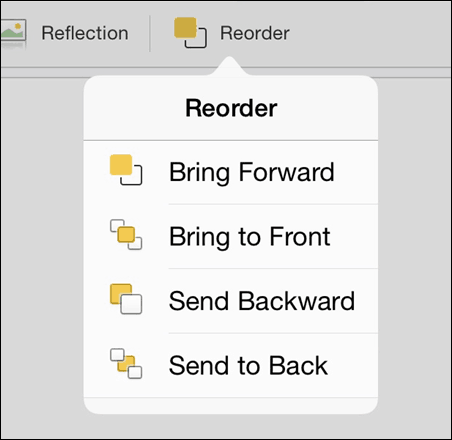 I will do some experimentation and post back...
Last edited by paulm on Sun Jan 29, 2017 9:04 pm, edited 2 times in total.
|
|
KDE Developer
|
The spatial metaphor chosen (which is reinforced by terms like Raise and Lower, which are also used throughout the UI) is in line with the desktop metpahor in general, where a piece of paper is also "above" or "on top of" others on a desk. It's further reinforced visually by the window shadow system, via the focused and topmost window receiving a larger shadow, suggesting greater verticality. It wouldn't be possible to change this to front/behind without changing the rest to keep a holistic theme going (which extends into applications, with very common strings like "Always on top" in many a video player).
Plasma, apps hacker. KDE e.V. vice president.
|
|
Registered Member
|
Except there isn't a single consistent "chosen" spatial metaphor for Plasma at all. The most common definition of "top" and "bottom" in Plasma actually corresponds to the vertical orientation of the overwhelming majority of displays. Here are just some of the first examples I came across: 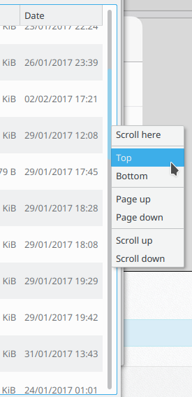   I don't see how the window shadow system enforces any particular spatial orientation. All it shows is a light source to the top(!)-left. A light source can be lamp or bulb or anything. Regardless, the main advantage of the terms "in front of" and "behind" in English is actually that the modelled spatial orientation/plane does not even matter -- the user does not even have to think about it as it is relative to the viewer. "In front" can refer to "the part or side that normally first presents itself to view" (Oxford dictionary, context 2) and "behind" "At or to the far side of (something), typically so as to be hidden by it". The reference plane could even be to the ceiling, and whatever object is visible and facing the viewer can still be "in front" and whatever can be obscured to the viewer by other objects would be "behind". Such a clearer change in terminology therefore doesn't change the "holistic theme" at all since we are now simply describing what is/is not in direct view to the user rather than referring to a particular abstract spatial orientation. I can only see 2 strings that would be affected -- the Alt-F3 menu and the "look and feel" "Buttons" configuration (there really should be tooltips on the window decoration buttons too, but this does not seem to have been implemented). As for video players, I have 3 installed and only see "on top" in VLC, most likely simply copying the terminology used in KDE rather than anything else -- such an option really isn't necessary in KDE given the Alt-F3 menu anyway. Other applications, such as every Office suite I know of, use "in front" and "back" to refer to objects moving in this plane. Then we can look at the usage of terminology in web applications -- just look to the bottom of this very web page!!!:  Regardless, third-parties will always have small inconsistencies. It is surely more important that Plasma is consistent with itself. |
|
KDE Developer
|
FWIW, the scrollbar context menu is coming from Qt (which in turns copies this from Windows), not a Plasma design (but way to go on the hunting).
Plasma, apps hacker. KDE e.V. vice president.
|
|
Registered Member
|
I got a chance to look at this again and made a few small changes. Namely, removed the diamond/kite from Classik as I don't think it is visually descriptive, and improved the restore icon at lower resolutions (the diamond/kite decoration is now known as "Kite"). As for the on top/in front and on bottom/behind icons, I went for consistency and kept them the same as what is used in the Breeze icon set for use in applications:
 Higher resolution image 1 Higher resolution image 2
Last edited by paulm on Tue Mar 16, 2021 4:32 am, edited 1 time in total.
|
|
Registered Member
|
Not sure where the correct place is to submit patches, but I uploaded to Phabricator a patch to implement this at: https://phabricator.kde.org/T12793
|
|
Registered Member
|
As well as the C++ implementation, I also made an Aurorae implementation of this called "Classik" available at: https://store.kde.org/p/1367676/
|
|
Registered Member
|
<deleted>
Last edited by paulm on Tue Feb 23, 2021 10:16 am, edited 1 time in total.
|
|
Registered Member
|
The original version as initially screen-shotted here with the Oxygen/Breeze-like diamond/kite restore button has been dubbed "Kite" and is also available as an Aurorae theme at https://www.pling.com/p/1482837/
The kite-like restore button will help you float in the Breeze!  IMO, not as visually descriptive/intuitive as the classic restore button in the KDE1-inspired Classik, but this is compensated by being more aesthetically appealing and keeps a certain brand for Plasma. IMO, not as visually descriptive/intuitive as the classic restore button in the KDE1-inspired Classik, but this is compensated by being more aesthetically appealing and keeps a certain brand for Plasma.
|
|
Registered Member
|
UPDATE: ClassikStyles version 2.0 released!
I have now properly forked the binary version (known as ClassikStyles) from Breeze and is now installable as its own independent binary/repositories for numerous distributions at https://github.com/paulmcauley/classikstyles. This version is superior to the Aurorae versions and has also added numerous new features for customization.      Feature overview:
|
|
Registered Member
|
UPDATE: ClassikStyles version 2.1 released!
https://github.com/paulmcauley/classikstyles
Matching system icon themes are also now available (they inherit Breeze icons). See https://github.com/paulmcauley/classikstyles#icons for details. |
|
Registered Member
|
UPDATE: ClassikStyles version 2.2 released!
https://github.com/paulmcauley/classikstyles Bug fixes: - Corner radius setting now updates instantaneously - Auto-boldness now instantaneously adjusts per-display on Wayland - Improve robustness of GTK button generation - Window outline in shadow now has correct window shape when bottom corners of window are not rounded New features: - Subtle 1px outline of window in font colour to improve contrast and add polish - Gapless auto-hiding scrollbar arrows -- see video at http://paulmcauley.com/kde/classikstyle ... arrows.mp4 - KCM option in Application Style whether to auto-hide scrollbar arrows |
|
Registered Member
|
It should be. I use it as my main window decoration and application style. There have been several bug fix releases. (I am biased though )
|


Bookmarks
Who is online
Registered users: bcooksley, Bing [Bot], claydoh, Google [Bot], paulgureghian, Yahoo [Bot]


