More perceptual and intuitive color dialog. Some questions…
Page 1 of 1 (1 post)
Tags:
None
|
Registered Member 
|
Hello.
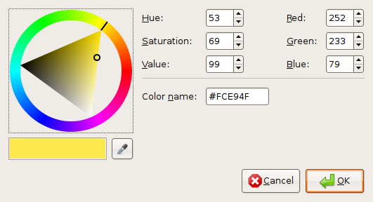
The color dialogs used currently (both in KDE and other environments) are normally not perceptually uniform. They are based usually on RGB or its transforms like HSV. Personally, I think the most intuitive one is the color wheel as used in Gtk. (Example Image) It matches quite well our perception of color. But even there: Why is full saturated yellow at the same position of the triangle as full saturated blue - because yellow is lighter than blue! I think it would be great to have a color dialog that is perceptually uniform and intuitive. And I think the best model for this purpose is the LCh color space. Of course, this is not a mathematically easy model. But I think it is possible to have an intuitive UI based on LCh without even requiering to user to know anything about LCh, but that “just works”. It might look like this:   LCh is based on hue, lightness and chroma as parameters. In the first image, you see a widget similar to Gtk's color wheel. First, you choose the hue. Than, you choose lightness and chroma in the image in the middle. But the triangle in the middle is not a perfect triangle, but really an image of the sRGB gamut. Its form varies when the hue changes.. In the second image, you choose first the lightness, and than in the other widget chroma+hue. The form of the color indicator is chosen to make intuitively clearer where is the center (neutral gray/white/black); the indicator's length is the chroma, and its angle the hue. So I've started to write a library that implements so an interface. Among others, it provides a source-compatible replacement for QColorDialog. It's compiling and working, but not optimized, not not really very clean code. I'm currently reviewing the code myself (clean API, coding style, efficiency…), adding documentation and writing unit tests. About half of the code has yet documentation and got unit tests. The source code is MIT licensed, available at https://github.com/sommerluk/perceptualcolor and from time to time the API documentation at https://sommerluk.github.io/perceptualcolor/ gets updated. The code links currently against Qt and LittleCMS. Now I'm at the point where I need some help.
Any help is appreciated, especially about how color management works. Best regards
Lukas Sommer
|

Page 1 of 1 (1 post)
Bookmarks
Who is online
Registered users: Bing [Bot], Google [Bot], kesang, Sogou [Bot], Yahoo [Bot]


