Icons Color and SVG
Page 1 of 1 (6 posts)
Tags:
None

Registered Member 
|
Hi !
I think that Krita could be more ergonomic with colorful icons, just as in Pixelmator. In think their toolbar is gorgious  I guess you have a lot more priorities than that (cf Bug List), so I think a nice solution to that could came from the community, unless the devs wanted to take care of this. Here a screenshot of how it could look (I quickly recolorize some icons). 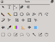 What do you think of that ?  Two questions before I go any further. Source : Do this icons already exist with color or do they have to be colored manually ? Format : I can see there is SVG and PNG icons. Do SVG are aimed to replace the PNG in a long term (Vector Graphical UI) or are they just some source file ? Thanks for listening !
|

KDE Developer
|
Actually, the original designer explicetly made them greyscale, because too many coloured icons don't do to well with proffesional artists (we often get people who complain about the remaining coloured icons).
|
|
Registered Member
|
I see.
 So... are the original colored icons avaible online for people who wanted to add a bit of color anyway ? Sorry I mis-read. EDIT : Ok so they are grayscale. I'm a bit more like those professional who use pixelmator (I really think this is gorgious) but I understand. I guess I will have to color icons myself 
|

Registered Member
|
The reason why many UI designers avoid colors in icons is because they add no information to a user interface. The purpose of icons is to communicate what a tool does. If you compare a color icon with a greyscale icon, they communicate the same thing. The color is superfluous information that is seen as a distraction.
People want to paint and draw when they use this application -- not look at icons. UI is a necessary evil. I have heard a few complaints by concept artists about the remaining color in Krita. Specifically the blue sliders. People will still know how to use a slider if that was turned into greyscale. Pixelmater has pretty icons with good padding. It is good 'design' from a graphic designer standpoint. If they actually did research on the effectiveness of the colored icons, I would be surprised if they colored versions would make any impact on productivity. |
|
Registered Member
|
UI designer for graphics software, at least
 So, I understand your point. There is no colors in photoshop and I don't it need it. It may be the time to be used to this new icons. Let's go black and white ! (and mostly, gey) Thanks both of you for your answers ! |
|
Registered Member
|
Thanks for the idea. We are always on the lookout to make Krita better (from UI or functionality standpoint). If you have other ideas to make it better or help you work better, please let us know.
|


Page 1 of 1 (6 posts)
Bookmarks
Who is online
Registered users: bancha, Bing [Bot], Evergrowing, Google [Bot], Sogou [Bot]


