Multiple Column Dockers
Page 1 of 1 (7 posts)
Tags:
None
|
Registered Member 
|
Hoping I have the terminology correct
 How about multiple dockers side by side? I would like to have the Tool Box docked as a single-icon-wide strip down the left of the screen and then things like brushes, palettes etc between that and the drawing canvas. Of course I would still like to have dockers on the right hand side My reasoning is that the tool box does not really need a wide layout, I think of Affinity Designer and Photo, Clip Studio Paint, PS etc. While I do not want to be of the "Product X has this so Krita must have it too" school of thought. As a work-around avoid this I have currently stretched mine along the top of the canvas but it is a work-around and leaves Krita slightly out of kilter with the rest of the tools in my work-flow. Again, not a deal breaker for me, but will help slot Krita more seamlessly into my workflow - as I do not have to look in a "non standard" part of the screen for a tool |

KDE Developer
|
Already possible. Just drag(click on the title to start dragging) and drop them into place.
|

Registered Member
|
Hey, the interface of Krita is really flexible. Have you tried drag'n'droping them and test how they can magnet?
|
|
Registered Member
|
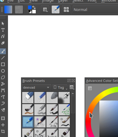
You have to be careful not to get carried away with this.
https://imgur.com/MHugrMS |
|
Registered Member
|
****! I feel really silly again
Although I will say that in my defense that perhaps I should have explained what I wasn't "getting" with this. I already had two docks "brushes" and "colours" above each other, on the left (the end result of David's animation). When I tired dragging the tool bar to the left it made a double column on the "upper docker" not vertically across both, as David achieves in his animation. So if you work the way David does in his animation this works as I want. But this order of operation is not immediately obvious. Rather my feature request should have been that the dockers stacked vertically, behave as a column. And that boils down to philosophical debates about which behavior is better. This current implementation reminds me of Blender's ability to subdivide windows - great but sometimes too powerful Thanks for the tips guys |
|
Registered Member
|
Yes that much is obvious, but it was not until I saw David's animation that I realized I have to change the order of docking the tools. I could not start with two dockers above each other and achieve that same result |

KDE Developer
|
One problem is that we totally do not control how the dockers function. The dock widgets are part of Qt: https://doc.qt.io/qt-5/qdockwidget.html.
We used to have, back in 2004, 2005 several different implementations of panels and dockers, and they were all so buggy and maintenance intensive that we heaved a collective sigh of relief, started using Qt's dockers and swore an oath on our keyboards that we'd never go back to a private implementation. |


Page 1 of 1 (7 posts)
Bookmarks
Who is online
Registered users: Bing [Bot], daret, Google [Bot], Sogou [Bot]


