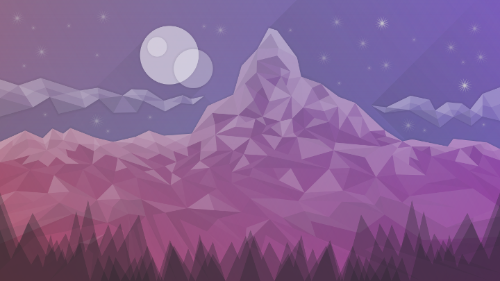
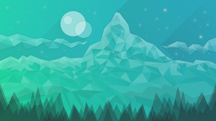
Starry dusk on Matterhorn wallpapers
Tags:
None
|
Registered Member 
|
Hi!
Submitting Starry dusk on Matterhorn wallpaper (CC by-sa) with a "purple" and a "green" versions:  * Link to 5120x2880px version (3.5 Mo)  * Link to 5120x2880px version (3.6 Mo) * Source file for both version (.svg) The wallpaper is inspired by a photography of the Matterhorn by Sven Scheuermeier that I currently use as a wallpaper!  As it's more or less my first contribution to a FOSS project (some translations to french for Ubuntu Touch project), I think it's a good occasion to thank the KDE team & community for its incredible work, and more specifically Michael Tunnell (one of his This Week in Linux video about setting Plasma to mimic Unity DE made me switch from Ubuntu 16.04 LTS to Kubuntu 18.04 LTS) and Nate Graham (Adventures in Linux and KDE made me follow Plasma development and try to contribute a bit)!  It seems that I'm not the only one loving mountains, dusk and stars! 
|
|
Registered Member 
|
You're very welcome! These are really really nice.
|
|
Registered Member 
|
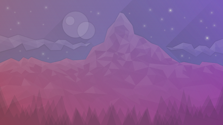
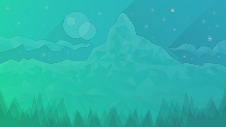
A more "subtle" version of the wallpaper for those who might prefer something more "light" as a desktop background...
  * Link to 5120x2880px version (3.3 Mo)  * Link to 5120x2880px version (3.4 Mo) NB: Inkscape svg file linked in the first post has been updated (the "subtle" version is on another layer). 
|
|
Registered Member 
|
Pretty cool! One thing I'd still tinker with are the drop shadows, they look a bit off to me but I can't quite tell why. Also make sure to note which would be your final entries as right now there are 4 which is 1 over the limit.
|
|
Registered Member 
|
Thank you!  Well, consider that the final entries are the first ones (first post), I will try to post a third entry before the deadline ! 
|
|
Registered Member 
|
Yes please do! Speed is appreciated.

|
|
Registered Member 
|
Oh and one more thing, would you consider a less literal name? For example, just "Matterhorn" maybe.
|
|
Registered Member 
|
I'm trying to post a last one but apparently the forum is "unable to determine the dimensions of the image"... I will find a solution! 
Go for "Matterhorn", I'm bad at giving names! 
|
|
Registered Member 
|
|
|
Registered Member 
|
So, with more subtle drop shadows!  First the two (purple and green) for the wallpaper competition: * Link to 5120x2880px version (3.4 Mo) (purple) * Link to 5120x2880px version (3.5 Mo) (green) Then the versions (purple and green) with less contrast (if someone wants to use them as a wallpaper or whatever): * Link to 5120x2880px version (3.3 Mo) (purple) * Link to 5120x2880px version (3.3 Mo) (green) |
|
Registered Member 
|
Thank you so much! It's appreciated.
|
|
Registered Member 
|
The panel of judges has decided to do a quick second round with our favorites, and I have congratulations to offer: Matterhorn (the purple version) has been chosen as a finalist! In the next 2 days, we would like to help you polish up your wallpaper, and to that effect we have some detailed feedback:
- Improve the stars to make them less attention-getting, more like how they are in the turquoise version - Adjust location of circles so they're not under the clock when it's on the lock screen |
|
Registered Member 
|
Wow! Thx a lot!  Below a new version where the "moons" have been moved more on the left side of the wallpaper (with more transparency for the main "circle") and with more transparency for the stars! Let me know if more adjustments are needed!  Link to 5120x2880px version (3.4 Mo) (purple) |
|
Registered Member 
|
|
|
Registered Member 
|
Bookmarks
Who is online
Registered users: bcooksley, Bing [Bot], Google [Bot], Yahoo [Bot]


