Ice Cold
Tags:
None
|
Registered Member 
|
|
|
Registered Member 
|
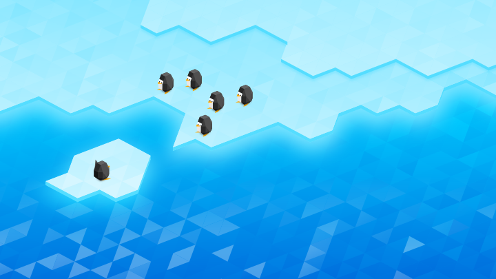
I love these. Easily my favourite ones.
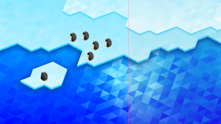
The only thing I don't like too much, is the water on the bottom left, I'm not a big fan of the strong contrast between triangles there. Penguins are just so cute. |
|
Registered Member 
|
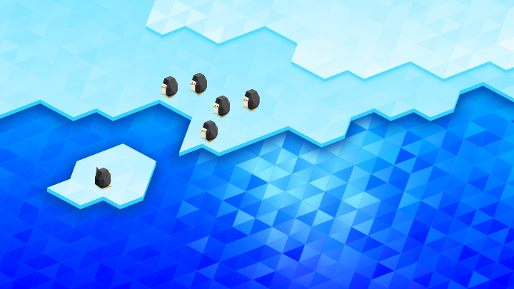
This is quite lovely, and very faithful to the current geometric aesthetic. However I find the area near glow where the ice meets the water to be a almost eyeball-searingly bright. I think that might benefit from being reduced in visual intensity a bit. Also it's rather monochromatic. I think one more contrasting color used as an accent would really set this off.
|
|
Registered Member 
|
|
|
Registered Member 
|
|
|
Registered Member 
|
Stunning! And yet, maybe a bit *too* stunning.
 I think it might benefit from having the color saturation reduced just a little bit. Not a lot, just a bit. I think it might benefit from having the color saturation reduced just a little bit. Not a lot, just a bit.
|
|
Registered Member 
|
|
|
Registered Member 
|
|
|
Registered Member 
|
|
|
Registered Member 
|
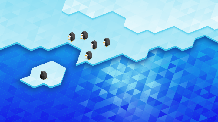
Thank you very much! Do you think you could make one last version with a less bright color for the dark blue water area? It still feels like it stands out a bit much. Maybe take inspiration from the shade of blue uses for the water in the original version.
|
|
Registered Member 
|
Agreed, I think the water looked somewhat better in the first version. |
|
Registered Member 
|
It's not too late! Wanna make another version with reduced water brightness?
|
|
Registered Member 
|
|
|
Registered Member 
|
|
|
Registered Member 
|
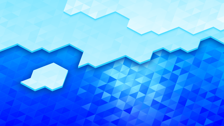
The panel of judges has decided to do a quick second round with our favorites, and I have congratulations to offer: Ice Cold (the non-penguin version) has been chosen as a finalist! In the next 2 days, we would like to help you polish up your wallpaper, and to that effect we have some detailed feedback:
- Make the water still softer and less attention-getting, closer to how it looked in the original. - Adjust the geometry so that when it's on the lock screen, the clock is entirely over a relatively simple area by moving this boundary a bit: https://i.imgur.com/6PEtdvd.png |
Bookmarks
Who is online
Registered users: bcooksley, Bing [Bot], Google [Bot], Yahoo [Bot]
