Expense Pie Chart
Page 1 of 1 (3 posts)
Tags:
None
|
Registered Member 
|
I have been using Kmyomeny for serveral years. I am not the best a creating graphical reports.
Is there a method to create a expense report (categories) represent each slice of the pie graph. I am looking to create a graph like the image listed below. Also if anyone has every used YNAB (You Need a Budget) that spending graph is something that I am trying to create within the reports section. Example Charity was 20%, Mortgage was 30%, then other things like auto and food of the pie slice. Not sure how to create this report. Report created with Skrooge 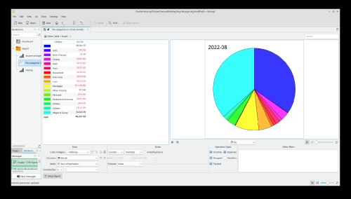 Full Image URL https://www.imgpaste.net/image/KtHLAx |

Registered Member
|
I don't use budgets, so I can't easily test myself, but have you looked at the charts in the existing budget reports to see if something already exists? If not, one workaround would be to find a report that includes the correct data, export the data, and do the graphics in LibreOffice or another external program.
|

Registered Member
|
You should be able to generate a pie chart like that. In the Report tab, open the "Income and Expenses Pie Chart", then click the configure button. First, click the "Rows/Columns" tab, and set "Detail" to "All" Then, click the Filters tab->Category tab and click the Expense button. That should give you a pie chart of all expense categories.
|


Page 1 of 1 (3 posts)
Bookmarks
Who is online
Registered users: Bing [Bot], claydoh, Evergrowing, Google [Bot], rblackwell


