[Dolphin] how to improving toolbar buttons placement
Page 1 of 1 (7 posts)
Tags:
None
|
Registered Member 
|
Hi
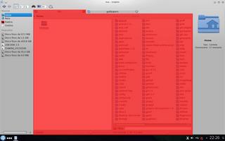
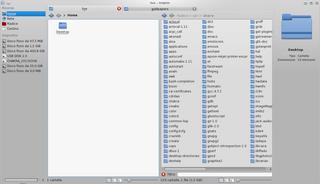
I was thinking it would be a great improvement for Dolphin if we can get rid of the toolbar and move buttons placed in it in more proper places. To be more precise, I'm pretty sure that following browsers' behaviors should be the right thing to do. Infact, analyzing the UI of Dolphin, you can clearly view that actually the toolbar is placed OUT of the navigation space:  Click here to zoom While, in my opinion (and in the usability studies form Mozilla, Google, etc. ), we should have, for example, navigation buttons (back and forward arrows) in the navigation area. So the view option buttons should be placed in the same place as the zoom slider, and so on. Here there is a simple (and very fast... I'm not a graphic  ) mock-up of how Dolphin should be (or should have options to have something like this) : ) mock-up of how Dolphin should be (or should have options to have something like this) : Click here to zoom As you can see with this change we could have also some other benefits:
Best regards! Emanuele |

|
I esp. like that there buttons for each view of the split - "SDI-a-like"
The mock lacks some buttons, but dolphin could add the suggested ones and then you /can/ hide the main toolbar (dropping some less important buttons) as well as keep and reconfigure it. |
|
Registered Member 
|
The problem with your mock-up is that the location of "Control", "Find", "Preview" and "Split" is not considered. I like the layout as it is at present as it keeps things simple and clutter-free, and was obvious to me after a few seconds of use that the controls also apply only to the selected pane in "split" mode, but understand that this might not be so obvious to some.
However, I agree though that there is logic in moving view settings to be at the bottom (and ties in nicely with the zoom which is also a view), but then things like "Preview" are also a form of view so that would then end up being at the bottom too -- this could add clutter, so perhaps "Preview" should display just as an icon in split mode. "Find" could perhaps be integrated at the end of the location bar. Perhaps the "Close" option for the split could be transformed into an "x" in the top-right of each pane. That just leaves "Control", and since settings are different for each pane then you should have a separate "Control" for each. "Up" is also removed, and when re-added twice may increase the clutter. Until such details are worked out in a manner which avoids such clutter, then I see no benefit to making any change to what is currently IMO the best designed UI of any file manager on any platform. I also think that Dolphin/Konsole etc. should use the same form of tabs that are used when you choose to "Attach as tab to" in the KDE window manager. This places the tabs in the title bar of the window.
Last edited by paulm on Thu May 02, 2013 2:05 pm, edited 8 times in total.
|

|
 The Brainstorm does not seem to be about dolphins tabbing feature at all. |
|
Registered Member 
|
Sorry, I think you were viewing half of my post when I was in the middle of editing it. |
|
Registered Member 
|
Broser example is not good reason to remove toolbar. The reason why browsers remove their toolbars and try to keep as small amout of space as possible for their own controls is to give web application as much space as possible. When working with a browser you are actually working with application shown in it but not with a browser itself. There are only few browser controls which are often needed. So browsers try to keep them in easily reachable area and hide rest somehow.
Similair situation one can see with virtual machines. Window showing guest OS screen has minimal space for its own controls since they are rarely needed and user prefere to do extra actions to reach them but keep as much space for guest OS screen area as possible. Rest of applications including dolphin are opposite. You are working with this aplication not with something running inside it and prefere to have its controls reachable. If those controls are not often needed moving them to toolbar is better then hiding them. Some ideas in this suggestions are good, like to move actions which are used more often to an easely reachable places however personally I'm against removing toolbar. |
|
Registered Member 
|
I think the detail described here is only one aspect of a general issue with dolphins twin view mode. There are some more problems that raise the impression that the two view mode is not really well implemented. It appears like a "well we could also try this" instead of a thought through experience.
Extending the suggestion made in this thread one might request to generally associate _all_ navigation and action aspects of dolphin to the currently active view, in case of a twin-view-only limited dolphin the the tab currently active. Everything else is only confusing. |
Page 1 of 1 (7 posts)
Bookmarks
Who is online
Registered users: Bing [Bot], Google [Bot], Yahoo [Bot]


