Menu Buttons
Page 1 of 1 (7 posts)
|
Registered Member 
|
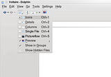
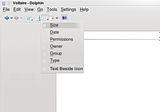
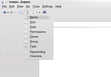
 This is an idea for dolphin that I call "menu buttons". These are toolbar buttons that, when clicked, pop up a menu. Currently Konqueror has back and forward buttons that pop up a built-in history list if you click and hold on them. I think it would be great if Dolphin's back and forward buttons provided this sort of list as well, so I have added them to the mockup. More generally, I think buttons of this sort can be useful in other roles in Dolphin as well. As a convention, buttons that execute a function when you click on it but pop up a menu when you click and hold have a big arrow off to the side. Clicking the arrow will bring up the menu immediately. This seems to already be the way things work in KDE, I am just trying to follow it for the sake of consistency. There is also another sort of button used for the KGet Konqueror button. This button has a smaller arrow touching the icon, and it pops up a menu immediately when pressed. Just pressing the button does nothing, in order to do something you have to click one of the menu entires. I also make use of this sort of button, using the same small arrow right next to the icon. The four buttons immediately to the right of the back and forward button are of these type. I will only include the first three in this section, since the fourth one is an independent idea. I created these buttons to fix what I perceive as a difficult in quickly and easily configuring the dolphin view. There are a huge number of options for configuring your view in Dolphin. The problem is that there is limited space in the toolbar. You obviously do not want to confuse and overwhelm users, that is what Konqueror is for. This means that, by default, there are only a few view property buttons on the toolbar. The rest of the options are all stuck in a single “view” menu in the menu bar, which is crammed and relatively slow to find stuff in. Most of the options, in fact, are in sub-menus of the view menu, which are even slower to access. This makes major changes to the view a relatively slow affair. These menus buttons are designed to group view properties into units with a consistent theme and organization, much fewer entries, and no sub-menus. The exact organization is open, what I describe below is simply one possible layout, one that appeals to me. I personally think it is best having these buttons as part pf the default toolbar layout and having advanced users who do not like them be able to switch them out for the old buttons. I think this layout will be easier for new users to understand and expose more functionality to them without confusing or overwhelming them. Whether the developers agree with that perspective or not, I think it is important that buttons like these at least be available. The first button of this sort, the button just to the right of back and forward buttons, is the “view mode” button. This button is equivalent to the “view mode” sub-menu in Dolphin, along with some options related to the view mode:  As you can see, this menu includes radio buttons to select the view you want, as well as check boxes to show file previews, show files in groups, and show hidden files. These are all currently present in the view menu and available as buttons. Notice that there are two views not currently available in Dolphin. These are placed here for consistency, the menu would work just fine if you decide not to implement either of these views (they are covered in more detail later on). The next button to the right is the “Additional Information” button:  Once again this is the same as the corresponding sub-menu in the view menu, with a few added options that I felt were related. Notice that these are all check boxes, since you can have as many of these as you want. Also notice the “text beside icon” check box. This is another new feature I will cover later one, if Dolphin developers do not implement it then it can just be left out of the menu. The I should also point out the icons I am using were just scavenged from the Dolphin icons, these particular icons do not have to be used. The next button is the “Sort By” button:  This has the standard sorting options. It also allows you to sort it descending. The “Columns” button allows you to organize the view by columns instead of rows. For some reason this is buried in the Dolphin configuration dialog box. I thought it was pretty useful so I made it more easily accessible. Changing view, sorting, showing additional information, these are all pretty basic tasks that people will want to do all the time. Yet to have all of them at your fingertips would currently require nearly two dozen separate icons, and most of them are two levels deep in the existing view menu. So they are either difficult to find and cumbersome to use or require a huge cluttered toolbar. This way, I feel is a good compromise between having them at your fingertips and not having them in the way. I think having a setup like this is a fairly good default layout for dolphin. More advanced users who want to have the separate buttons for any of these can just add them. Vista solves this last problem a bit differently. It keeps the column headings normally used to sort the details view even when explorer is not in details view. Although this is an option and as such I thought I should point it out, in my opinion this wastes precious screen real estate. I think my solution is better without being very much more difficult to use. This is part of my series of Dolphin ideas
Last edited by TheBlackCat on Fri Mar 27, 2009 4:04 am, edited 1 time in total.
Man is the lowest-cost, 150-pound, nonlinear, all-purpose computer system which can be mass-produced by unskilled labor.
-NASA in 1965 |
|
Registered Member 
|
I was pocking around my configuration directory and figured out I could implement this myself by modifying my dolphinui.rc file. Here is the obligatory screenshot:
 This is NOT a mockup, this is a real screenshot of my current dolphin toolbar layout. I won't mark this as implemented, since this is more of a hack than anything, probably an unsupported hack. However, it does mean that this idea is possible, in fact fairly easy The one problem is that clicking on the icon doesn't work, I have to click the arrow next to the icon to get the menu. There may be a way to modify it to avoid that. If anyone knows post it here, if not I have a few things I intend to try. Also, I cannot change or move the icons in the normal icon configuration dialog, I have to do both of those by hand in the file. But until (or unless) the is implemented in a legitimate manner this is a passable solution.
Last edited by TheBlackCat on Mon May 18, 2009 5:22 am, edited 1 time in total.
Man is the lowest-cost, 150-pound, nonlinear, all-purpose computer system which can be mass-produced by unskilled labor.
-NASA in 1965 |
|
Registered Member 
|
For Rekonq 0.3, we will remove the menubar. We have implemented a button-menu containing few actions to replace it.
Here an example of code: KActionMenu *toolsMenu = new KActionMenu(KIcon("configure"), i18n("rekonq tools"), this); //button-menu toolsMenu->setDelayed(false); //important for instant activation toolsMenu->addAction(actionCollection()->action(KStandardAction::name(KStandardAction::SaveAs))); //action in the button menu actionCollection()->addAction(QLatin1String("rekonq_tools"), toolsMenu); // button menu as action. This button-menu can then be added in the toolbar. |
|
Registered Member 
|
Please attach a link with this code... It\'s lovely. Now to add to this request, I think clicking each button once should cycle through the list of available options. So in case of the view buttons, say Icons is the current setting. Clicking will give details, clicking again will give Columns. A third click will bring icons back. And of course click-and-hold (or clicking the arrow) shows the list with the additional options. I wonder if the above would be acceptable to Peter (dolphin author)... I think the drop down menu\'s wont as it is more complex but the idea above, while requiring hard code instead of changing the xml files, would be easy enough yet give the poweruser more power. Right?
I don't do sigs.
|
|
Registered Member 
|
I don\'t know if it is useful. A more generic idea is: improve the toolbar editor to be able to create this kind of buttons. It would benefit to all applications.
Your idea is good. Anyway, it will still take many buttons in the toolbar. Imo, the dolphin UI is ugly. Why ? Because its actions focus on layout configuration instead of useful contextual actions like: copy, cut, paste, delete, open with, decompress etc. We don\'t need to change the icon size all the time, it is something you do one time for a folder and if it could be automatic it would be better. |
|
Registered Member 
|
To get the menus I showed, first you need to change something in the Dolphin toolbar. Add a button, remove a button, change a button position, change a button icon, it doesn't matter. The configuration file does not get created until you change something. Next, open your kde4 configuration directory. In openSUSE it is the .kde4 directory, but it varies. Go to share->apps->dolphin->dolphinui.rc. Make a backup of the file, then open it in a text editor.
Find the section that starts with ToolBar and contains name="mainToolbar". Replace that section, from ToolBar to /ToolBar, with this:
Next, see if there is a section labelled ActionProperties. If there is not, add this to the end, before /kpartgui:
Either way, in that section, just before /ActionProperties, add this:
Then save the file. It should give you what I have. You can then move icons around to suit your preferences.
Man is the lowest-cost, 150-pound, nonlinear, all-purpose computer system which can be mass-produced by unskilled labor.
-NASA in 1965 |
|
Registered Member 
|
I implemented this for 4.5.
Man is the lowest-cost, 150-pound, nonlinear, all-purpose computer system which can be mass-produced by unskilled labor.
-NASA in 1965 |
Page 1 of 1 (7 posts)
Bookmarks
Who is online
Registered users: Bing [Bot], blue_bullet, Google [Bot], rockscient, Yahoo [Bot]


